Exercise: Rain

Imagine a magazine cover on one subject; Rain. You have the entire cover space to work in. You should produce a single, strong, attractive photograph, that leaves no one in doubt about the subject.

Below are some guidelines:

  • Keep it simple
  • Think of all the effects of rain that you have ever seen
  • Be interesting, don’t settle for an ordinary middle-distance shot of a street in the rain
  • With some photographs, you don’t need to wait for a rainy day
  • Make it attractive

IMG_0235

I decided to convert it to Black and White to see if it would have a more dramatic look, and I am happy with the result.

IMG_0235 - Copy

Exercise: Juxtaposition

For this exercise, choose either a still life approach, or a larger scale shot. If you choose to do a still life shot, take any book you like, and make a suitable cover illustration using two or three relevant elements.

I decided to research what Juxtaposition meant. Juxtaposition is to put side by side: to place two or more things together, especially in order to suggest a link between them or emphasize the contrast between them.

I decided to choose two of my favourite novels rather than just one. I chose The Great Gatsby by F. Scott Fitzgerald and The Kite Runner by Khaled Hosseini.

The Great Gatsby:

The Great Gatsby: Gatsby is a 1925 novel written by American author F.Scott Fitzgerald. The Great Gatsby explores themes of decadence, Idealism, Social Upheaval, Excess and creates a portrait of the Jazz age, and the American Dream in the 20’s.

This is the cover I have on my copy of the novel: It portrays one of Gatsby’s extreme parties.

For my novel cover, I decided to go with the still life approach. I chose some objects which I thought would be suitable in portraying the Gatsby themes. Its all about, diamonds, glamour, cars, pearls, the eyes of Dr.TJ Eckleburg and the breakdown of relationships. My objects are obviously more modern than items which would have been on a cover in the 20’s, however, I chose objects that sum up the novel, or would be recognisable to someone who has read the novel beforehand. I think the photograph has come out really well.

The Great Gatsby ( My Cover )

IMG_0261

The Kite Runner:

The Kite Runner is a novel written by Afghan-American author Khaled Hosseini. It is based in Afghanistan, and tells the story of a young boy Amir, and his Hazara Servant Hassan. There are themes of Guilt, Redemption, Violence, War, Taliban and Love. The kite is very symbolic and it travels throughout the novel symbolising guilt, loyalty, redemption and lots more. Instead of a still life set up for my interpretation of the cover, I decided to make a silhouette. I wanted a simple cover, yet I wanted something powerful and striking, so that if you were to walk past a book store and see this on a novel, you would stop and look. I chose simple white paper for the cut out, and a plain black background. I photoshoped the white paper and made it more whiter so it would be bold, and stand out more.

This is the cover I have on the novel.

I got my influence from the DVD cover I have of the film.

The Kite Runner ( My Cover )

IMG_0274 - Copy

Original (Without Photoshop)

IMG_0274


Exercise: Symbols

The most obvious symbols, those that spring to mind first, are often so well used, that they are hackneyed. However, it is often possible to overcome the most well worn symbol by treating it in an original or interesting way.

The idea of this exercise, is to find symbols for a number of concepts. Complete it by listing more than one symbol for each of the following subjects, and add a short note saying how you might use them in a photograph. You do not need to take any photographs for this.

The subjects are:

Growth

Plants, Seeds, Children, Hair, Nails, Ruler, Measuring tape, Companies

Excess

Food, Body weight, Alcohol, Skin, Hair,

Crime

Knives, Hoodies, Guns, Burglar, Broken objects, Graves, Police

Silence

Sadness, Tears, Crying, Empty rooms, Books, Library, Mediation, Church, Prayer, Gliding

Poverty

Homeless, Starving, Unclean, Hunger, Death, Sadness

Exercise: Evidence of Action

For this exercise, you were asked to produce one photograph in which it can be seen that something has happened. As a suggestion, included in the photograph something that has either been broken, or emptied.

For this, I looked again at the work of Gregory Crewdson, and Jeff Wall.

Gregory Crewdson

Jeff Wall (The destroyed room 1978)

With both of these images, they show a ‘mess’ and items which are ‘broken’. Taking influence from these images, I decided to photograph a cupcake which had been half eaten but made to look ‘broken’ or ‘torn apart’ .

I decided to use a spot lamp with a diffuser for this image, as I wanted a strong yellow colour from the icing, but I didn’t want the photograph itself to be too exposed.

IMG_0247


Project: Narrative

In photography, a narrative is the way of telling a story through a set of pictures. On the whole, this is usually easier than the alternative of trying to sum up a story in one single photograph.

A set of photographs like this is called a Picture Essay. They can contain anything from 3 or 4 photograph or in some cases, a dozen or more.

Before I started the narrative project, I decided to research more into picture essays, photojournalism and narrative photography so I could gain some more knowledge of what was needed of my photographs.

Photojournalism:

Photojournalism is a form of journalism which uses images and photographs in order to tell a news story, for publication or broadcast. It is now usually understood to refer only to still images, but in some cases the term also refers to video used in broadcast journalism.

The one rule in photojournalism is that the work is both honest and impartial, whilst telling the story in strictly journalistic terms.

Photojournalism is a form of narrative photography, and I suppose in some cases, can be picture essays especially if used in magazines etc as you can use more than one image, making it a picture essay and not just one photograph which sums up the story.

I found a powerful photograph by Samuel Aranda who won the 2011 World Press Photo of the Year. Even though this isn’t a picture essay, this image is extremely powerful and tells a story (Narrative).

‘Narrative photography is the idea that photographs can be used to tell a story’ Wikipedia.

Duane Michals : An American photographer who uses photography to create interesting, and unusual photo sequences and narratives. He worked mostly around themes, investigating; love, emotion, philosophy, life and
death. He also used text to strengthen the narrative.

Duane Michals work on the other hand, uses more than one photograph, which makes it a picture essay (Narrative essay).

Paradise Regained 1968

Tutor’s feedback for Assignment Four: Applying lighting techniques

I have been extremely busy at home, and have been unable to start any of my final assignment or projects (Number 5), but I am back now, and I am determined to work really hard on this last set of projects so I can get it formally marked.

I received my tutors feedback for Assignment Four a while ago and I am extremely pleased with her feedback and thoughts on my work so far.

I have posted her response below.

Overall Comments

Thank you for sending me assignment four. You have worked hard on this assignment and this shows dedication to your photography. This assignment was all about applying lighting techniques. You have demonstrated a knowledge of lighting a particular object to bring out physical properties of it.

Assessment potential

I understand your aim is to go for the Photography/Creative Arts* Degree and that you plan to submit your work for assessment at the end of this course. From the work you have shown in this assignment, and providing you commit yourself to the course, I suggest that you are likely to be successful in the assessment.

Shape  

This quality has to do with the outline of an object and should stand out against a contrasting background with minimal detail visible in the object itself. Your first image for shape has a little too much detail to be focusing solely on light. In the second image there is more focus on the shape of the subject as all other detail has been eradicated by the lighting that you have used. I like the fact that this isn’t just a silhouette, there is minimal detail  to give the image an extra dimension and extra interest.

Form 

This is another way of describing the volume of an object – how three dimensional it looks. Does it look as if you could pick it up from the page? I agree that you have lit the image very well with the shadows falling nicely for example how the light falls on the bear’s face. I think you have captured form very well here. The second image has also captured the object well to show its three dimensions. I really like the extra form and detail shown for example the fur on the face and the ears. I think going in closer has also made an interesting composition

Texture 

This is all about the surface detail, the angle of the light is important in bringing out the surface quality of an object. The first image has been lit very well to show the texture of the fur on the figurine. In the second image your lighting shows the smoother textures very well. You have shown very good control of lighting in these two images to utilize lighting to really concentrate on particular elements.

Colour 

You have shown colour in these two images, the second image works particularly well to show the richness of the tones of the colours of the figurine, particularly the colour of the hat and the plane.

I think that these photographs overall show your creativity in looking for different viewpoints and different compositions rather than purely using it as a lighting exercise. Well done.

Learning Logs or Blogs/Critical essays Context  

The learning log is all up to date with all exercises completed and well documented. I think that the amendments you have made to the previous assignment are also a good improvement.

I am really happy with her feedback, and I am pleased that she doesn’t feel that I need to change anything with this assignment.

Assignment Four: Applying Lighting Techniques

For this assignment, you will draw together the different lighting techniques you have been studying and apply them to one object. The idea is to use your new knowledge of lighting to bring out particular physical properties of the same object. It is also a test of your observation. Choose any subject that you can move around and take 8 photographs based on the 4 themes of this assignment. At the core of this assignment, you should aim to show the following qualities of your subject, one at a time, by means of lighting.

  • Shape:

This quality has to do with the outline of an object- its edges. These are likely to stand out more clearly if they contrast with the background, and if there is minimum detail visible in the object.

  • Form:

This is another way of describing the volume of an object, how 3 dimensional it looks. The modelling effect of the lighting, and the way you deal with the shadows is all important. Try to show as much depth as possible in the subject.

  • Texture:

This is a quality of the surface detail. Fine detail, such as that on sandstone or skin. This stands out best with a pattern of small, hard shadows, so you will have to consider both the diffusion (Or lack of it) and the angle of the light.

  • Colour:

Choose a kind of lighting and exposure setting that shows the subject’s colour (Or colours) as strongly as possible. In addition, you could photograph your subject in any other interesting, unusual or attractive lighting.

For this assignment, I used a small figurine as I was able to move it around and change the location and backgrounds easily. I used a mixture of outdoor lighting (Natural lighting), as the sun was shining strongly. I also used diffused artificial lighting with plane backgrounds, it depended on what theme I was trying to show.

Shape: Outline the edges of the object.

IMG_9891

For this image, I decided to stand the artificial light, to the side of the figurine, but pointing upwards. It caused shadows to form, and I was able to see a strong outline of the figure and the clothing on the bear itself, whilst not loosing any details.

IMG_9900

For this image, I decided to do the opposite. I decided to loose all of the strong details, and only focus of the outline of the figure itself. I stood the figure on a stand inside a light box I had. I left the artificial light outside the light box and it caused a diffused light as the sides of the light box are a white material. I positioned the camera inside the light box. I wanted a silhouette, and I was really pleased with the outcome. I managed to keep some small detail as you can see on the feet and the nose. However, the main focus was to cause a silhouette, which I managed to do.

Form: Describe the volume of the object. How 3 dimensional it is. Show as much depth.

IMG_9878

For this image, I decided to use natural lighting. I positioned the figure so that the sun was shining down on one side, which caused a shadow on the other side. As the figure is quite small, I couldn’t use much depth, however, I positioned the camera quite close to the figure. With the help of the shadows falling in the right places, the figure became 3D. This is visible by the figures round belly.

IMG_9909

For this image I decided to use artificial lighting. I positioned the camera quite close to the figure. I held the artificial light above my head causing only some reflection on the figure itself. I wanted to show the 3 dimensional shape of the bears face a lot closer than the other photograph. Moving closer to the figure enabled me to show the 3D shape more.

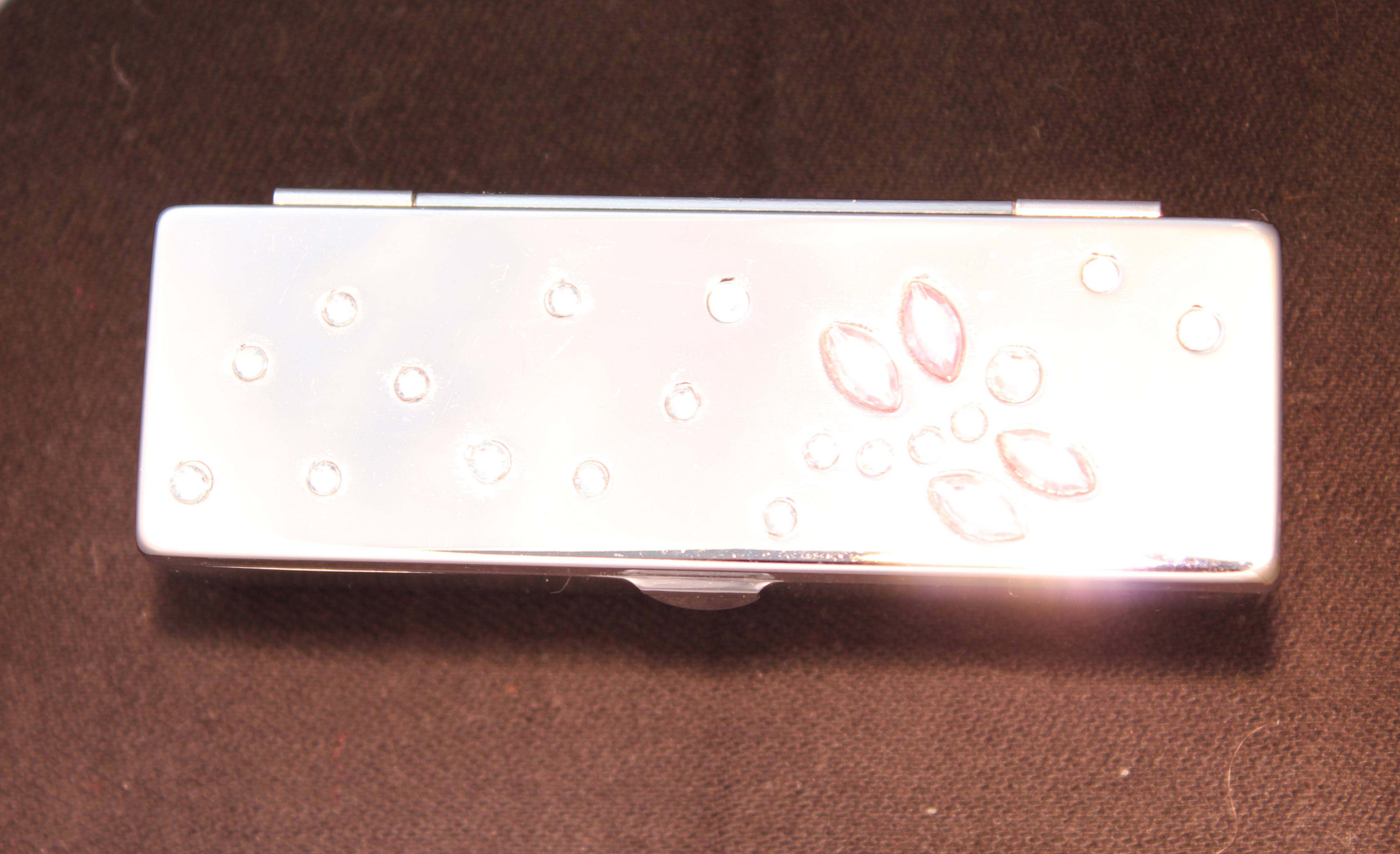
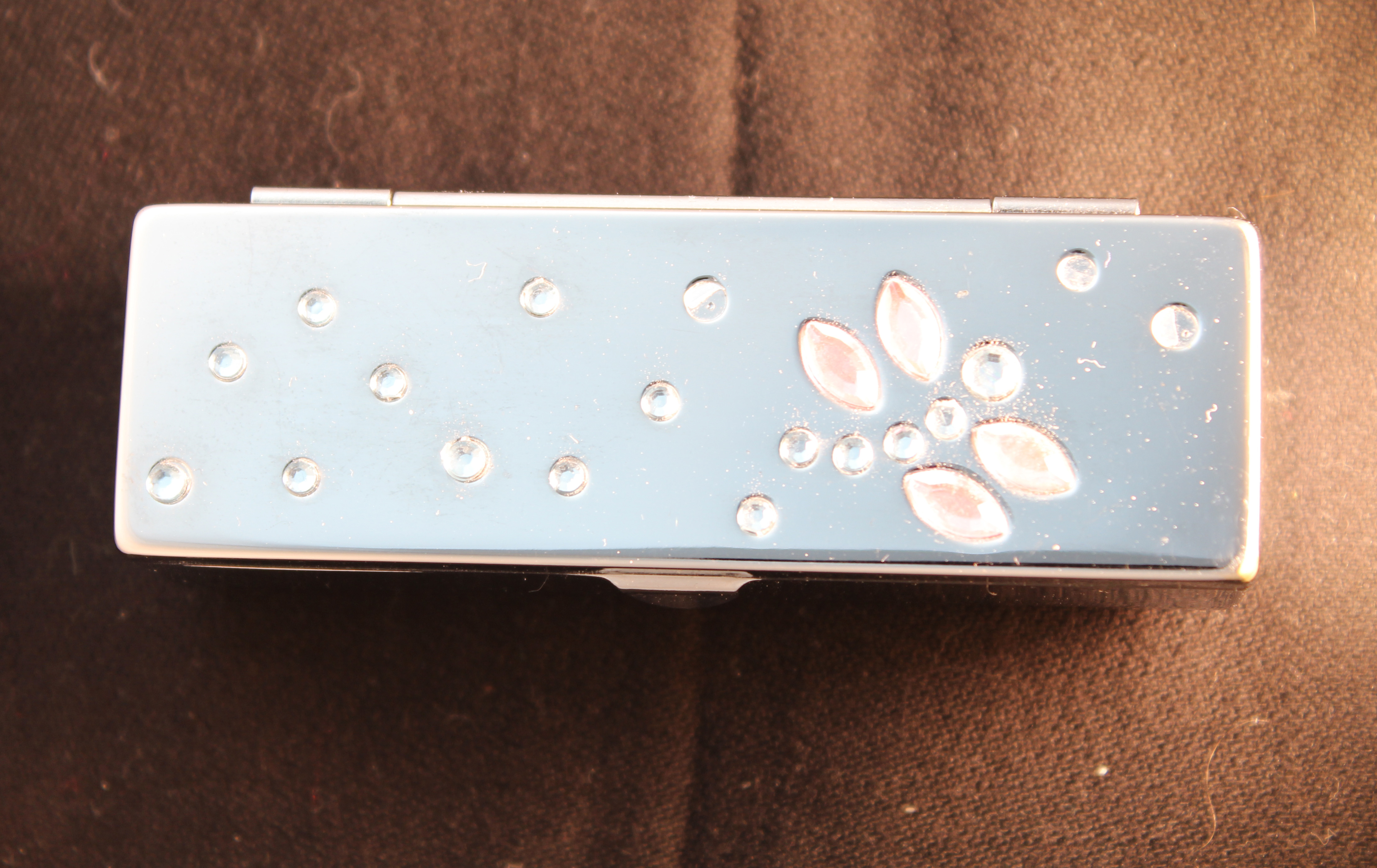
Texture: Surface detail, Fine detail. You may have to use hard shadows or diffusion.

IMG_9888

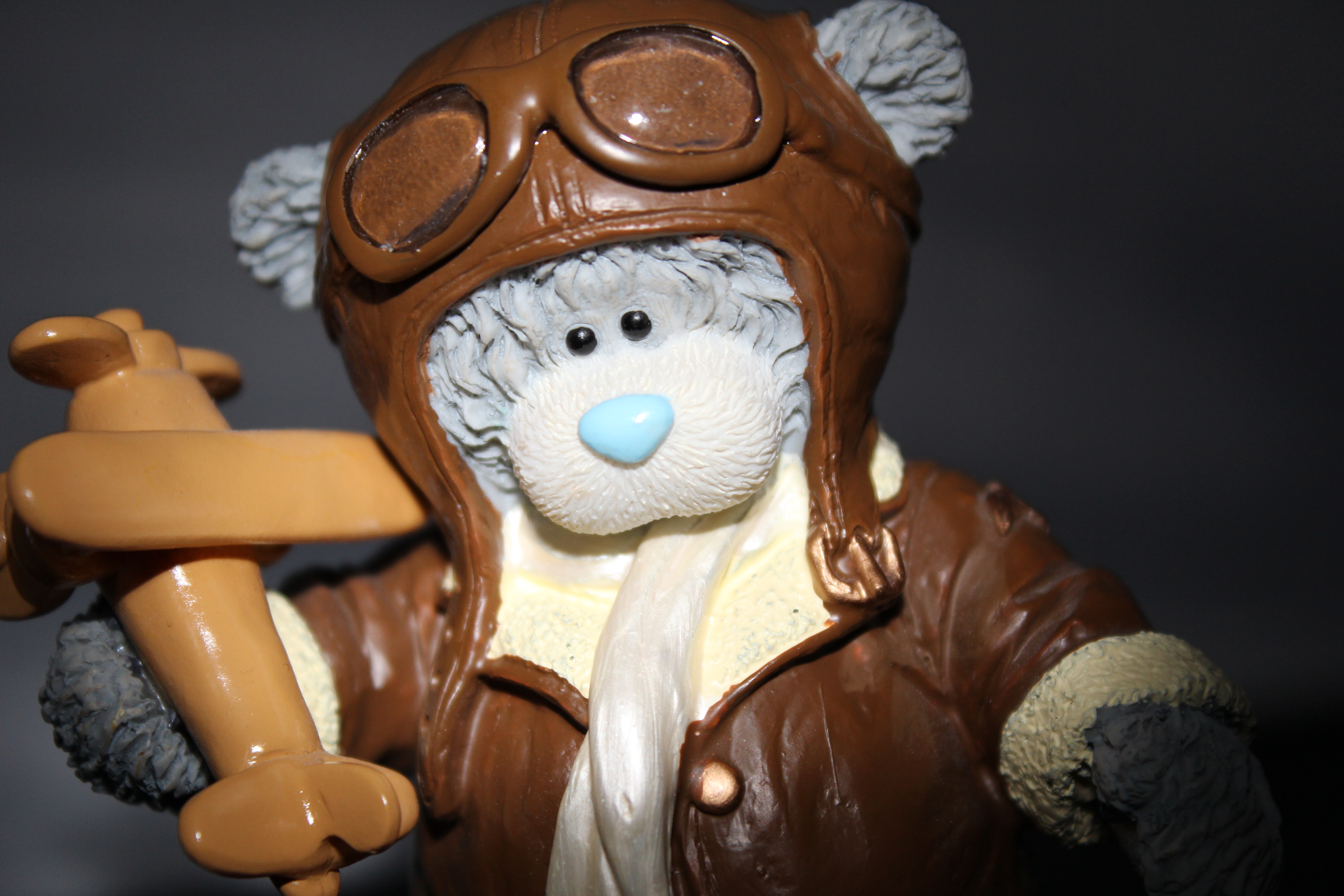
For this image, I used a diffused light as I didn’t want harsh lighting. Harsh artificial lighting wouldn’t show much detail, and I wanted a more softer tone to the image in order to see all of the detail. I positioned the diffused light to one side of the figure and framed it almost central in the viewfinder. Using the diffused light worked really well, it caused shadows and shading in all the right places and I am really please with this image. You are able to see all of the fine detail on this figure. You are also able to see all of the texture on the figure especially the bumpy feet and hands.

IMG_9905

For this image, I decided to use the diffused light again. I held it above the camera. I positioned the camera above the figure as I now wanted to show the smooth texture of the clothing, goggles and the aeroplane as these had hardly any fine detail on them, but instead, they had the smooth texture. The reflection of the light on the smooth sections caused a ‘shininess’ which helped show the smoothness of the clothing.
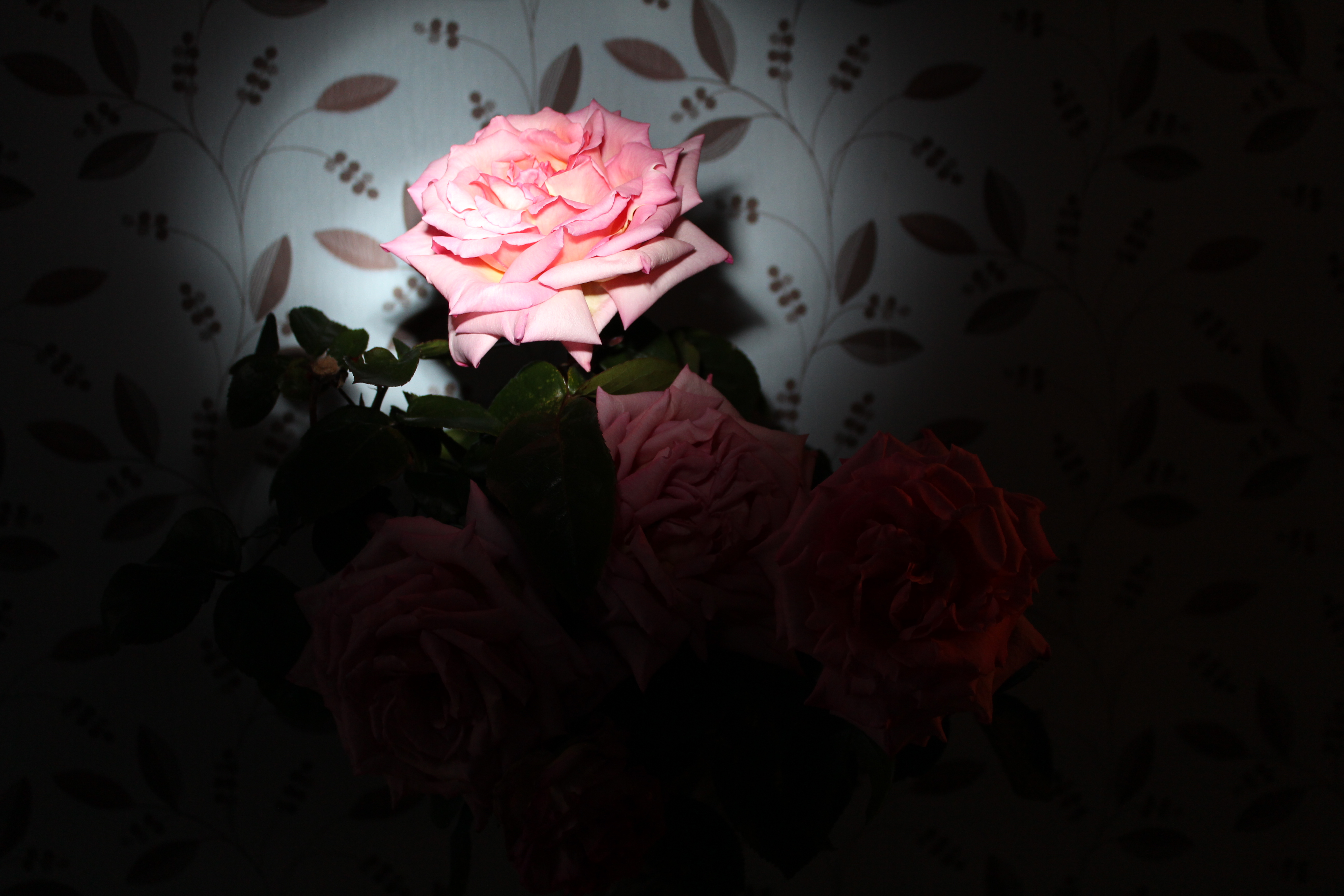
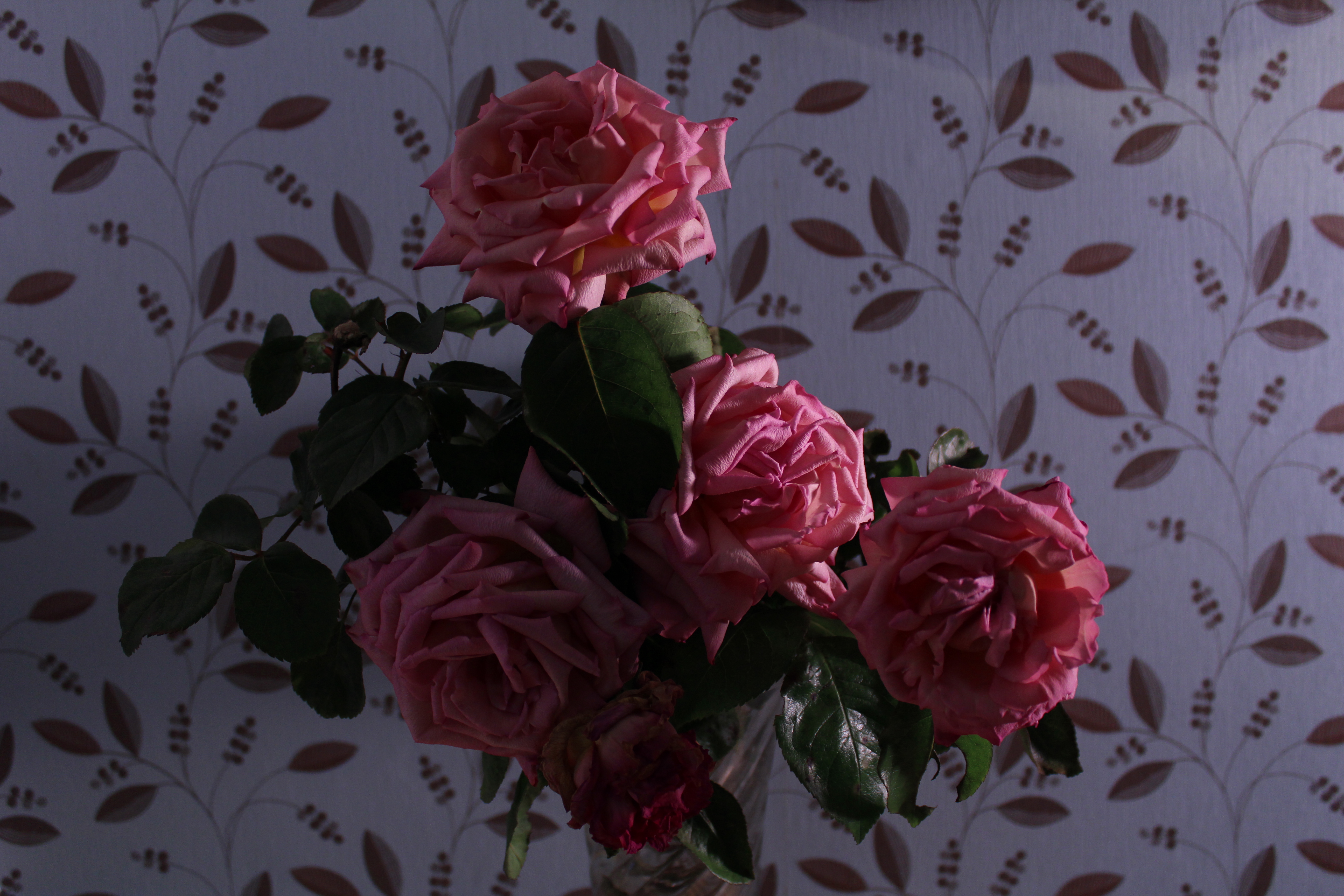
Colour:

IMG_9877

For this image, I decided to use natural lighting as I wanted to show the difference between natural and artificial lighting for this theme. I stood the figure in the sunlight but not directly as I didn’t want the strong sunlight taking the emphasis away on the colour.

IMG_9914

For this image I focused more closely in on the figure. I used the built in camera flash for this, and used the rolled up piece of paper technique I learnt in a previous exercise. I set the camera position and held the rolled up piece of paper so that it would flash only on the figure but mainly on the facial section. This turned out really well. The main focus is his bright blue nose, which wasn’t the main focus in the previous image. You are also able to see a large difference in the colour of the paint. The brown is a lot more darker with artificial lighting than natural lighting, and the same can be said for the colour of the aeroplane.

Overall Opinion:

Part four: Light

Before starting these projects, I researched more into shutter speeds, ISO’s and apertures as this would be essential for this set of projects. As I was still learning how to use settings on my new DSRL camera, I had to re-familiarise myself with the basics of lighting and exposures, and also how to change the settings or enhance the settings on my camera itself.

I enjoyed this set of projects. It was interesting to learn about the colour spectrum, and how lighting can effect the colour spectrum itself. Playing around with the WB settings on my camera helped understand this a lot more as I had never manually changed the WB setting myself until now, and learning that by changing it can cause a different colour temperature was really interesting and a technique which I will use in the future.

I have learnt a lot about how lighting can alter your photographs for better or worse. Learning new lighting techniques such as using reflectors, rolled up paper, diffusers and much more has helped me enhance my images along these projects and has helped me for the final assignment. I enjoyed the tungsten and fluorescent lighting exercise, as I never realised that different light bulbs can cause that much of a difference in a photograph. You don’t realise it until you do an exercise like that one and you understand that even changing the light bulb can help your image 100% more.

I do still have to update my research and photographer research as I haven’t been able to add that to the blog as of yet. I also have missed the Outdoors at night exercise, but I will also add the photographs one I have done that exercise.

Assignment Four:

It took me a while to think about this exercise as I was running a bit behind with the course as it was. When I read through the assignment, I was quite excited, as I would be able to use my home made diffuser again, and make use of my light box etc, as well as using the sun when it decided to show itself in my garden, as just lately it has been nothing but extremely dark clouds or rain. I really enjoyed this assignment and I am more than happy with my final results. Learning the new lighting techniques and applying them to the different themes helped much more. Looking back on some older assignments, I could have definitely used some of the lighting techniques I have learned here to help me. I did take a number of photographs with different lighting positions, angles, with diffusers and without, but the images I have chosen are the ones I believe portray the theme overall with the use of lighting only.

I will now await for my tutors response and post it on here. If there are any changes to be made, I will change them.

Excerise: Shiny Surfaces

Objects with surfaces that reflect brightly, such as anything of chrome or silver, are a special lighting problem. There are ways of dealing with them that make such a remarkable difference to a photograph that this is a very rewarding exercise to do.

First find an object that is so shiny that you can see your face in it. Choose an object you can lay flat and have the camera above the object. Set up the object, and your camera on a tripod, place a light close to the object. Take the first photograph, you should notice how unsatisfactory the image is.

Roll out a long tube made from tracing paper. Stick it together with tape and cover the shiny object. Attach the other end of the paper tube to your lens and stick it down. Or hold it in place. Then take a photograph. For the next set of photographs, play around with lighting in different positions and distances.

For this set of images, I kept the lighting at approximately 1 foot away from the shiny object. I then moved it right next to the shiny object for the other set of images.

I used settings ISO 200, 1/8 , F/5.6

Natural Light:

1 Natural Light

Artificial Light Above Object:

2 Above Light

Artificial Light To the Side of the Object:

3 Side Light

Artificial Light Behind Object:

4 Behind Light

Diffused Light to the side of the Object:

5 Diffused Side Light

Natural Light with Tracing Paper:

6 Natural Light Paper

Artificial Light Above Object with Tracing Paper:

7 Above Light Paper

Artificial Light Side of Object with Tracing Paper:

8 Side Light Paper

Artificial Light Behind Object with Tracing Paper:

9 Behind Light Paper

Diffused Light Side of Object with Tracing Paper:

10 Diffused Light Side Paper

Diffused Light Above Object with Tracing Paper:

11 Diffused Light Above Paper

For the next set of images, I moved the artificial light extremely close to the shiny object.

Artificial Light Above Object:

17 Above light close

Artificial Light Side of Object:

18 Side light close

Artificial Light Behind Object:

19 Behind light close

Diffused Light Side of Object:

20 Diffused light close

Diffused Light Above Object:

21 Diffused light above close

Artificial Light Above Object With Paper:

12 Above Light close paper

Artificial Light Side of Object With Paper:

13 Side light close paper

Artificial Light Behind Object With Paper:

14 Behind light close paper

Diffused Light Side of Object With Paper:

15 Diffused side light paper

Diffused Light Behind Object With Paper:

16 Diffused light behind paper

Overall Opinion:

The set of images taken with no tracing paper, give the ‘shiny’ surface a more dull tone. Whereas you can instantly see the difference with the images taken with the tracing paper. The shiny object becomes even more shiny and a lot brighter overall.

My overall favourite for this exercise would have to be the images taken with the diffused light with tracing paper. The lighting isn’t harsh like with the artificial light. You are able to see the detail with the stones clearer, and the metal is shiny overall.

Exercise: Concentrating Light

Sometimes, you may want the light to fall on just part of a scene, and want the surroundings in shadow. The easiest way to confine the lighting is to place a dark piece of card between the lamp and part of the subject. You can also roll a dark piece of card into a tube and hold it in front of your light or flash. Aim it at the part of the scene you want to remain lit. Then shoot your photograph.

I have a built in flash on my dsrl camera. I arranged some flowers on the table in a vase and took a normal photograph. I then rolled up a piece of black card into a long tube and held it in front of my flash, so the flash was almost inside the tube itself. I then aimed the tube at one of the roses and took the photograph. As the flash went off, it only fired light onto the desired rose, keeping the rest of the image in darkness.

IMG_9803

IMG_9805

I really enjoyed this exercise, It was very interesting. It will be a very useful technique to try out in the future. I like how it focused your eye on the one rose.

Exercise: Contrast and Shadow Fill

For this exercise, you needed a camera, tripod, white card, kitchen foil and still life objects.

You were asked to set up a still life. Something which was accessible to and had enough room around it to be able to move the light around the still life.

You were asked to set the camera up on a tripod and have it at the same level as the still life. Fix your light source about 2 or 3 feet away from the still life and to one side.

  • Your first photograph should be of the still life with the naked light.
  • Second should be with a diffuser
  • White card placed 3 feet away from the still life, to the opposite side of the light. Facing the still life. With diffuser
  • Move the white card twice as close. With diffuser.
  • Attach kitchen foil to the white card. Dull side facing out. Same distance as before. With diffuser.
  • Kitchen foil shiny side facing still life. Same distance as before. With diffuser.
  • Crumpled kitchen foil. Shiny side facing out. Same distance as before. With diffuser.

Compare the results.

I used the settings. ISO 400. 1/6 , F/3.5.

Naked Light:

1 full light

Diffuser:

2 diffuser

White card (2 feet approx. away):

3 white card 3 foot

White card closer:

4 white card closer

Kitchen Foil, Dull Side:

5 dull foil

Kitchen Foil, Shiny Side:

6 shiny foil

Crumpled Kitchen Foil, Smoothed Out:

7 crumpled foil

Differences:

The biggest difference you can see is between the naked lamp, and the diffuser. The photograph taken with the naked lamp is very bright and the light is harsh, whereas when taken with the diffuser, the light is less harsh.

The image taken whilst the card was approx. 2 feet away shows an overall bright image, however when the card was moved even closer, in my opinion, it became a lot darker. I was expecting the light to reflect off of the card a lot more when it was moved closer, so that was a surprise to me.

When I used the kitchen foil, I was also expecting the shiny side to reflect the light a lot more than what it did. The crumpled and smoothed out foil seemed to reflect more light than the smooth shiny side which was un expected.

By doing this exercise, I have learnt that different materials and techniques allow you to reflect light or shade light from certain parts of your image, and can make an overall better image for you.