Exercise: Colours into Tones in Black and White

When shooting with black and white film, you are able to use filters which allow only certain colours to pass through them but block other colours. For example, a Red filter…. If you hold a red rose up to a bright blue sky, the red filter will allow all of the light from the rose petals to pass through, however, it will block out most of the blue light from the sky. This will end in a photograph with a bright rose and a very dark sky.

Red Filter: These are attached to your camera lens.

You are able to use filters when shooting with a digital camera, however, processing programmes are much easier to process your final images, rather than using filters there and then.

Exercise:

For this exercise, you were advised to find a small groups of objects which were GREEN, YELLOW AND RED. You were also asked to include a Grey piece of card.  As I would be using a digital camera, I would only need to take one photograph. After I take the one photograph, I would then use Photoshop to add the different filters as required.

I decided to stick to the Peppers which were an example in our study book. Rather than using a piece of grey card, I decided to use a grey piece of material to place the peppers on.

Original Image: No Filter

IMG_1187

Default Black and White: No Filter.

Black and White

Red Filter:

Red filter

Yellow Filter:

Yellow filter

Blue Filter:

Blue Filter

Green Filter:

Green filter

Overall Opinion:

Being honest, I found this exercise difficult, mainly because I hadn’t used my Photoshop before so I had to know how to use the filters. I looked everywhere for help to explain how to add the filters and I asked my tutor. I took her advice, however I still think im doing something wrong. I have been looking at other blogs and I can see how the filters work on other peoples photographs, and how they don’t on mine. I am still confused with this exercise so it would definitely be something I would have to play around with in order for me to learn how to add filters to my image more. I would perhaps have to experiment with a 35mm film camera and filters in order to get the correct final images.

Looking at some other blogs, I can see how when you add a filter to your image, it can completely change the look of a colour. It can make the tones either lighter or darker, and you are able to change selected parts of an  image, just by choosing the right colour and filter.

I would like to understand how to add a filter properly so if anyone reading this could help, that would be hugely appreciated. I am using Photoshop Elements 9.


After letting this exercise stew over night, I decided to re-do it, as I did not want to let it beat me. I went back onto my Photoshop and began from the beginning. I converted the image to black and white. I then moved the RGB cursers depending on what colour filter I wanted mainly. I began with the Red curser. I moved it to the end, which meant it was mainly red. I then moved the green and blue cursers making sure that the red was the main filter for the image. I carried on with blue and green. I have included the updated photographs with the correct filters.

Updated Images:

Red Filter:

RWED FILTER

Blue Filter:

BLUE FILTER

Green Filter:

GREEN FILTER

Yellow Filter:

Yellow filter


Overall Opinion:

I am a lot happier with how this has turned out now. I am pleased that I managed to understand how to change the filters. I can definitely see how changing one colour can influence a photograph and the colour tones.

Black and White

Composing images without colour, as in all Black and White photography, calls for a different sensibility. It involves training your eyes not to be influenced by the colours in the scenes, and paying more attention to the structure in a composition, the form of things defined by line, shape and volume.

Example:

Black and white photography is becoming more popular with the help of digital photography. It is a step from reality. With the use of lighting, shapes and shadows, you are able experiment with your images.  Through the lack of colour, black and white photography enables you to add emotion and depth to an image.


Desaturation:

With desaturation, you are able to convert your colour photograph, into a black and white photograph with the help of many processing programmes such as Photoshop etc. You are able to go back to your images and change them however you want. If you were to take photographs using a 35mm black and white film, you would be unable to change any of the lighting etc.


Project: What makes a colour.

Primary Colours:

ART:

The idea of Primary colours is an old one in Art. The principle that a few colours are irreducible and all other colours can be made by mixing them. Painters have long been used to consider Red, Yellow and Blue as the Primary colours (RYB) instead of (RGB). I have learnt this over a handful of years whilst studying art and painting, myself.  Artists use colour by Reflection.

Digital:

Digital photography and computer screens have made us more aware of the main transmission primary colours, being RGB. RGB Meaning that photographers who use digital camera or computers are aware that the transmission primary colours are Red, Green and Blue. Photographers use colour by Transmission. Transmission is when you mix coloured lights that produce different results that are not expected. For example, If a photographer mixes a Red and a Green light, it will produce a Yellow colour. Monitor screens, colour film and out retinas automatically work this way.

Colour Printing:

Colour printers begin printing using (RGB). They then begin to use (CMY), Cyan, Magenta and Yellow, Whilst adding the key Black for extra density.  Black is known as a KEY when printing. If you look on some printer boxes, they may say CMYK, The K standing for Black.

In the end, we have Two ways of dealing with colour.

  1. The first being technical. This is to do with the process of recording and displaying colour, i.e. printing and photography.(RGB)
  2. The second being perceptual, this is to do with the way we ourselves process the way we see and feel about colour. (RYB)

Hue, Saturation and Brightness:

There are three qualities which define colour, Hue, Saturation and Brightness. Art/Painting students learn how to mix colours using pigments, however, photographers aren’t able to do this. Instead its essential that we learn the skills on how to recognise colours and be able to describe and compose them accurately.

Hue:

Hue is the essential quality that decides how we name a colour. Example being Red, Blue or Purple.

Saturation:

Saturation is when you take a colour, for example Red, and decide whether or not the colour is Pure, Intense or Weak, Unsaturated.  The scale which you decide from is Pure Saturation-Intense-Saturated-Dull-Weak-Unsaturated.

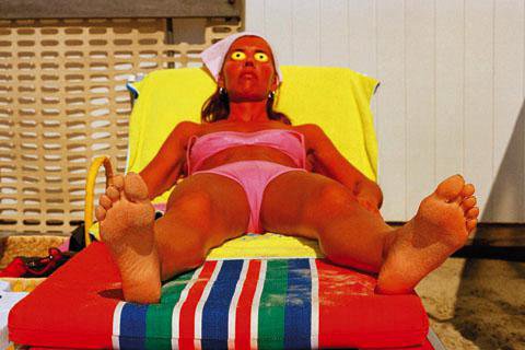
The well-known photographer Martin Parr, whom I previously studied is well-known for his saturated photographs.

(Martin Parr)

These are some examples of the saturation chart.

Brightness:

Brightness can be seen as being very dark or very light. The scale is Very bright-Bright-Fairly Bright-Average-Slightly Dark-Dark-Very Dark. Brightness can change depending on how we set our exposure. The colour Purity will always remain the same, no matter what the brightness is. Colour which lacks brightness however, will turn dark, and will become Black.


Part Three: Colour

For this set off assignments, we are going to be looking at colour. I will be looking at colour harmonies, Primary and Secondary colours, Black and White photographs, and how the use of photo editing or camera controls, can change the way colours look.

I’m beginning by looking into the History of the use of colours in photography.

Photography first began with the use of Black and White film. It was originally a Black and White medium because the film chemistry was not as sufficiently advanced as todays film. Using a restricted palette of only black, white and grey, photographers were able to concentrate their attention of graphic elements such as lines, shapes and tones.  The most influential photographers who use black and white photography are Edward Steichen, Ansel Adams  and Henri Cartier Bresson.

Edward Steichen:

Steichen was an American Photographer and Artist.  He was a frequently featured photographer in Alfred Stieglitz magazine Camera Work during  1903-1917. Steichen even Photo judged Ansel Adams work for a piece called  Moonrise, which was to be put in the formal exhibition at the Museum of Modern Art in 1944.

Ansel Adams:

Adams was an American Photographer who is best known for his black and white landscape photographs. With the help of Fred Archer, Adams developed the Zone System, as a way to determine proper exposure and adjust the contrast of the final print. The resulting clarity and depth characterized his photographs and the work of those to whom he taught the system.

Henri Cartier-Bresson:

Cartier-Bresson was a French photographer whom was described as being the father of modern photojournalism. He popularized ‘Street’ photography and ‘Life Reportage’ photography which was and still is popular with generations of photographers.

The technology of colour photography became widely accessible to photographers in the 1960’s. If cheap, reliable colour processes became more available in the 19th century. Black and White photography then became less common.  Colour photography became so common that it became more accepted and less special.

The most influential colour photographer is Ernst Haas.

Ernst Haas:

Haas was an Austrian born photographer who was well-known for his photojournalism and for being a pioneer in colour photography. His work was used in magazines such as Vogue and Life, and was also shown in New York’s museum of modern art.

I have also researched some more famous colour photographers.

Charles O’Rear:

Charles O’Rear is most well-known for his photograph which appears on all of our Windows XP Computer desktops. He has also photographed for National Geographic Magazine for more than 25 years.

William Eggleston:

Eggleston is an American photographer who is widely credited for his colour photography. He used his inspiration from Cartier-Bresson and Robert Frank in order to pursue his photography. He began photographing only using Black and White, however, Eggleston began experimenting with colour in 1965 and 1966 after being introduced to the medium by William Christenberry. Colour film became his dominant medium in the late 60’s.

Martin Parr:

Parr is a British photographer who is well-known for his documentary and photo journalist photography. Parr began his photography career using black and white, however he switched to using colour photography in 1984. He is known for his documentation of the suburban life, with his use of a ring flash and his overly saturated colours within his photographs. He has had almost 50 books published, and featured in around 80 exhibitions worldwide.


Tutor’s Feedback for Assignment Two: Elements of Design

I received my tutor’s feedback for my Assignment Two: Elements of Design. Due to it being Christmas and New year, I haven’t been able to act upon what she advised me to change until now.

I took her advice and realised that some of the photographs for my final assignment could be changed in order to create a better photograph.

Therefore, before carrying onto my third set of projects, I decided to make the changes to my second assignment.

I have included my tutor’s comments about the old photograph, above the new photograph.

Overall Comments

Thank you for sending me assignment two, please see below for your deadline for assignment three. I think it is a good idea to get your work assessed and you can register your interest and find out more about it by contacting the OCA directly.

Pointers for the next assignment

Try to carefully consider your images very carefully as images in their own right rather than as simply an exercise in colour.

Single point dominating the composition

 I think you have composed this image well to create a single point dominating the composition. I think the image could be improved by simplifying the background of the bottle to really focus all attention on the bottle itself.

(New Photograph)

IMG_0934

Two Points dominating the composition

I think that you have composed this a little more carefully to get the viewer really looking between two objects in the image without them being so close together. Maybe looking at the rule of thirds with one perfume bottle nearer in a lower third and the other bottle further away in the opposite upper corner to create a sense of depth and more movement of the eye to explore the image.

(New Photograph)

IMG_0950

Several points in a deliberate shape

 I like the way that you have thought about this image and carefully placed the lids and bottles in a deliberate shape to make a flower. I think, again that a more simple background would be beneficial as well as settling the colours a little. It is a busy image at the moment.

(New Photograph)

IMG_0988

A combination of vertical and horizontal lines

 I think that if you had gone in really close to the bottles and really filled the frame with them the lines would be emphasised more. It would also make for a less distracting image eradicating backgrounds etc.

(New Photograph)

IMG_0960

Diagonals

There are strong diagonal lines here, I like the way you have carefully considered this image and the placement of the object to create a feeling of diagonal lines. I think the colours work very well here and the shallow depth of field means the background is not distracting but part of the image as a colour and a texture, also making extra diagonals with the texture of the mat.

( I kept the same Photograph)

IMG_0836

Curves

 I think that this is a good subject choice for the photograph. I think that you could have emphasised the curves by going in closer to the bottle, maybe looking down on it to really show the curves and fill the frame.

(New Photograph)

IMG_0979

Distinct, Even if irregular, shapes

 The bottles themselves have very irregular shapes which are perfect for this category but could you have made them more interesting in the image? Perhaps by considering the background and composition a little more.

(New Photograph)

IMG_0968

Implied Triangle

 This creates an implied triangle well, I like the viewpoint you have chosen, looking down on the bottles to give a different perspective.

( I kept the same Photograph)

IMG_0855

Rhythm

I think that you have chosen a difficult subject to make into a rhythm image here but I think that you have done well to get a sense of rhythm from the way that you have arranged the boxes.

(New Photograph)

IMG_0962

Patterns

I think that you could go in closer to the bottle to really fill the frame with the pattern, maybe not even seeing it as a perfume bottle to start with.

(New Photograph)

IMG_0964

Conclusion:

I am really pleased with how my photographs have turned out after re-doing them, taking my tutor’s advice. I think that the plain background really helps make the bottles etc stand out a lot more, and composing them better has also really helped.