I received my tutor’s feedback for my fifth and final assignment for this first year.
I have posted her feedback below, and anything that needed changing has also been posted below.
Overall Comments
Thank you for your final assignment. It has been a pleasure to advise you on all of your assignments for the Art of Photography and would like to wish you luck with your future photographic pursuits.
Feedback on Assignment:
In this final assignment you imagined you were illustrating a story for a magazine. You had to illustrate a cover and several pages inside. This assignment brings together everything that you have learned on the course.
I think that you have chosen a great subject in Bristol Zoo, you might be interest in the work of Britta Jaschinski “ZOO” where she took monochrome images within zoos but challenge the celebratory image of the zoo that the organization would want to put across, showing an oppressive place with animals shown very much as in captivity, perhaps with more of a political slant than the images you have produced.
Also of interest is this blog post on the OCA site, http://www.weareoca.com/photography/tweet/ , Gary Winogrand’s Zoo and Michel Vanden Eeckhoudt’s work to see how other people have put their own slant on the zoo.
The first thing I notice Chantelle, is that you have twice as many images as suggested by the brief. Part of the work of a photographer is to select the best images to meet a brief so I would suggest that when you send of this work to be moderated it would be a stronger body of work if you went through this selection process to choose the twelve strongest images. Some, for example are duplicates of the same or similar animals, are each of these images telling you something new or could you chose the strongest one?
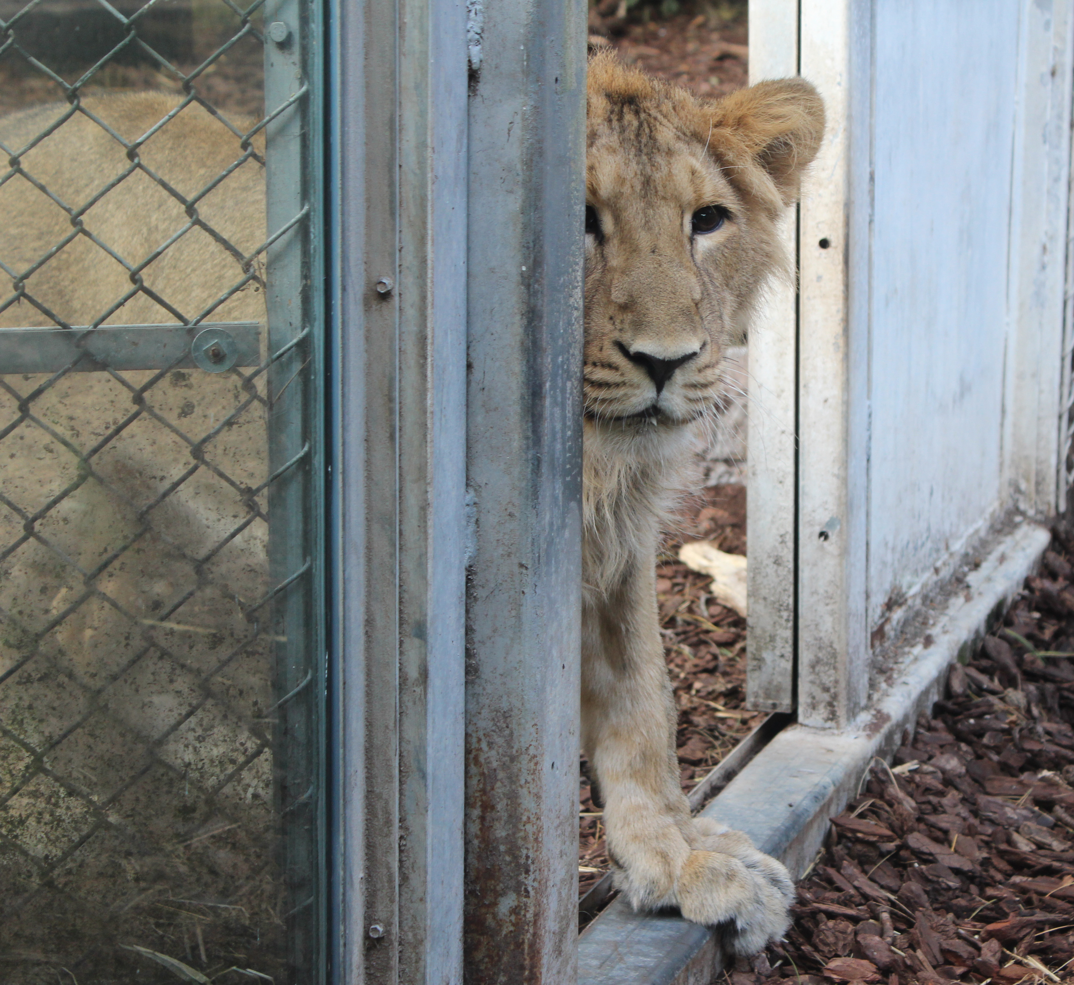
I think that you have shown adequate technical and visual skills with this assignment. You have produced correctly exposed images in what can be very dark environments, which shows good control of the camera. Using shallow depth of field in some images to isolate the subject matter against the background. I think in some of your images you have shown good compositional skills, for example in the cover image of the butterflies where it is well balanced using the rule of thirds. In the square shot of the lion peering through the doorway there is a sense of perspective and depth as well as giving the lion a feeling of trepidation and character. Other images feel a little central in their composition but you have filled the frame in most, which is good.
You have adequately realised your ideas in this project and presented your work well. You show the zoo in some images as a place to visit to see these particular animals but I feel some images look a little more snapshot in appearance as they include the wires of the cages which you wouldn’t usually see in images to promote a place, zoos battle against this view that people have of animals in cages and focus more on the conservation side of things. It is more likely to see these sort of images in a more challenging work on zoos. For promotional work showing the positive side of zoos I would expect to see more images of animals looking like they are in their natural environment, for example the meerkat, bird and reptile images.
I think that this work shows some creativity, although it would be good to see more of your personal style in the images, this might have been going in even closer to focus on particular expressions of the animals or characteristics, it might have been making very colourful images of the animals, it might have been showing some of the animals movement with longer exposures or maybe different viewpoints, animal eye view etc. You have begun to do this in the image of one meerkat where you are more at it’s eye level and it is filling the frame, the composition here also works as the meerkat is looking into the empty space.
An example of showing your personal voice or response to a subject is in Jaschinski’s work, this is work which could only have been made by her with her view of zoos, she shows sadness, focuses on marks on glass created by bored animals, close up facial expressions etc.
I think I wouldn’t worry about making page layouts for the work, concentrate on getting 12 really strong images for submission.
Learning Logs or Blogs/Critical essays Context
I think that the learning log is looking good, you have some evidence of self-reflection and research. You have been looking at the work of other photographers and have a good range of photographers working with narrative in your log. I would like to see more analysis and discussion of images produced, perhaps you could work more on the photographers I have mentioned above.
It would be good to see more self-reflection though, what you intended the image to be about or show, what you did, whether you achieved your intentions, anything you would change, reshoots of the image etc.
You mentioned adding narrative captions, narrative in imagery isn’t the same thing as describing a story with captions. I suggest you think about this further – maybe look at the book Context and Narrative.
I took my tutors feedback, and I decided to look into, and research the photographers she had suggested, to see if I could gain some inspiration from their work, in order to help me re-do my final choice images for this last assignment.
I began by researching into Britta Jaschinski.
Britta Jaschinski:

Jaschinski is a world-renowned, award-winning, Germany photographer. Her animal and nature photography has won her a dedicated and strong international following. During the 1990’s, Jaschinski set about documenting the sad world of captive animals in zoos. She is a member of CAPS, which stands for Captive Animals’ Protection Society. She quotes:
“We talk to animals but we don’t listen to them. We stroke them with one hand and beat them with the other. CAPS gives animals a voice and fights for their rights. Animals don’t need us but we need them. We must protect them from ourselves.” Britta Jaschinski.
The dark, sad and heart breaking photographs of animals in concrete compounds, gained her instant recognition. Her ‘Zoo’ work was displayed in the Photographers Gallery in London in 1996 and an accompanying book which depicted 75 haunting black and white images of captive animals, was then published.
‘This, then, is Jaschinski’s impressive achievement. In the places where animals are most obviously emasculated and confined, she has found the essential, wonderful strangeness of the hopefully untameable animal spirit. ’ Guardian Newspaper
Until now, I was unaware of Jaschinski’s work. However, after researching into her more, I am starting to appreciate her work, as I too believe that animals should be in their own environment, however, that may not be appropriate due to poaching etc. Therefore zoo’s do have a ‘Good’ and ‘Bad’ side to them. This topic is one which would create an interesting discussion.
When I was studying photography for my A-Level’s, for one of my final exams, we were given the opportunity to create a portfolio of work, about something which you felt strongly about. I decided to choose Animal Testing, with a more broad expansion to do with the Fur trade, Captive animals etc, Which I am completely against. It is a shame that I couldn’t have used inspiration from Jaschinski’s work, as it would have helped me so much more, however, I achieved a high-grade for my work and I was extremely pleased with my final images.
Therefore, as I had already (Unknowingly) documented something similar to Jaschinski’s work, for this final assignment, we were asked to create a magazine or something similar, which is why I decided to go down the route of creating a ‘Positive’ view of zoo’s, and a ‘Welcome to Bristol Zoo’ magazine, rather than expanding my work by going down the route of the ‘Bad’ side of zoo’s.
Below are a few photographs from Jaschinski’s ‘zoo’ work.
‘ ZOO ‘
Looking at these images, and then re-reading the feedback from my tutor, I can see why she would suggest re-doing some images. Some of my images show the glass or fences in the frame, and I can see how it can portray a ‘Unwelcoming’ feeling to the image, rather than a ‘Welcome’ feeling, which is not what I wanted to achieve.
“…some images look a little more snapshot in appearance as they include the wires of the cages which you wouldn’t usually see in images to promote a place, zoos battle against this view that people have of animals in cages and focus more on the conservation side of things. It is more likely to see these sort of images in a more challenging work on zoos.” Celena Beech
I then decided to research the photographer Gary Winogrand and his work ‘The Animals’
Gary Winogrand:
Winogrand was a well known street photographer who was known for his portrayal of The United Sates during the mid 20th Century. His first book of photographs ‘The Animals (1969)’, was made up of photographs he took of the Bronx Zoo and Coney Island Aquarium. The book consists of 43 black and white photographs which were taken over a period of seven years. From 1962 to 1969.
I found a really interesting blog which talks about Winogrand’s animal work, and the subliminal and hidden messages in his photographs.
http://peterbaker.org/the-animals/Below are some of the photographs that are in ‘The Animals’ collection.
Winogrand’s work is very similar to that of Jaschinski’s. They are both black and white images. In my opinion, black and white images show the expression and feelings of the subject more than that of coloured images. It is a feeling I have always had whilst studying photography.
With colour photographs, you are more focused on the pretty, different colours, whereas with black and white images, your main focus is on the subject itself. With both of these photographers, it has helped their pieces a lot more, as your main focal point is of the captive animals facial expressions and feelings.
They both show the animals with either the fence structure being seen, or with the dividing glass, being seen. This adds to the ‘Captive’ and ‘Enclosed’ feel to the images. I can now understand why my tutor advised me to re-think about the images I have used which contain visual fences or glass windows.
” …they include the wires of the cages which you wouldn’t usually see in images to promote a place, zoos battle against this view that people have of animals in cages and focus more on the conservation side of things.” Celena Beech.
The last photographer I researched into was Michel Vanden Eeckhoudt and his work ‘Zoologies’
Michel Vanden Eeckhoudt:
Eeckhoudt is a Belgian photographer, who lives in Brussels. He is well known for his animal photography, just like Jaschinski and Winogrand. Usually his animal photography looks into the troubling and sad relationships between pets and their masters, however, in 1982, a book called ‘Zoologies’ was published containing sad images of captive zoo animals.
There are many similarities between all three photographer. Eeckhoudt also uses black and white images. He also includes the dividing glass and fences in his images.
Below are some images taken from the ‘Zoologies’ Book.
After researching into these photographers and taking my tutor’s feedback into consideration, I now know what I can change in order to make my final images a lot better. Firstly, I need to take into consideration that I am not trying to portray a ‘Bad’ side to Bristol zoo. Unlike the photographers I have looked at, I intend to ‘Sell’ Bristol zoo as a great place to go. Therefore I need to take away images that may hinder me in portraying Bristol zoo as being good. Images which may have noticeable glass, fences or cages. I need to use photographs that show the animals in their ‘Natural Habitat’, and I also need to add my own personal touch, by focusing on certain animals facial expressions or cheeky characteristics.
Secondly, I haven’t used black and white photographs. I decided to use colour, as this enables me to show the wonderful colours of the animals, such as the reptiles or butterflies. Using colour will help me catch the ‘Viewers’ attention more, and they will be more interested in looking at more photographs or if they were published in a magazine, they would want to read ahead, whereas with black and white images, it may not have the same desired effect.
My tutor advised me to cut down the amount of images I use, and stick to several powerful images. She also advised me to leave the narrative captions out, and just focus on the images. I want my final images to speak for themselves!!
I want the animals in the photographs to invite you to visit them, without using any words.
She also mentioned to talk about the final images I have chosen, and say why I chose to compose them as I have.
“It would be good to see more self-reflection though, what you intended the image to be about or show, what you did, whether you achieved your intentions, anything you would change, reshoots of the image etc” Celena Beech
I haven’t re-shot any images as I am unable to re-visit the zoo. Therefore, I have decided to cut down the amount of images used, and only focus on the images that work well. I don’t believe the final choices I have used, needed any adjustments to them, as I have managed to capture facial expressions and characteristics on the animals which as my tutor mentioned, using my own personal touch by focusing on these things, I have been able to create ‘Welcoming’ images of the zoo animals, rather than using images of them with fences or glass dividers between us and them, which would have had the entirely opposite effect of what I want to achieve.
Therefore, below, I have included the updated Assignment Five. These are the final choices I have chosen for this assignment.
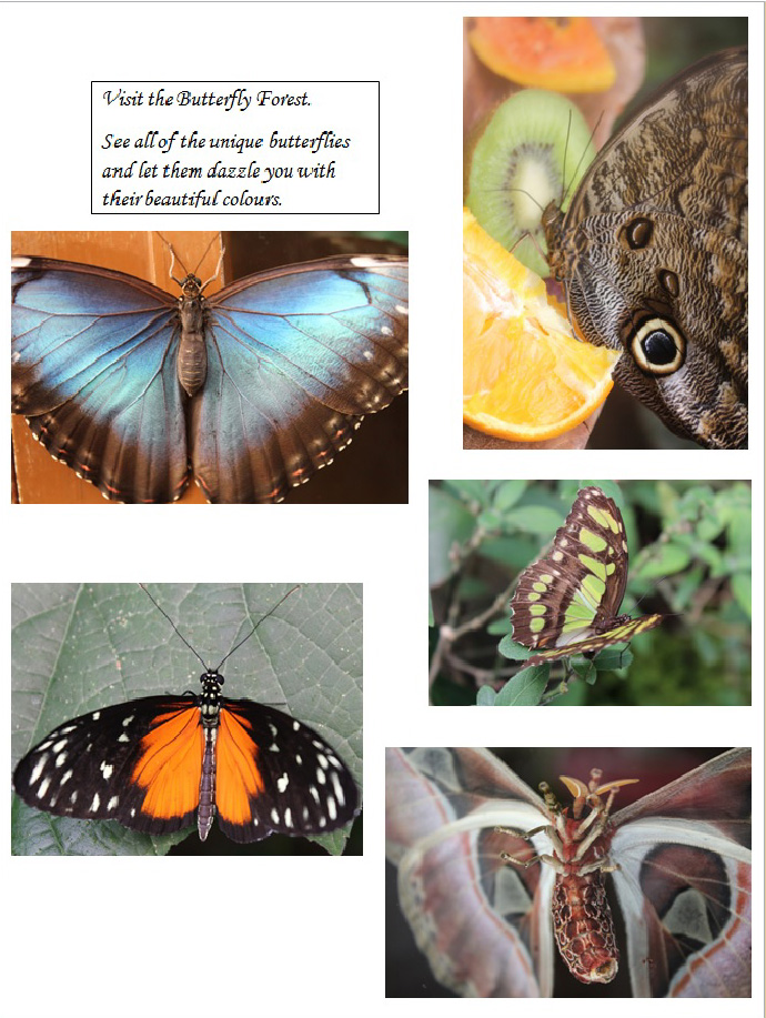
For the front cover, I wanted something unique and something which would stand out amongst any other image. The butterfly house at the zoo is beautiful. Full of amazing colourful butterflies, of all shapes, sizes and colours. I spotted these two butterflies hiding amongst some trees, and no one seemed to spot them apart from me. I found it great as the tree they were perched on would create a diagonal line in the frame which is unusual and would draw the eye to the image. With the position of both butterflies, they have managed to create a balanced image.
Also with the help of the diagonal line, it looks as though, if you were to fold the image in half, the butterflies would be sat the same.
These butterflies work perfectly on the ‘Front Cover’ as they have a unique ‘Eye’ on their wings. They are almost looking out at you! I wasn’t worried that I didn’t use a bold, colourful butterfly for the front cover, to draw in your attention, as that would have been one of my easier of options to chose from. I wanted something original. I am also pleased that the colours in this image are very natural colours, Browns and Greens. This works great with showing the butterflies in their ‘Natural’ surrounding and not the ‘Captive’ Surroundings that the photographers I have researched, have used.
I decided to use this image because I wanted to capture the butterflies in their natural surrounding. Many butterflies were feeding on the heaps of juicy colourful fruit that the zoo keepers had hung in the trees, or had laid on tables for them. It was amazing that you could get extremely close to these butterflies, and you could touch them whilst they were eating or flying around.
With this image, I wanted to incorporate the butterfly, feeding on the colourful fruit.
I wanted to add one more butterfly into this, mainly because the blue butterflies are my favourite. The colours on this butterfly are amazing and very bold. I was very lucky to have been able to touch it. I wanted to fill the frame with this butterfly as I wanted the bold colours to fill the frame, and to have the attention on the butterfly only.
With this image, I remembered my tutor saying “…showing some of the animals movement with longer exposures”
I am pleased that I managed to capture the Pelican just about to flap his wings.
This is one of my favourite images. I was lucky to photograph this as the lion enclosure was very busy and you could hardly get close to see the lions. I decided to stand away from everyone and wait to see if the cubs would walk near by. I was really lucky that this cheeky little cub decided to come and have a look at me with my camera, as I was stood on my own. It just shows, that waiting for the perfect photograph pays off. My tutor commented saying “In the square shot of the lion peering through the doorway there is a sense of perspective and depth as well as giving the lion a feeling of trepidation and character.” I couldn’t agree more. This little guys character really shows in this image. He was very inquisitive.

These photographs of the Meerkat’s were hard to take and took a lot of patience and different shutter speeds, in order to take a photograph of them as they were extremely fast. Like with the lions, I stood away from every one else, as the viewing gallery was full of people. I stood in the corner and waited to catch the right shot. I spotted the lonesome meerkat digging a hole by himself. He kept looking around to make sure no one was watching him or would disturb him. I managed to photograph him just as he was looking around. Another aspect which is great, is that I am able to show them in a natural habitat environment, with no fences etc.
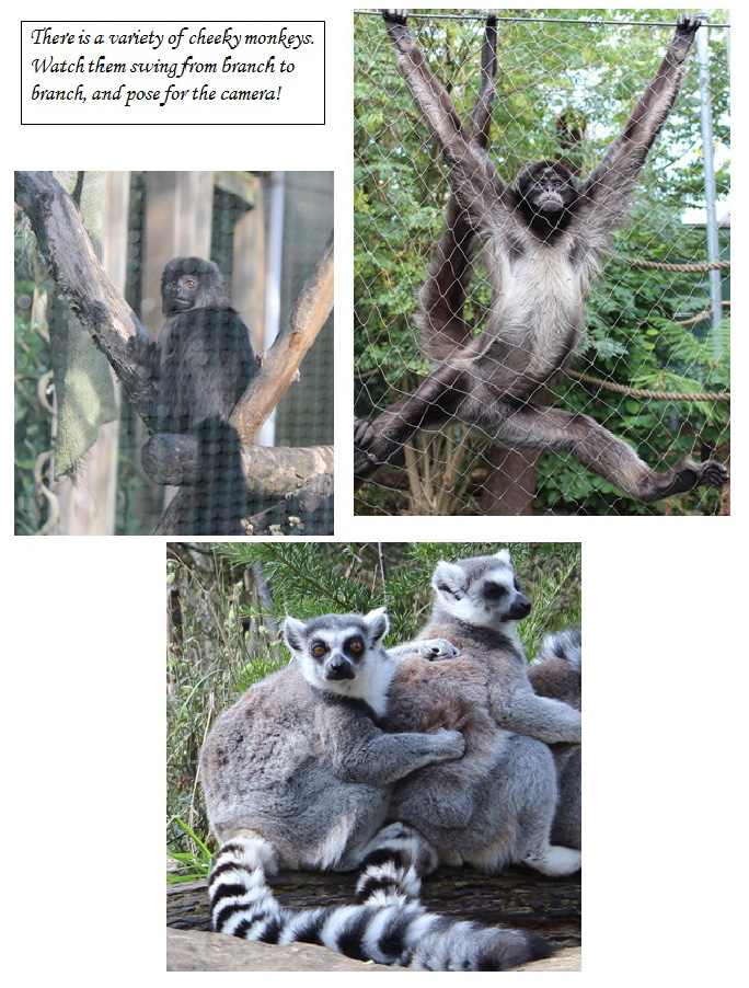
These ring tailed lemurs were sat hugging each other looking at people who would walk into and around their enclosure. It was almost as though they too were observing us, observing them. I zoomed into the Lemur sat on the end of the hugging line, as he was staring straight at me, right into the lens.
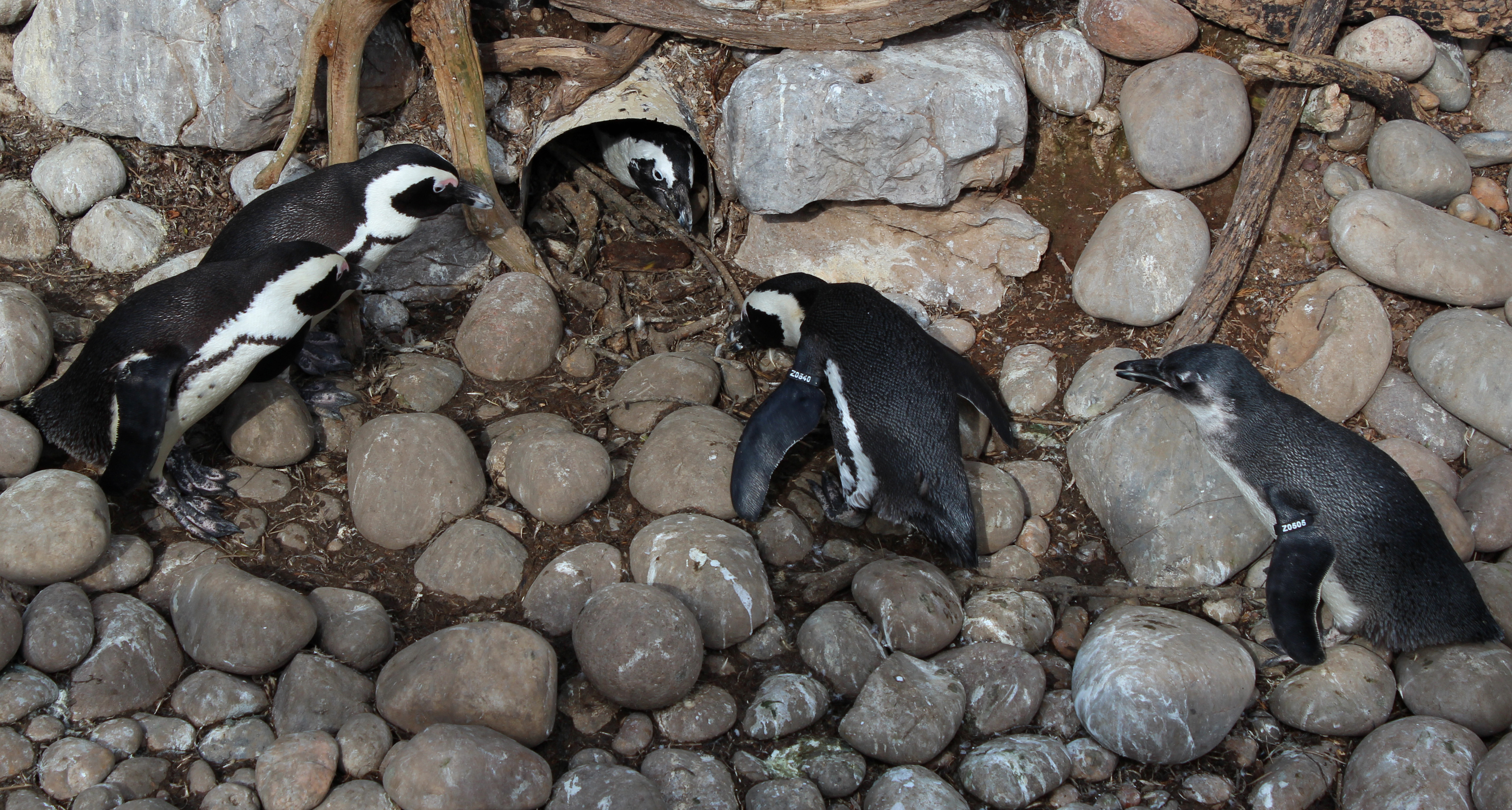
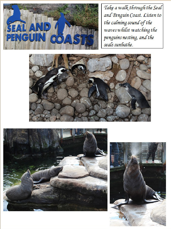
With the penguin’s I stood watching them for ages. They were fascinating. It must have been mating season because there were couples of penguins nesting. I watched this group of penguins and I must say, they are very cheeky. I was really happy with how this image has turned out, as it practically shows the story of what was happening at the time. The poor penguin was sat in his nest, whilst the pair on the right hand side were stealing bits of twig from his nest, and taking it back to theirs. The penguins on the left hand side were stood watching. I am please that I managed to capture the characteristics of these animals. It has created a great image.

For this image, I decided to focus on the reptiles face as this reptile was happy posing in front of the camera. The composition of the image works well as he has created an almost diagonal line through the frame, making him more prominent. I managed to take this photograph through the glass, by putting my camera up against the glass itself, in order to stop any reflection, and thankfully it worked very well. It looks as though there is no glass divider between us.
The giant tortoise are Bristol zoo’s more famous animals and are well known. I wanted to photograph them up close to capture their facial expressions. Even though this was taken through glass, the same as the previous image of the reptile, I used the same technique by putting my camera against the glass, in order to stop any reflection or glare, and thankfully it worked. I was able to zoom in close to the faces. As with the Lemurs, these tortoise seemed to be observing us whilst we were observing them.

The final image I chose was of the Tapir’s. They were not outside in their ‘Natural’ habitat, however, they were in the warm cosy bed they have. This is one of my favourites mainly because it shows the characteristics of the animals. I love the fact that one of them is smiling at the camera. This Tapir was smiling from the moment I walked over with my camera. It was really funny, as the others were sound asleep dreaming, yet this cheeky fellow was more focused on smiling at the camera. Rather than looking at depressed animals behind glass, this image shows them enjoying their environment. They feel safe enough to sleep and even smile.
Overall Opinion:
After taking into consideration, my tutor’s feedback, and researching into the photographers who use their photography to portray zoo’s or captive animals in a ‘Bad’ way, I completely understood why my tutor advised me to re think some of my images. She advised me to use my personal touch, and focus on facial expressions of animals or certain characteristics of the animals, in order to create more friendly and fun images of the animals, rather than keeping those which showed them perhaps behind glass or with fences in the frame.
Some images didn’t need changing, as I believe I managed to capture very expressive and welcoming photographs.
Taking the narrative comments away and cutting down on the amount of photographs I have used has definitely helped more. Viewing the photographs larger definitely helps a lot more, as I can see that the photographs speak for themselves, which is what I wanted.
I wanted to achieve a collection of images which showed Bristol zoo at its best, and showed the variety of animals there are too see, and to see them in their ‘Natural’ environment, even if it is in a zoo enclosure. I didn’t want to portray any depressed or sad animals, like Jaschinski or Winogrand do, I wanted to show happy animals, and I am pleased with my final choices and final results.