I now have a separate blog which I will be using for my Digital Photographic Practice set of work.
Below is the link which will take you to my new blog.
I now have a separate blog which I will be using for my Digital Photographic Practice set of work.
Below is the link which will take you to my new blog.
I received my tutor’s feedback for my fifth and final assignment for this first year.
I have posted her feedback below, and anything that needed changing has also been posted below.
Overall Comments
Thank you for your final assignment. It has been a pleasure to advise you on all of your assignments for the Art of Photography and would like to wish you luck with your future photographic pursuits.
Feedback on Assignment:
In this final assignment you imagined you were illustrating a story for a magazine. You had to illustrate a cover and several pages inside. This assignment brings together everything that you have learned on the course.
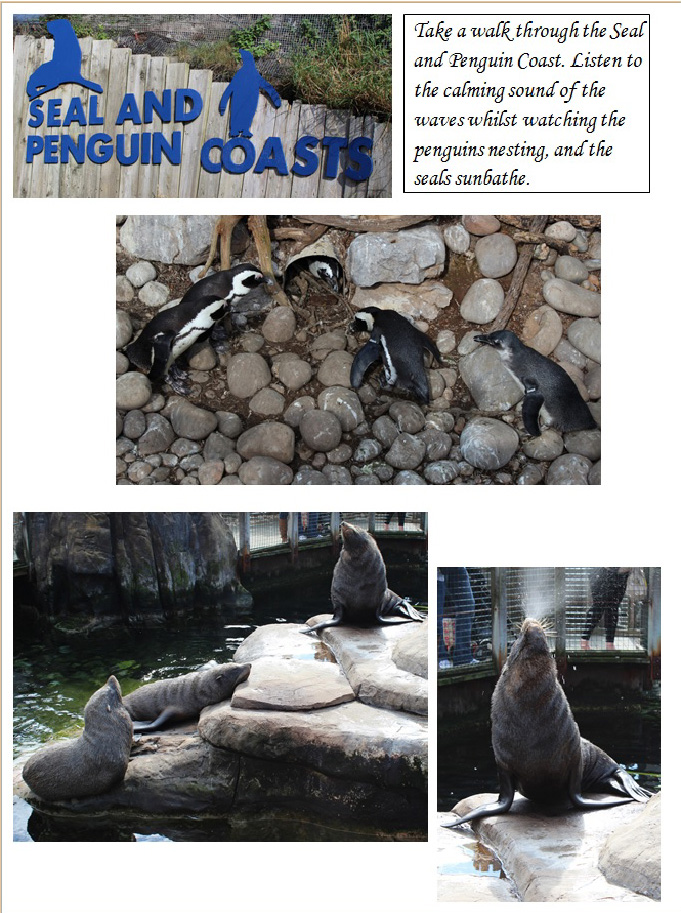
I think that you have chosen a great subject in Bristol Zoo, you might be interest in the work of Britta Jaschinski “ZOO” where she took monochrome images within zoos but challenge the celebratory image of the zoo that the organization would want to put across, showing an oppressive place with animals shown very much as in captivity, perhaps with more of a political slant than the images you have produced.
Also of interest is this blog post on the OCA site, http://www.weareoca.com/photography/tweet/ , Gary Winogrand’s Zoo and Michel Vanden Eeckhoudt’s work to see how other people have put their own slant on the zoo.
The first thing I notice Chantelle, is that you have twice as many images as suggested by the brief. Part of the work of a photographer is to select the best images to meet a brief so I would suggest that when you send of this work to be moderated it would be a stronger body of work if you went through this selection process to choose the twelve strongest images. Some, for example are duplicates of the same or similar animals, are each of these images telling you something new or could you chose the strongest one?
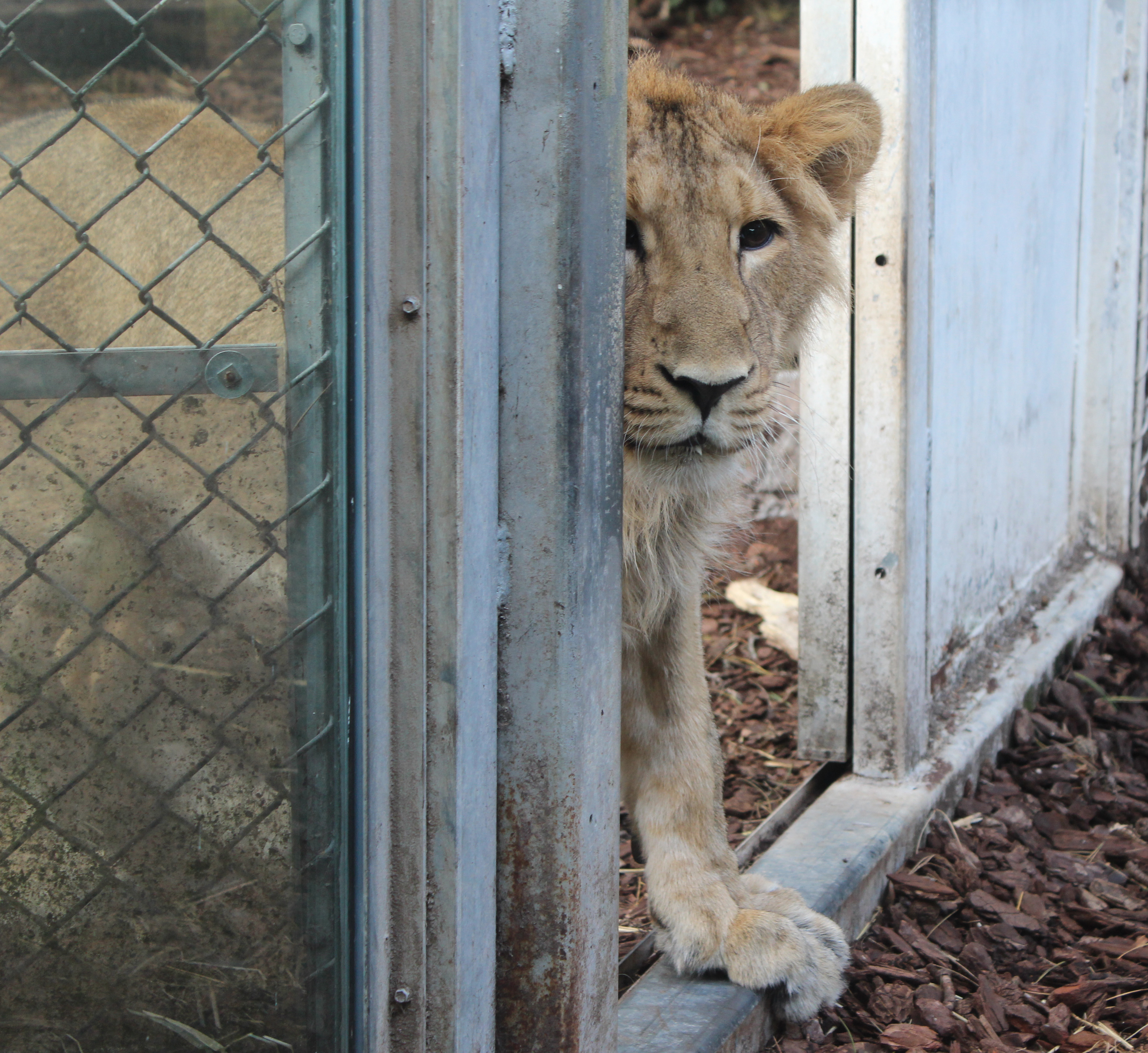
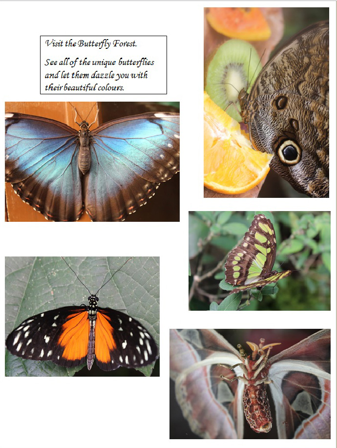
I think that you have shown adequate technical and visual skills with this assignment. You have produced correctly exposed images in what can be very dark environments, which shows good control of the camera. Using shallow depth of field in some images to isolate the subject matter against the background. I think in some of your images you have shown good compositional skills, for example in the cover image of the butterflies where it is well balanced using the rule of thirds. In the square shot of the lion peering through the doorway there is a sense of perspective and depth as well as giving the lion a feeling of trepidation and character. Other images feel a little central in their composition but you have filled the frame in most, which is good.
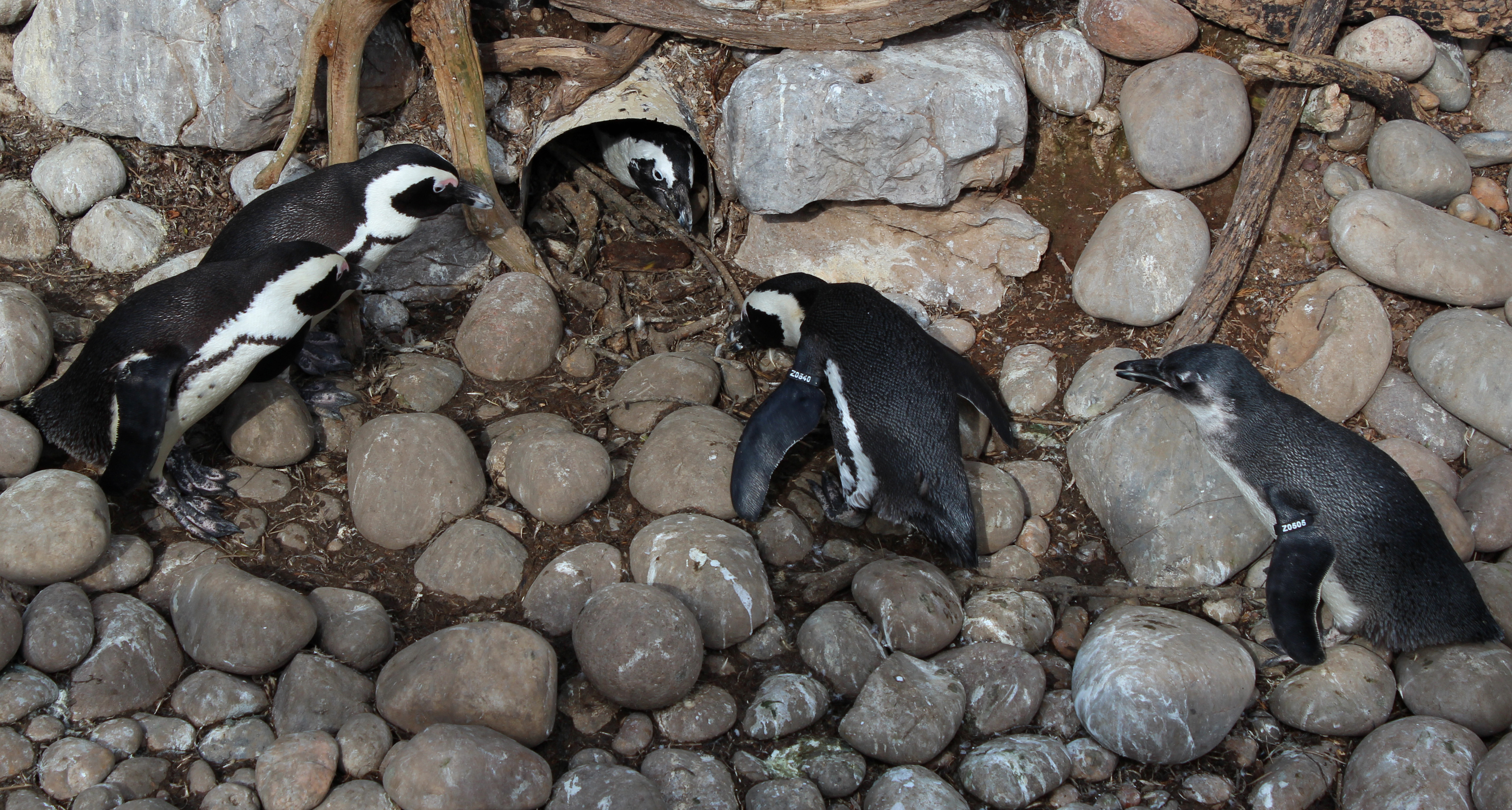
You have adequately realised your ideas in this project and presented your work well. You show the zoo in some images as a place to visit to see these particular animals but I feel some images look a little more snapshot in appearance as they include the wires of the cages which you wouldn’t usually see in images to promote a place, zoos battle against this view that people have of animals in cages and focus more on the conservation side of things. It is more likely to see these sort of images in a more challenging work on zoos. For promotional work showing the positive side of zoos I would expect to see more images of animals looking like they are in their natural environment, for example the meerkat, bird and reptile images.
I think that this work shows some creativity, although it would be good to see more of your personal style in the images, this might have been going in even closer to focus on particular expressions of the animals or characteristics, it might have been making very colourful images of the animals, it might have been showing some of the animals movement with longer exposures or maybe different viewpoints, animal eye view etc. You have begun to do this in the image of one meerkat where you are more at it’s eye level and it is filling the frame, the composition here also works as the meerkat is looking into the empty space.
An example of showing your personal voice or response to a subject is in Jaschinski’s work, this is work which could only have been made by her with her view of zoos, she shows sadness, focuses on marks on glass created by bored animals, close up facial expressions etc.
I think I wouldn’t worry about making page layouts for the work, concentrate on getting 12 really strong images for submission.
Learning Logs or Blogs/Critical essays Context
I think that the learning log is looking good, you have some evidence of self-reflection and research. You have been looking at the work of other photographers and have a good range of photographers working with narrative in your log. I would like to see more analysis and discussion of images produced, perhaps you could work more on the photographers I have mentioned above.
It would be good to see more self-reflection though, what you intended the image to be about or show, what you did, whether you achieved your intentions, anything you would change, reshoots of the image etc.
You mentioned adding narrative captions, narrative in imagery isn’t the same thing as describing a story with captions. I suggest you think about this further – maybe look at the book Context and Narrative.
I took my tutors feedback, and I decided to look into, and research the photographers she had suggested, to see if I could gain some inspiration from their work, in order to help me re-do my final choice images for this last assignment.
I began by researching into Britta Jaschinski.
Britta Jaschinski:

Jaschinski is a world-renowned, award-winning, Germany photographer. Her animal and nature photography has won her a dedicated and strong international following. During the 1990’s, Jaschinski set about documenting the sad world of captive animals in zoos. She is a member of CAPS, which stands for Captive Animals’ Protection Society. She quotes:
“We talk to animals but we don’t listen to them. We stroke them with one hand and beat them with the other. CAPS gives animals a voice and fights for their rights. Animals don’t need us but we need them. We must protect them from ourselves.” Britta Jaschinski.
The dark, sad and heart breaking photographs of animals in concrete compounds, gained her instant recognition. Her ‘Zoo’ work was displayed in the Photographers Gallery in London in 1996 and an accompanying book which depicted 75 haunting black and white images of captive animals, was then published.


In this final assignment, you were asked to imagine that you are about to illustrate a story for a magazine. You have a cover to illustrate, and several pages inside, create between 6-12 images. Even though there are no text, you should write captions for each image.
The cover photograph will need some of the techniques of illustration that you have been experimenting with throughout the course. This picture essay needs to be more of a narrative. This means that, as you will be using several photographs to illustrate the main body of the story, you will have the opportunity to spread the load of the story telling among them.
Any theme which has a narrative element could be a suitable subject for this project. There are some suggestions we have provided, however, you can develop your own idea, or adapt the choices we have given you.
Overall Opinion:
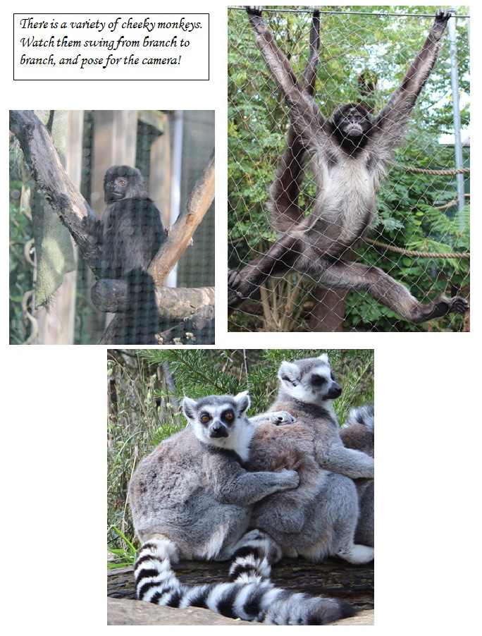
I was offered to go to Bristol Zoo for the day, and I knew that this would be a perfect chance for me to photograph all of the animals, in order for me to create a short ‘Magazine’ on Bristol zoo animals, and what tourists or visitors will see whilst they are there. I took nearly 350 photographs that day, and I had to choose a handful for this small ‘Magazine’. They needed to be bold, strong images which would be able to tell a story or narrative by themselves, without too much writing or comments underneath. I chose more photographs than originally suggested above, however, I am extremely happy with how it has turned out. I wasn’t sure at first how I was going to approach this assignment, however, going to the zoo, and seeing the quirky, cheeky animals, definitely secured my decision that this was what I wanted to focus on and make a short narrative of. I approached this short narrative as though I was creating a small brochure almost, for visitors or tourists to view. I wanted enough, but not too many photographs, in order to show the different animals, but not ALL of the animals, other wise there would be no point going to the zoo. I wanted it to grab the attention of who ever would be reading it, and make them interested in visiting the zoo. I added small, short narrative comments along the way, describing what they would see etc. I am really pleased with how it has turned out, and I don’t think there is anything I would change. Below is the finished product.
Front Cover:
Page One:
Page Two:

Page Three:
Page Four:
Page Five:

Page Six:

Page Seven:

Page Eight:

Imagine a magazine cover on one subject; Rain. You have the entire cover space to work in. You should produce a single, strong, attractive photograph, that leaves no one in doubt about the subject.
Below are some guidelines:

I decided to convert it to Black and White to see if it would have a more dramatic look, and I am happy with the result.

For this exercise, choose either a still life approach, or a larger scale shot. If you choose to do a still life shot, take any book you like, and make a suitable cover illustration using two or three relevant elements.
I decided to research what Juxtaposition meant. Juxtaposition is to put side by side: to place two or more things together, especially in order to suggest a link between them or emphasize the contrast between them.
I decided to choose two of my favourite novels rather than just one. I chose The Great Gatsby by F. Scott Fitzgerald and The Kite Runner by Khaled Hosseini.
The Great Gatsby:
The Great Gatsby: Gatsby is a 1925 novel written by American author F.Scott Fitzgerald. The Great Gatsby explores themes of decadence, Idealism, Social Upheaval, Excess and creates a portrait of the Jazz age, and the American Dream in the 20’s.
This is the cover I have on my copy of the novel: It portrays one of Gatsby’s extreme parties.

For my novel cover, I decided to go with the still life approach. I chose some objects which I thought would be suitable in portraying the Gatsby themes. Its all about, diamonds, glamour, cars, pearls, the eyes of Dr.TJ Eckleburg and the breakdown of relationships. My objects are obviously more modern than items which would have been on a cover in the 20’s, however, I chose objects that sum up the novel, or would be recognisable to someone who has read the novel beforehand. I think the photograph has come out really well.
The Great Gatsby ( My Cover )

The Kite Runner:
The Kite Runner is a novel written by Afghan-American author Khaled Hosseini. It is based in Afghanistan, and tells the story of a young boy Amir, and his Hazara Servant Hassan. There are themes of Guilt, Redemption, Violence, War, Taliban and Love. The kite is very symbolic and it travels throughout the novel symbolising guilt, loyalty, redemption and lots more. Instead of a still life set up for my interpretation of the cover, I decided to make a silhouette. I wanted a simple cover, yet I wanted something powerful and striking, so that if you were to walk past a book store and see this on a novel, you would stop and look. I chose simple white paper for the cut out, and a plain black background. I photoshoped the white paper and made it more whiter so it would be bold, and stand out more.
This is the cover I have on the novel.
I got my influence from the DVD cover I have of the film.

The Kite Runner ( My Cover )
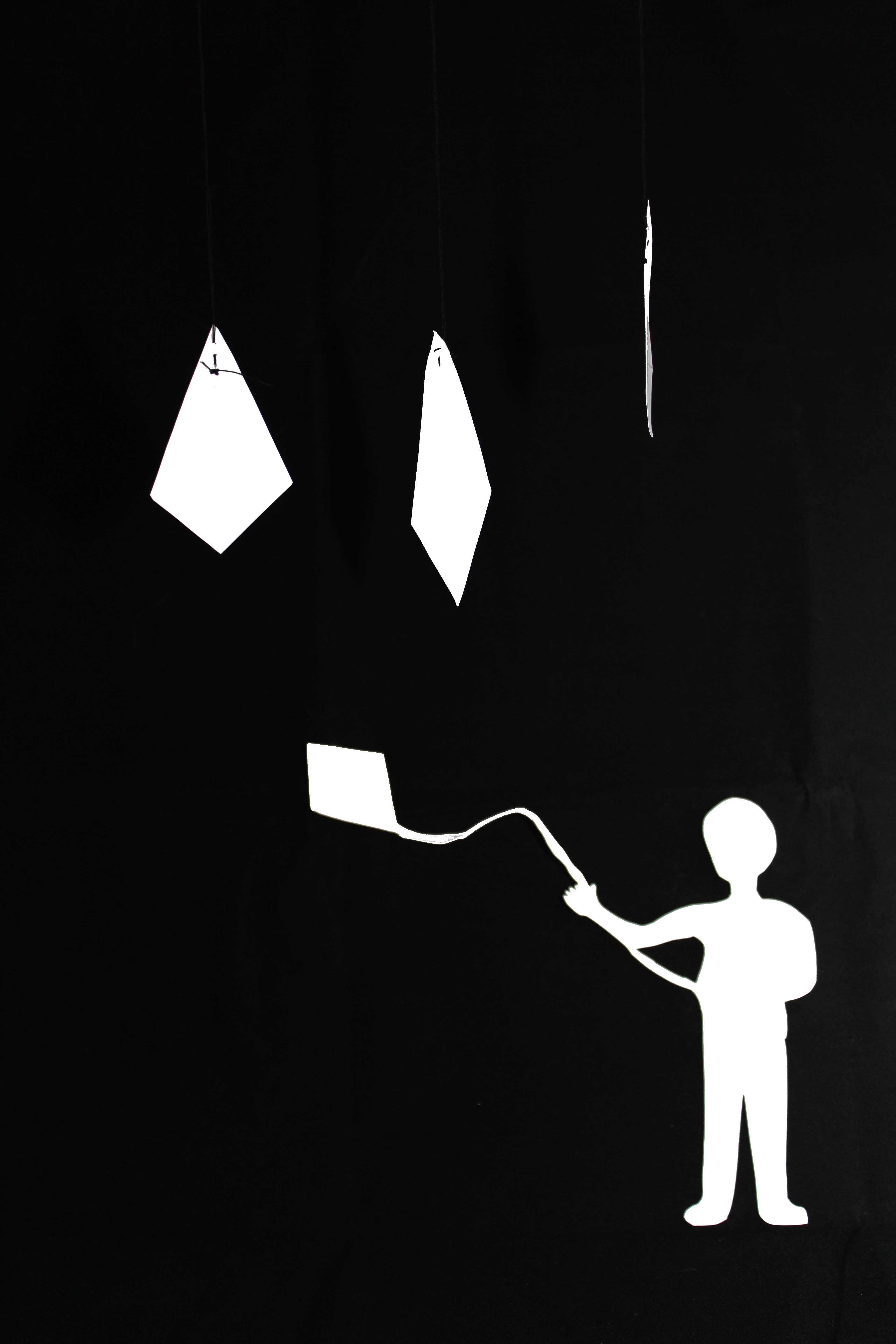
Original (Without Photoshop)

The most obvious symbols, those that spring to mind first, are often so well used, that they are hackneyed. However, it is often possible to overcome the most well worn symbol by treating it in an original or interesting way.
The idea of this exercise, is to find symbols for a number of concepts. Complete it by listing more than one symbol for each of the following subjects, and add a short note saying how you might use them in a photograph. You do not need to take any photographs for this.
The subjects are:
Growth
Plants, Seeds, Children, Hair, Nails, Ruler, Measuring tape, Companies
Excess
Food, Body weight, Alcohol, Skin, Hair,
Crime
Knives, Hoodies, Guns, Burglar, Broken objects, Graves, Police
Silence
Sadness, Tears, Crying, Empty rooms, Books, Library, Mediation, Church, Prayer, Gliding
Poverty
Homeless, Starving, Unclean, Hunger, Death, Sadness
For this exercise, you were asked to produce one photograph in which it can be seen that something has happened. As a suggestion, included in the photograph something that has either been broken, or emptied.
For this, I looked again at the work of Gregory Crewdson, and Jeff Wall.
Gregory Crewdson

Jeff Wall (The destroyed room 1978)

With both of these images, they show a ‘mess’ and items which are ‘broken’. Taking influence from these images, I decided to photograph a cupcake which had been half eaten but made to look ‘broken’ or ‘torn apart’ .
I decided to use a spot lamp with a diffuser for this image, as I wanted a strong yellow colour from the icing, but I didn’t want the photograph itself to be too exposed.

This project requires you to set yourself an assignment and then photograph it. Based on what you have learnt so far, tell a story of any kind, in a set of pictures. It could be something as simple as preparing some food.
Keep in mind that ultimately the success of your narrative will depend on how interesting, attractive and varied your photographs are.
The way you lay out the final selection of photographs is very important.
Before I began this exercise, I decided to study several photographers, who use narrative within their photography.
Jeff Wall:
Wall is a well known Canadian photographer and artist , who has been in the art scene since the early 1970s. I researched his work in the Tate Modern. Wall is well known for his large scale colour transparencies, mounted in wall-hung light boxes. Wall describes his work as being ‘typified by two approaches, which he characterises as either cinematographic or documentary’.
When you first view Wall’s images, they appear to be ‘Snap shots’ and taken at the ‘Right moment’, however, they have all been composed meticulously down to the fine detail, and many of his photographs have needed crew and staging crew in order for him to create his final pieces. They are all narrative images, and they all have some story behind them, some more obvious than others.
Jeff Wall ( Card Players, 2006 )

Gregory Crewdson:
Crewdson is a well known American photographer. He is known for his elaborately staged scenes of American homes and Families. His photographs are very macabre, dramatic, and sometimes feature surreal events or ‘disturbing’ scenes. His work is somewhat similar to Jeff Wall, as he too uses a large crew to help stage the scene before he begins shooting. However, Crewdson’s work is more cinematic than Wall’s. Every photograph has a narrative and tells a story.
Gregory Crewdson (Sunday Roast)

Richard Billingham:
Billingham is an English photographer and artist, who is well known for his photo book ‘Ray’s A Laugh’ which documents the story of his alcoholic father, and ‘obese, heavily tattooed mother’, living in poverty and deprivation. Which Billingham himself grew up in. Unlike Wall and Crewdson’s work, Billingham’s photographs were taken as snap shots, and were not staged. His images were taken using the cheapest 35mm film he could find, thus producing old fashioned, bold, brash coloured, and bad focus images. However, this series of narrative pictures are authentic, and we as the audience are able to be part of his story just by viewing the series of images. His work is very truthful, and we are able to see his parents true personalities.
Ray’s A Laugh (Photo book – 1996)


Exercise:
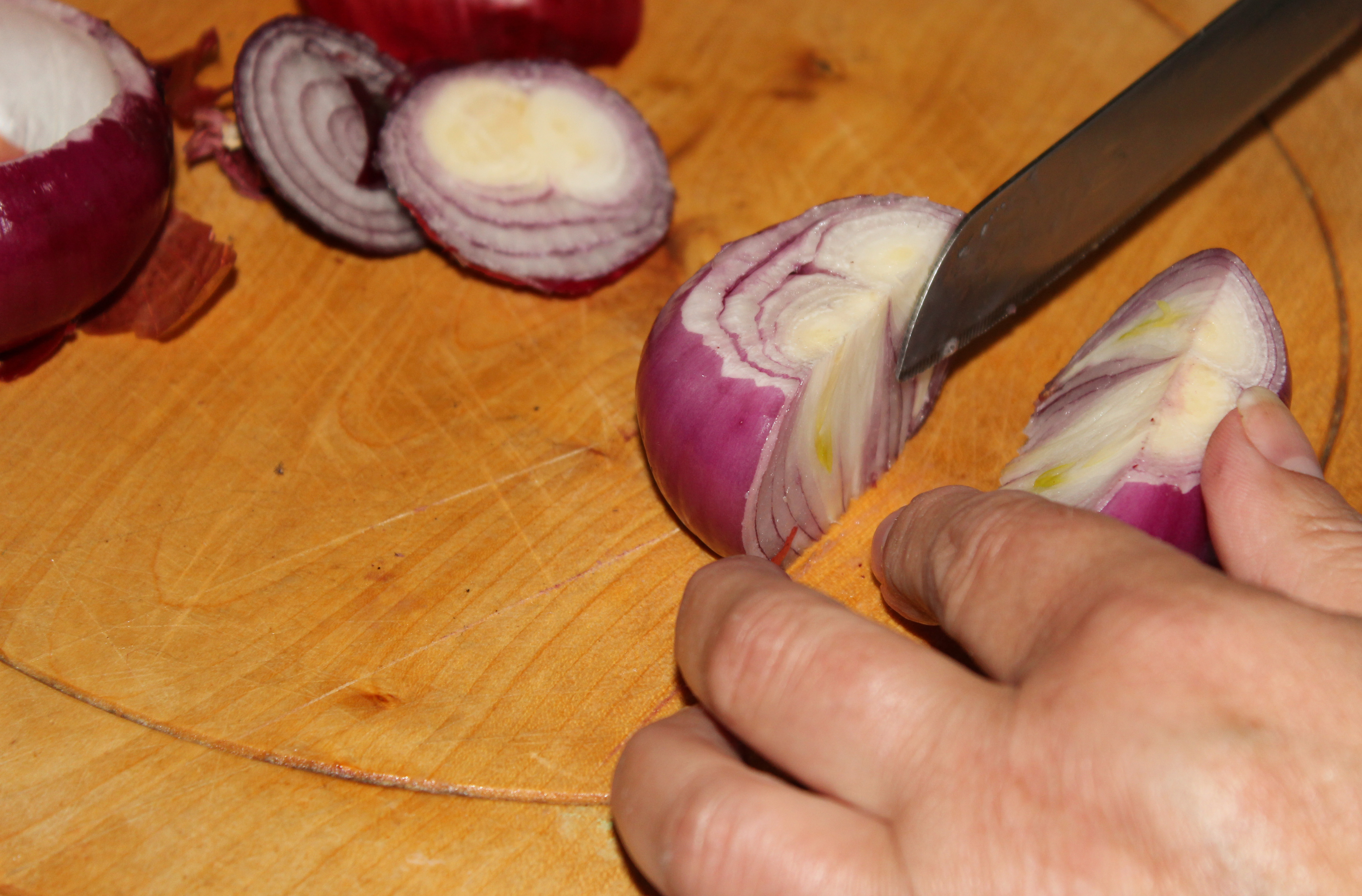
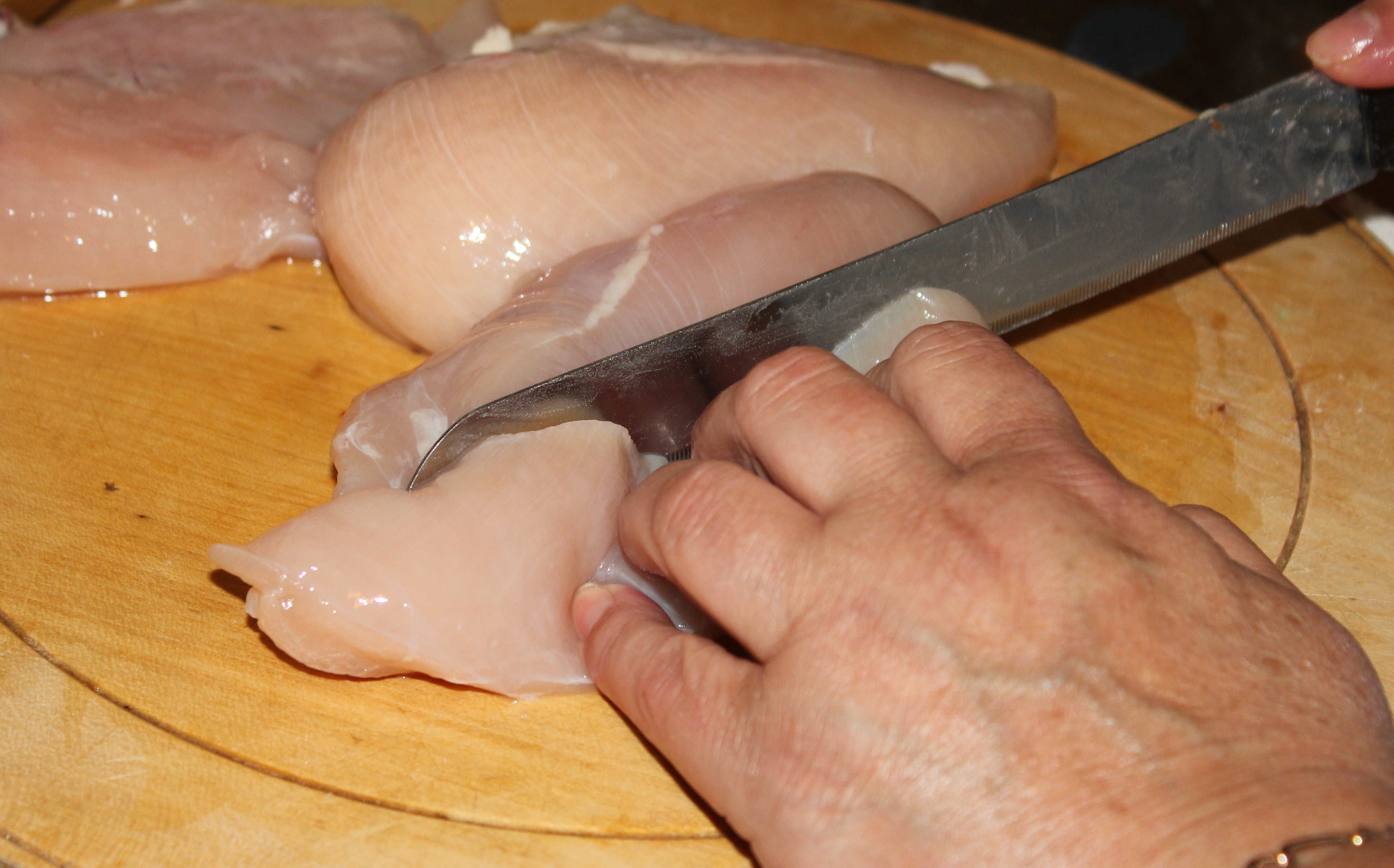
For this exercise, I decided to create a narrative picture essay of cooking dinner. My Mother gladly offered to let me photograph her whilst she prepared the food. Some of these images have been cropped and enhance using Photoshop Elements 9.
1: Heating the pan, let the butter melt.

2: Time to peel the potatoes

3: Chop, Chop

4: Add some water, so they can boil.

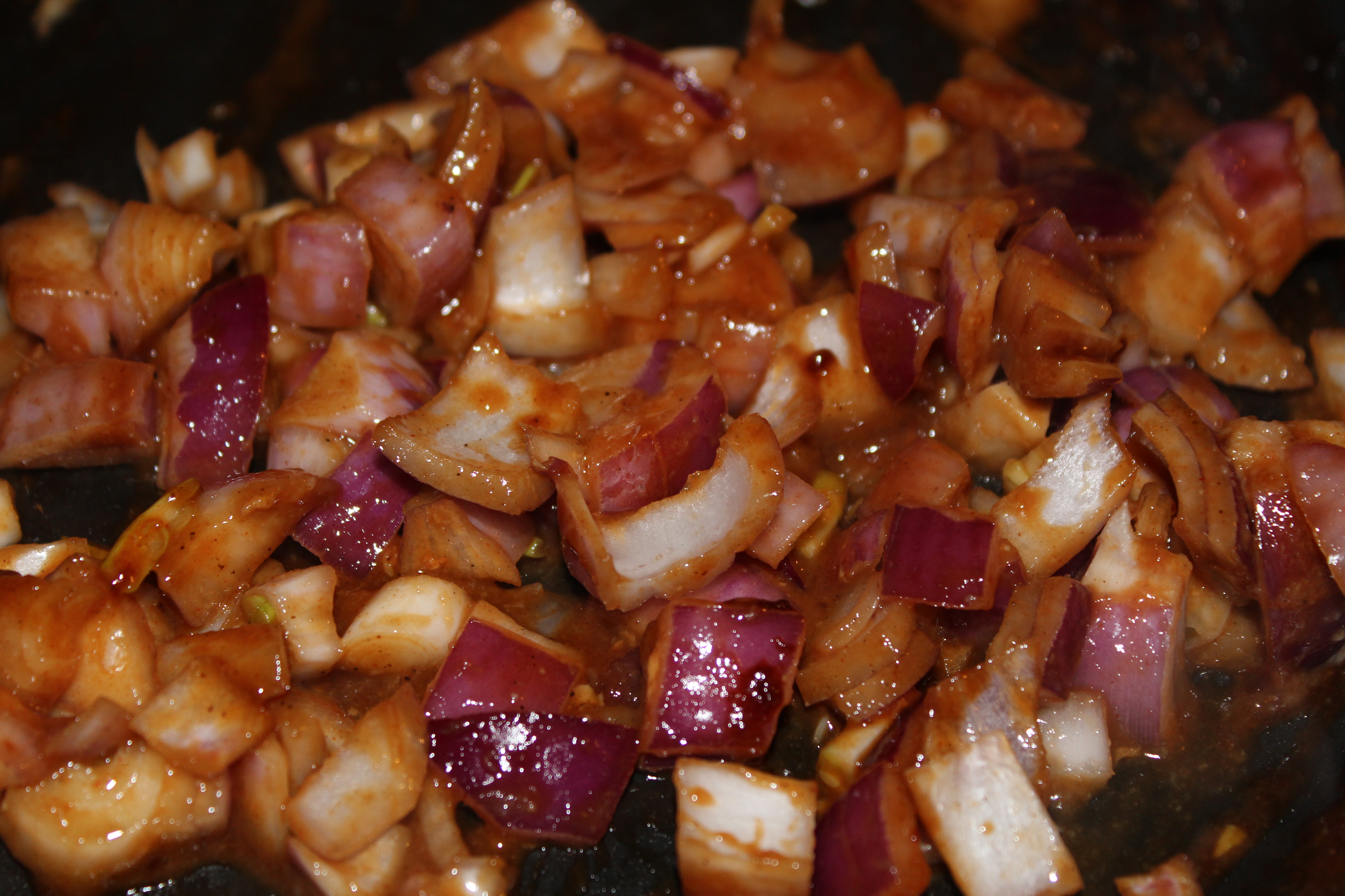
5: Chopping the onions, time for the tears.
6: Onions are ready for frying.

7: Time to open the sweet corn.

8: Washing the Chicken.

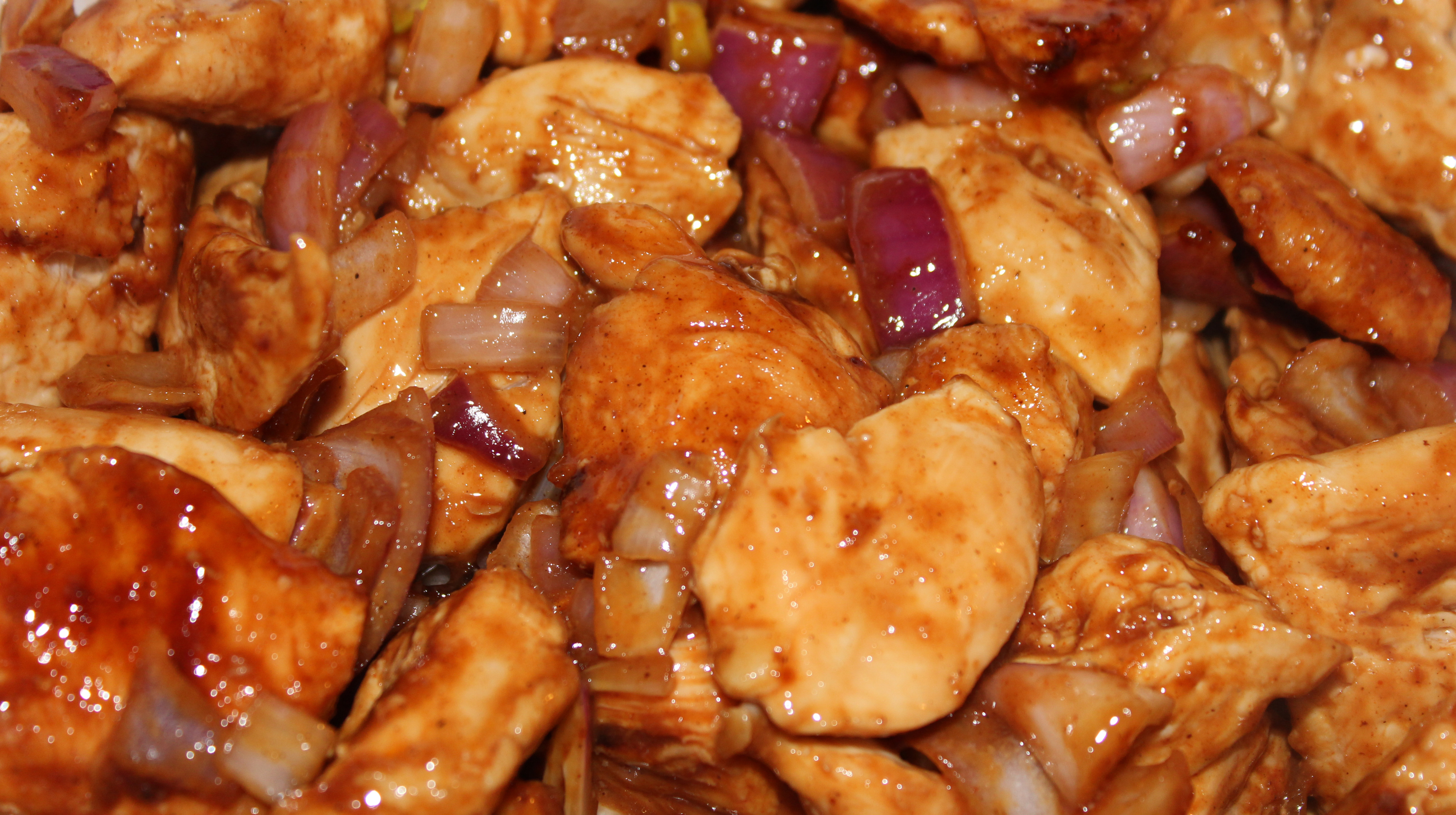
9: Cutting the chicken.
10: Mmmm, Barbecue powder…

11: Mix the chicken into the powder

12: The pan is ready for the chicken.

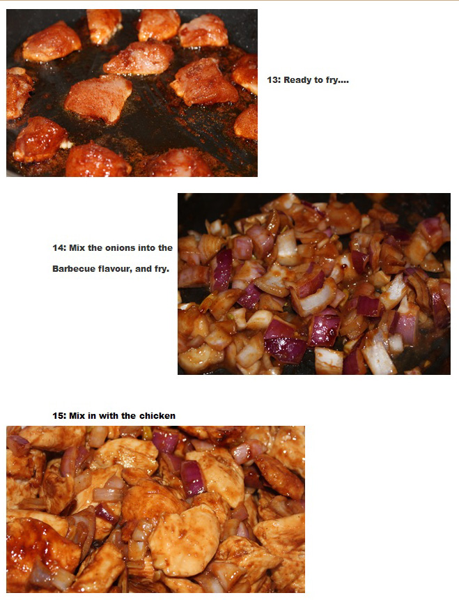
13: Ready to fry….

14: Mix the onions into the barbecue flavour, and fry.
15: Mix in with the chicken.
16: Served, and ready to eat!
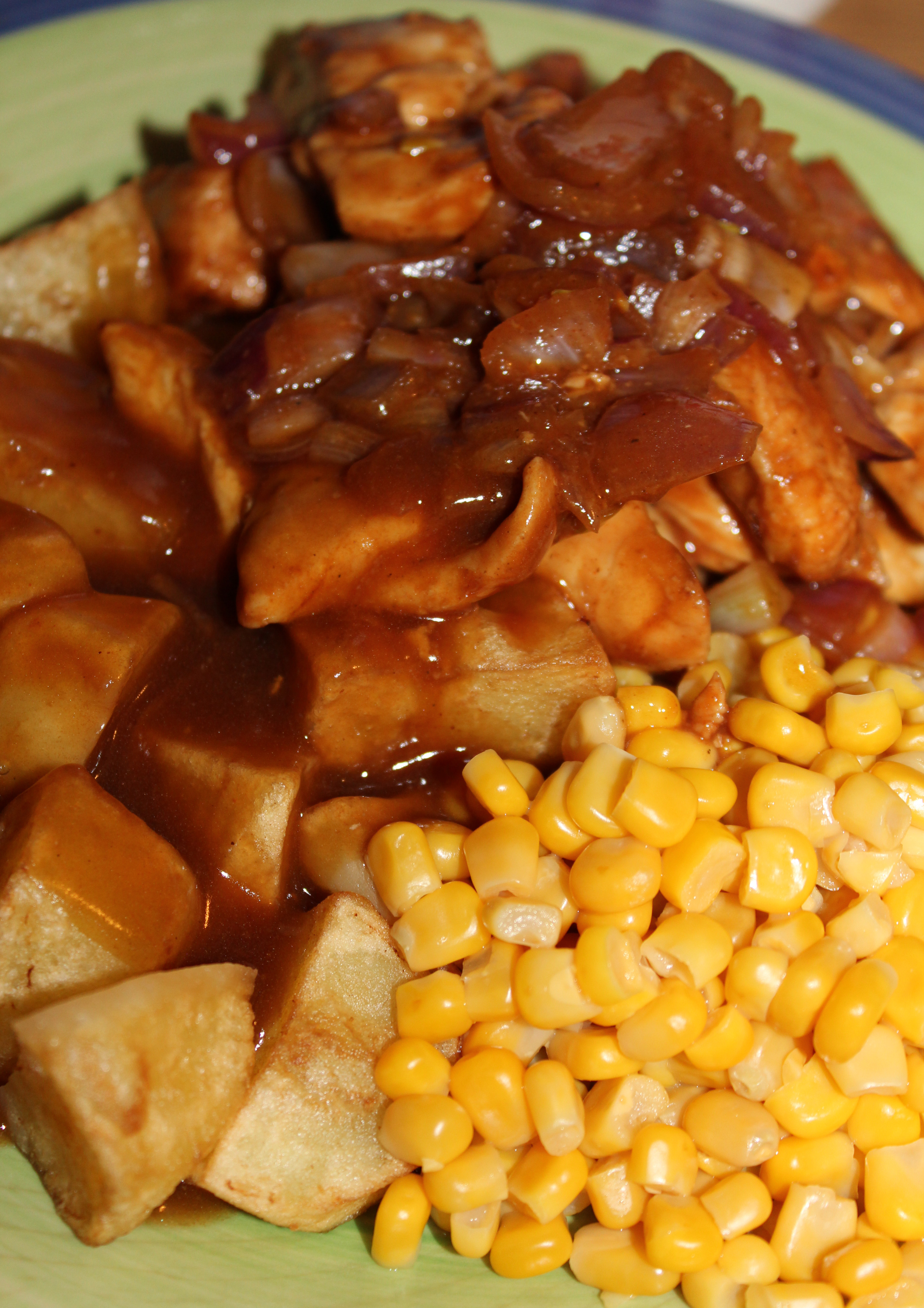
17: Too much! Eyes were bigger than my belly…..

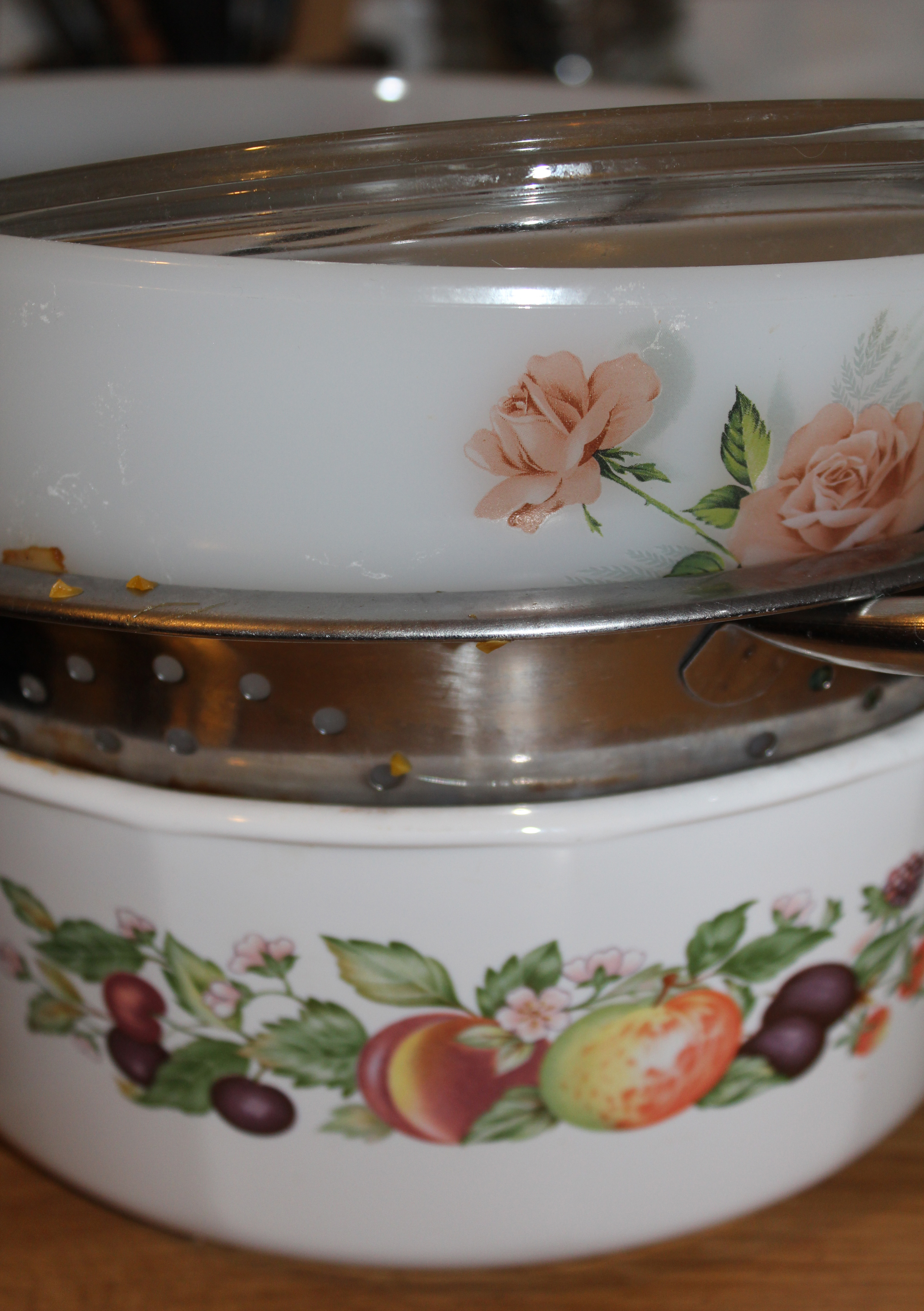
18: Washing up is ready……
After this exercise, you then had to lay your final photographs out in order on a piece of paper, and see how they would look. The way you lay out the final selection of photographs is very important. You have to decide if some of them should be small or larger than the others, In order to create a better narrative effect.
I decided to lay mine out on a word document and then took a screen shot in order to post my final lay out on here.
1.

2.

3.

4.

5.
6.

7.

In photography, a narrative is the way of telling a story through a set of pictures. On the whole, this is usually easier than the alternative of trying to sum up a story in one single photograph.
A set of photographs like this is called a Picture Essay. They can contain anything from 3 or 4 photograph or in some cases, a dozen or more.
Before I started the narrative project, I decided to research more into picture essays, photojournalism and narrative photography so I could gain some more knowledge of what was needed of my photographs.
Photojournalism:
Photojournalism is a form of journalism which uses images and photographs in order to tell a news story, for publication or broadcast. It is now usually understood to refer only to still images, but in some cases the term also refers to video used in broadcast journalism.
The one rule in photojournalism is that the work is both honest and impartial, whilst telling the story in strictly journalistic terms.
Photojournalism is a form of narrative photography, and I suppose in some cases, can be picture essays especially if used in magazines etc as you can use more than one image, making it a picture essay and not just one photograph which sums up the story.
I found a powerful photograph by Samuel Aranda who won the 2011 World Press Photo of the Year. Even though this isn’t a picture essay, this image is extremely powerful and tells a story (Narrative).

‘Narrative photography is the idea that photographs can be used to tell a story’ Wikipedia.
Duane Michals : An American photographer who uses photography to create interesting, and unusual photo sequences and narratives. He worked mostly around themes, investigating; love, emotion, philosophy, life and
death. He also used text to strengthen the narrative.
Duane Michals work on the other hand, uses more than one photograph, which makes it a picture essay (Narrative essay).
Paradise Regained 1968


In this project, we will look at photography not just as the skills you need to produce good images, but in terms of what you can do with it. Many photographers pay more attention to the graphic content than to the subject matter.
The larger part of photography however, is directed towards its subject, whatever that may be. A news photograph, for example, generally stands out or falls on how successfully it informs us about a person or an event, and this tends to outweigh any master of, for example, colour or composition.
Example: The Royal Wedding. News Photograph. This photographs informs us on the event, yet, the composition of the people within the image is not the best, it is still a photograph which informs.

Of course, however important the subject of a photograph is, the image will always be improved if it is skilfully handled.
For this small project, and in order for you to gain some kind of perspective, scour any of your own photographs or that of others. Choose two photographs.
The first photograph must show the subject, but it must have little importance within the image, and the image making skills, such as colour, lighting or composition, must be the paramount focus of the image.
The second photograph should be the opposite. The subject needs to be the main focus in the image, and the image making skills, must be less important such as the example above of the royal wedding.
Photograph One: Subject of less importance:


Photograph Two: Subject with strong importance:


