This third assignment was created to show off the knowledge you have learnt about colour in photography. You should be able to find and use different colours in deliberate relationships.
For this assignment, you should be able to identify at least two kinds of colour relationships.
- Complementary Colours: Colours that face each other across the colour wheel
- Similar Colours: Those colours that are near to each other. Cool and Warm colours.
- Contrasting Colours / Eye Catching Colours (Not Harmonious): These types of colours are when the combination has a strong contrast such as Blue and Red, or Green and Orange. Usually they should clash with each other, however, when used right, they may not be harmonious, but they will defiantly be eye-catching.
- Large and Small Colour: When a small amount of colour sits against a much large amount of colour. This can accentuate the smaller or larger colour depending on where they are placed.
Assignment Three:
You were given a list of colour relationships that you were asked to find and photograph.
- Colour Harmony through Complementary Colours
- Colour Harmony through Similar Colours
- Colour Contrast through Contrasting Colours
- Colour accent using any of the above.
You were advised to vary the subject matter such as Still life and Found situations (eg.People, Houses etc)
With arranged photographs, you will have the advantage of being able to choose objects and settings that have the exact colours you are looking for.
With uncontrolled situations, this will be more difficult. It will demand a more careful observation. You will have to make use of lighting conditions and filters to help create the colours, but not in every photograph.
To accompany the photograph, you will make notes about the ways in which colour works in each photograph. You will also have to make a sketch for each to show the balance and movement of the colour.
Before I began taking photographs, I decided to do some research on Google, to find some examples.
Colour harmony through complementary colours:
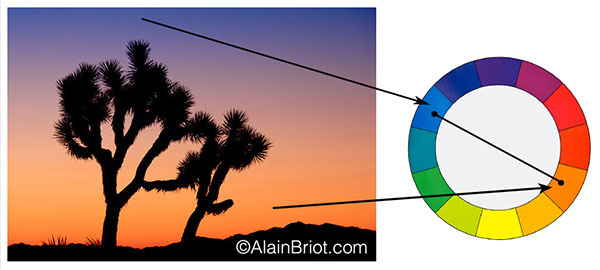

My Images:
Colour harmony through complementary colours:
Red-Green:
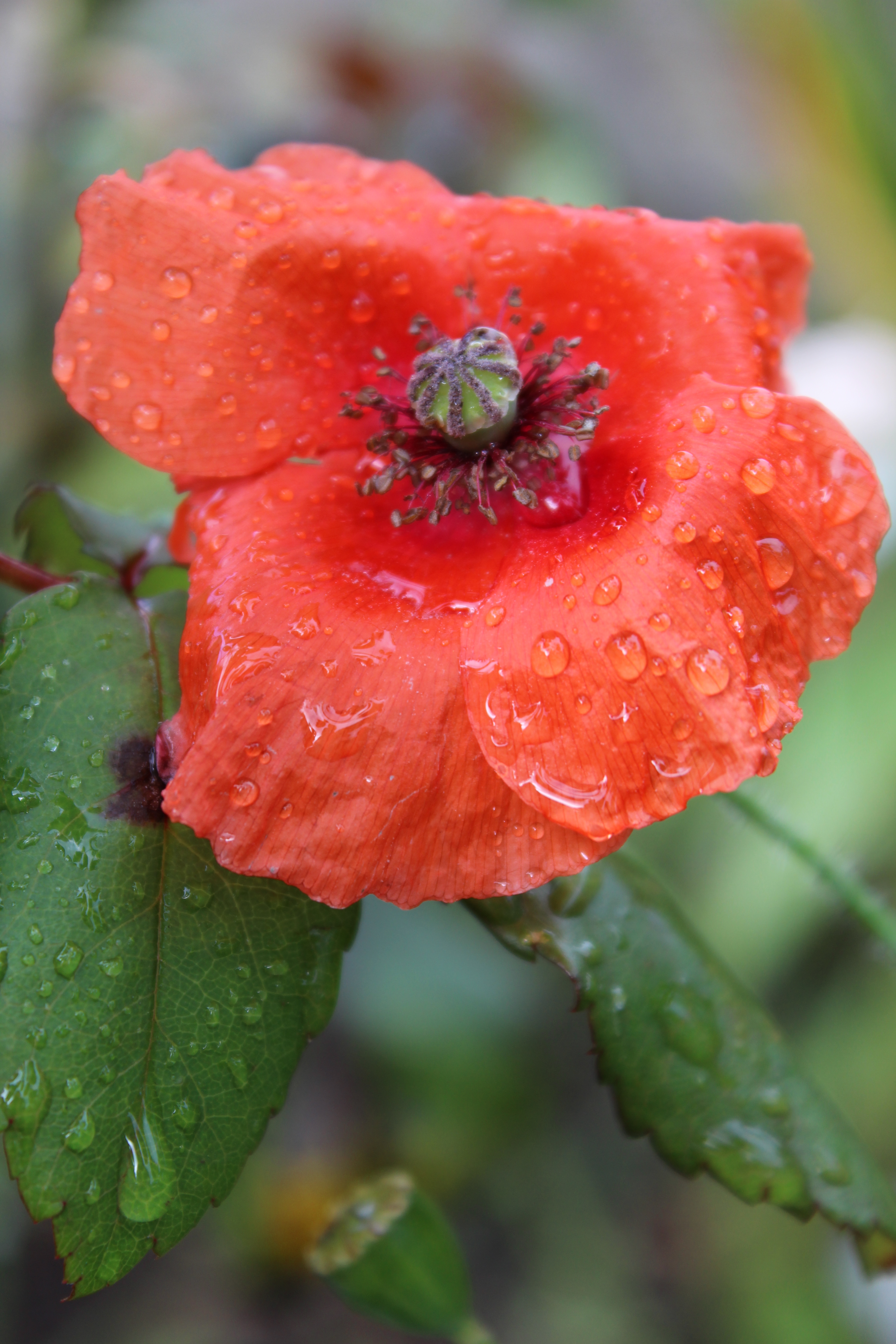
I spotted this poppy whilst visiting a friend, in her garden. It had just stopped raining so the flowers were dripping with water. Amongst the green leaves from her rose plants, I spotted this bright, bold, Red poppy. I focused in on the poppy whilst keeping as much green from the leaves in the frame as possible, to balance the red colour out, but trying not to include the other plants behind it. This colour relationship work really well. The Red is bold, strong and really stands out against the Green leaves. Even though there is more Red, the Green balances the image out because it doesn’t make the red too harsh which it would have been if there was no Green from the leaves.
Yellow-Blue:

On the beach in Weston, they have these brightly coloured triangular signs stuck in the middle of the beach. I used this object for the ‘Triangle’ exercise in the last set of projects, however, I had taken more photographs of it, and I knew that this would be perfect for the Yellow and Blue colour relationship. This is another colour relationship that works well together. The Blue from the sky, hugs the bright Yellow sign. It pushes your view to the sign whilst surrounding it in a lovely Blue colour which doesn’t make the Yellow sign so bright and bold.
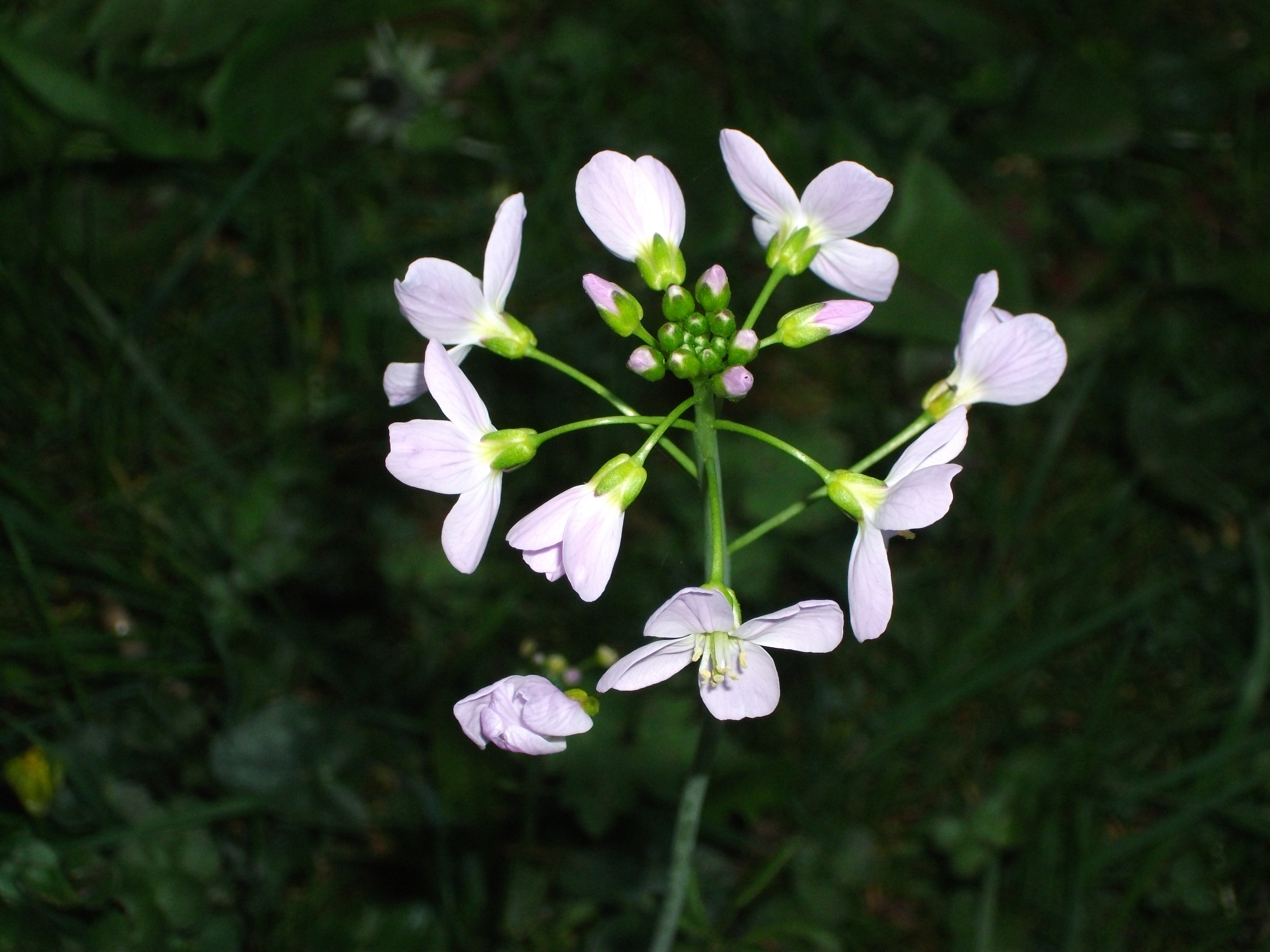
Violet-Green:

I found this lovely flower in my Nan’s garden in Wales. The sun was shining (For once), and I was able to capture this lovely violet-coloured flower amongst the green leaves from other plants. I positioned myself between what I think was a ‘Fern’ plant, it had a lot of green leaves, so I managed to capture the green leaves in the front of the frame (Foreground), in order to give the photograph the feeling that the violet flower was being surrounded by the green leaves. I believe this colour relationship works well. I find it very calming. The light Violet colour against the green is very bold, just like the Red poppy against the Green leaves, However it’s not as strong as the red colour. It’s still a powerful colour against the green, however, its balanced. I think the placement of the flower, just off centre, towards the bottom of the frame and the framing of the Green leaves around it, also helps with the colour balance.
Blue-Orange:

My garden has a very large tree which blows in the wind all the time. Thankfully the sun has been shining quite a few days, so I was able to photograph the tree with all of the dead leaves on, until it began dropping them. The dead leaves were all kinds of Brown, Yellow and Orange colours, however, in the sunlight, it became a more burnt orange colour. As the sun was shining, it meant the sky was bright Blue, which enabled me to photograph the Orange-Blue colour relationship. I think the colours work well together. I would have liked the tree to have been a bit brighter with sunlight as this would have made the colours of the leaves more bold and more Orange.
Colour Harmony through Similar Colours:
Red-Orange-Yellow:

Whilst staying with a friend in Weston, the sunset over the beach was beautiful. I took this photograph as it shows the warm Red colour, a bold bright Yellow sun, and the warm Orange which surrounds it. These colours are all very similar as they sit next to each other in the colour wheel, so having them all in one photograph, works really well. The bold Yellow circular sun, almost central in the centre of the frame, balances the Orange and Red colours behind it.
Violet-Blue:
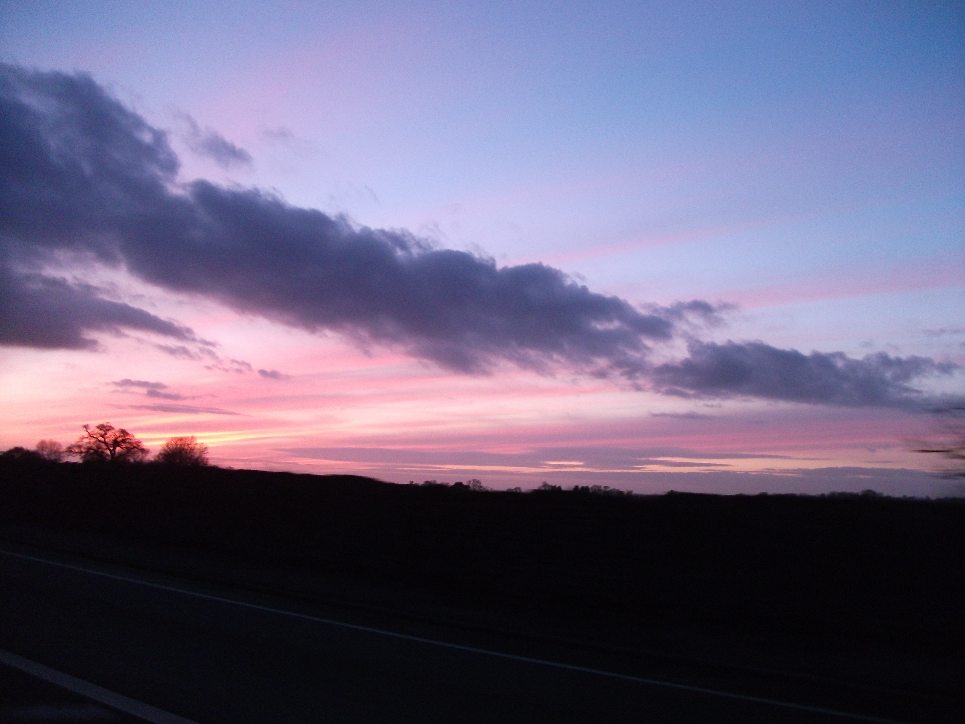
I was a passenger in a car when I noticed the sky was this beautiful mixture of colours. I took my small digital camera out of my bag and took photographs of it as we moved. This photo here shows the cool blend of the colour Violet and Blue. They are very similar colours and the dark and light tones of the colours here in this photograph work really well together. I like how the cloud formation almost cuts the two colours in half, yet the clouds are a dark Violet colour themselves.
Green-Blue:

In my living room, I have these pale Green and Blue curtains. They have a mixture of light and dark Green’s and Blue’s. I focused in as close as I could to the curtains, trying to fill the frame with the colours. I pulled the curtains across in order to let the sunlight shine through the material. This made the pale Green stand out more against the darker Blue colours. These two colours work well together. The colours give the photo a ‘cool’ temperature.
Green-Blue:

Whilst at my Nan’s house in Wales, we thankfully had a beautiful sunny day. The sky was a bright Blue colour, and the grass was a strong bright Green. I stood at the bottom of the garden and framed the image so that the green trees at the bottom became a strong line of Green almost central in the frame. It would then split the Green grass and the Blue sky.
Yellow-Orange:
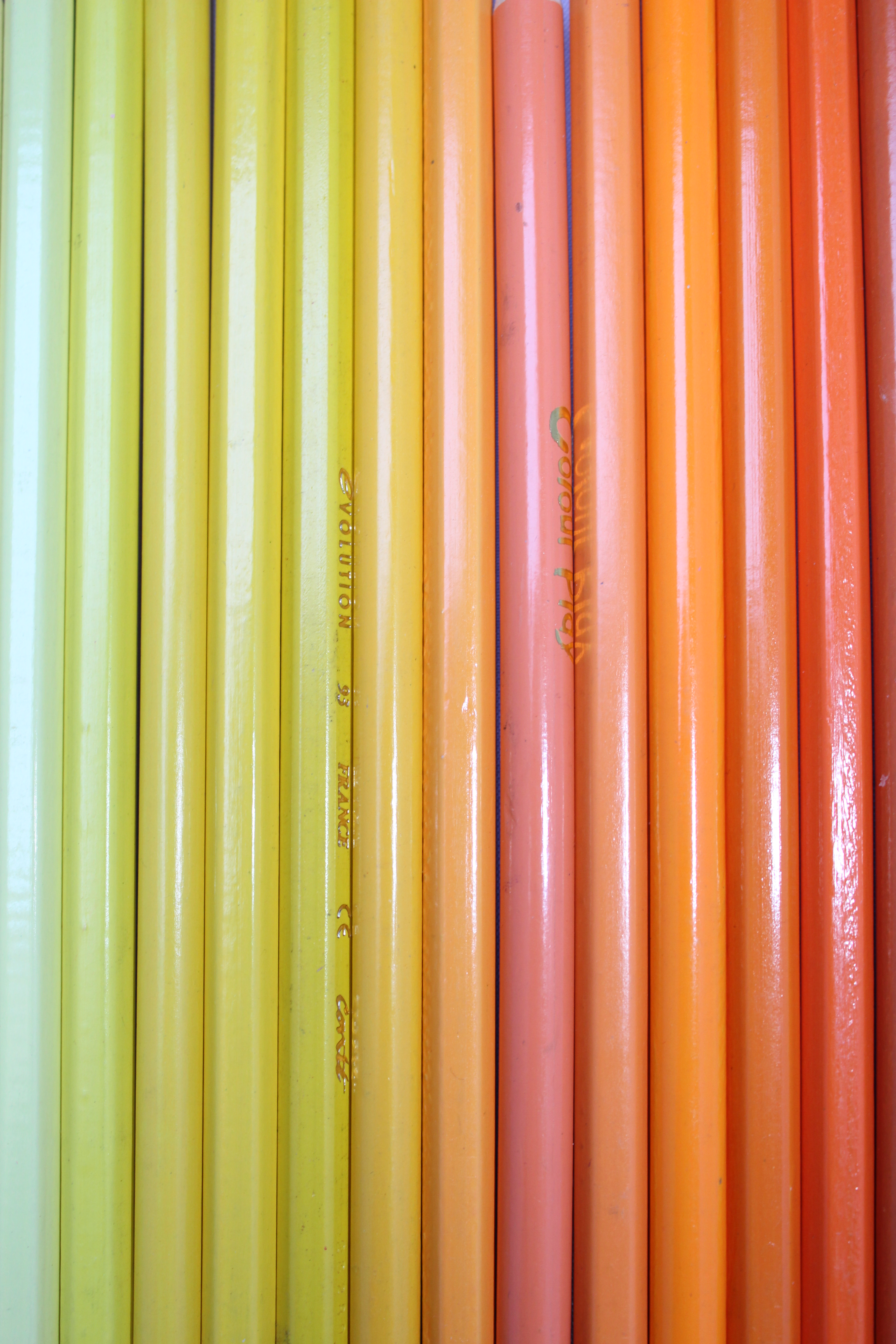
For Yellow and Orange, I wanted something other than a sunset. I decided to be creative and arrange a set of colouring pencils in colour order from pale Yellow to dark Orange. I focused in making sure I filled the frame. I decided to photograph the pencils vertically as I wanted a dominant photograph which made you look specifically at the two colours.
Colour Contrast through Contrasting Colours:
Red-Blue:

Red and Blue are both contrasting colours. I remembered I had a small union flag hanging around the house which I knew would be perfect for this. I focused in on the flag, making sure it filled the frame. I used a flash for this as I wanted to make the colours stand out more, especially the bright red against the dark blue background.
Red-Blue-Yellow:
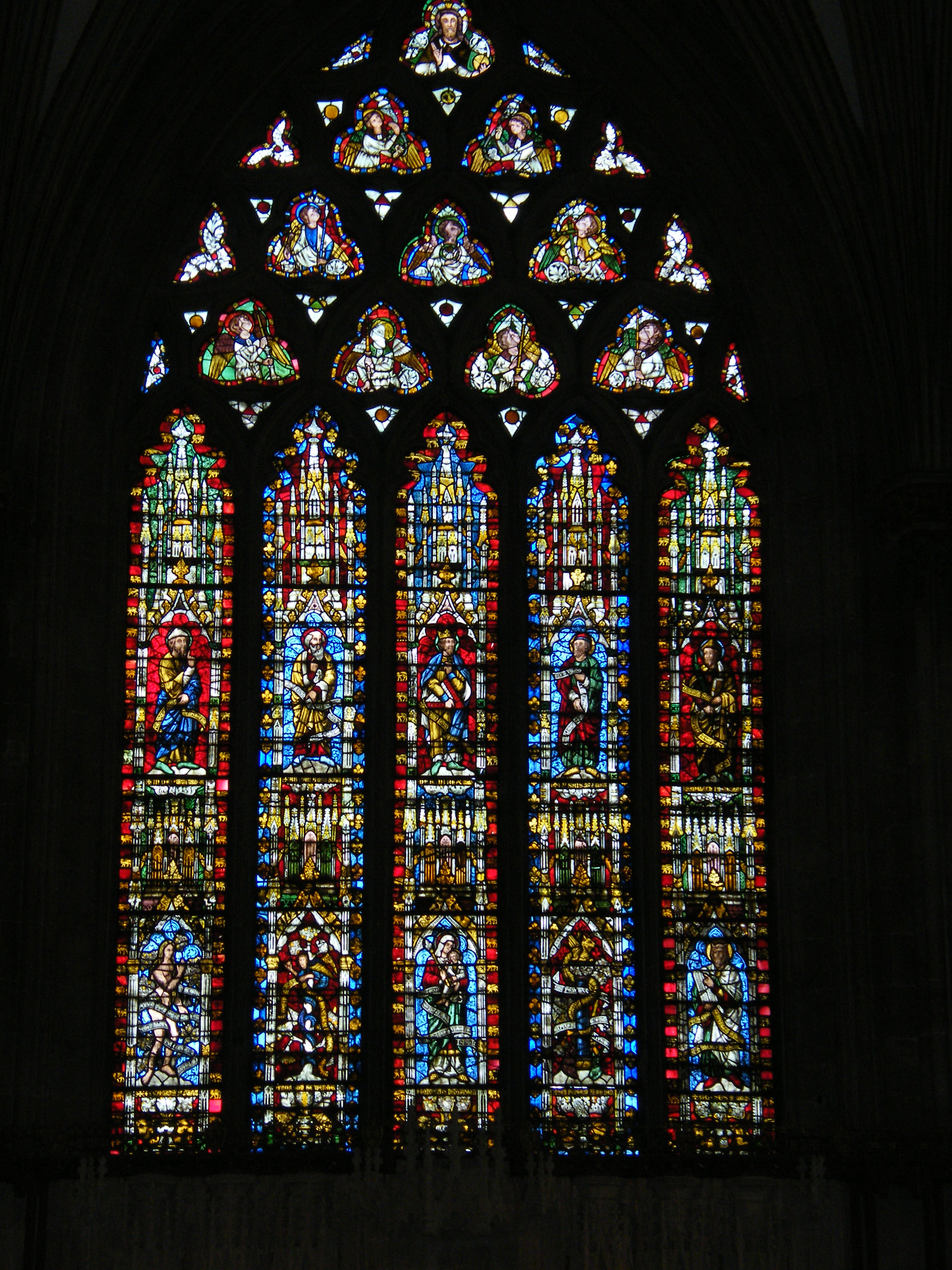
I visited Wells cathedral recently, and the stained glass windows are beautiful. The colours are so bold especially with the sunlight coming through them. I sat down and noticed that the window in front of me had Red, Blue and Yellow throughout it. I positioned the window in the centre of the frame and photographed it. Thankfully the sun was just about shining which made the colours stand out. As there was no lighting inside the cathedral, the rest of the photograph (Other than the window itself) was black. This draws your focus even more towards the colours in the window.
Yellow-Violet:

I have some different types of crystals which I knew would be great for this. Usually for contrasting colours, the two or more colours wouldn’t usually work well together, however, in certain circumstances, they can work really well together. As the crystals are not one particular strength of the colour, they are light or dark depending on how the light hits them, therefore, the Violet and Yellow colour work really well together. The colours aren’t to ‘harsh’ next to each other. They balance each other well.
Blue-Yellow:

This painting was more of an accident as it was not planned. I was planning on photographing two paint tubes for this colour contrast, however, I gave up and folded the piece of paper with the Yellow and Blue paint still inside. However, when I opened it back up, it had made a beautiful blurred pattern which looked like a butterfly almost. I was really impressed with how the colours look together, so I decided to photograph it closely in order to get the fine detail in the photograph.
Green-Orange:

I decided to choose to create a still life for this colour combination, as bright Orange clementine’s, and bright Green pear’s would be great to use. Fruit usually has bold colours to attract your view to them (If you were an animal) in order for you to eat them. I decided to use small clementine’s as they are usually an extremely bold Orange colour, and I decided to use a handful of pear’s because they have a lovely vibrant yet pale Green skin to them. I decided to use a lot of the clementine’s with only a few pear’s in order to balance the colouring. As contrasting colours, they wouldn’t usually work well together, however, I really like these colours together.
Colour Accent using any of the above:
Green-Yellow: Similar Colours

Green and Yellow are Similar colours as they sit next to each other on the colour wheel. I noticed a bright bold Yellow flower whilst out in a forest. I focused in on the flower, whilst keeping the leaves from the other flowers in the frame, to form the Green background. Making the accented colour Yellow against the Green background.
Red-Orange: Similar Colours

Finding this bright orange bucket in a friends garden, I realised it would be a colour accent against the red-painted building. I stood the bucket against the wall, and knelt down to be as close to the bucket as possible. It is a very bold colour and it really stands out against the dark red wall.
Violet-Green: Complementary Colours
These pretty dainty Violet coloured flowers are in my friends garden. I was visiting late in the early evening, but noticed that the colour combination of Violet and Green are complementary. As I already had an image for the complementary colour section, I decided to photograph these flowers for the accent section. I focused in on the flowers closely and framed them almost central as I wanted the attention on them. I used a flash for this image as it was late and I wanted to pick up the colours better. Therefore, using the flash enabled me to make the accented colour Violet, against the Green stem, buds and grass.
Blue-Orange: Complementary Colours

Whilst visiting a friend and sitting in her garden, I noticed an extremely bright blue handled spade and a bright orange bucket. It was leaning against her fence. I decided to lean the spade against a table and stand the orange bucket behind it. I focused in on the blue handle of the spade whilst blurring the orange bucket behind. I wanted the focus to be on the blue handle, yet keeping an orange background.
Violet-Yellow: Contrasting Colours

I wanted something different for this colour combination. I decided to use Violet glitter as I wanted something bold. Glitter is definitely eye-catching. I then used a Gold coloured glitter as I didn’t have Yellow, however, it is very close to a Yellow colour. I decided to use the Violet colour as the main, large circle as I knew that the Yellow would be more accented this way, rather than Yellow with a Violet circle in the middle. I then made a circle using the Yellow glitter in the centre of the Violet circle. I focused as close a possible in order to get as much detail as possible. I then only focused in on the Yellow circle, which then blurred the Violet glitter. This then enabled me to achieve the Yellow colour accent.
Overall Opinion:
During part three, I have really enjoyed the different exercises. Before I began the projects, I researched a lot into the different ‘colour photographers’ and types of colours such as Primary, Secondary, RGB and CMYK. I also looked into Hue, Saturation, Brightness. Doing this enabled me to understand exactly what would be required of me for the different exercises.
I enjoyed learning how over and under exposing your image can completely change the appearance of a colour. Sometimes this can be a good thing, as with the Primary and Secondary colour project, you can see how either the over or under exposure can be more similar to the objects colour than the average exposure image. This I found very interesting.
Learning about Colour relationships, and how the ratio of colours were very important within an image really helped me when composing the rest of my work for the projects afterwards.
With the Black and White tone project, I did have difficulty at first, however, I managed to achieve what I wanted as I was not letting it ‘beat’ me. I have included my thoughts on that project throughout my work.
Assignment Three:
For this assignment, I literally had to carry my camera around with me all the time, in order to capture colour at any time. Thankfully I did visit friends or family which live near lovely beaches or have larger gardens than I do, which gave me the opportunity to photograph colour combinations such as Blue and Green (Grass and Sky) or Beautiful sunsets (Red, Orange, Yellow). I was also able to photograph beautiful coloured sky (Cloud) formations on the way. For this assignment, you were allowed to use a mixture of still life and found situations. I did change my mind quite a lot for each colour combination as for some of them I wanted to use a still life for e.g. with the fruit for contrasting colours, but I also wanted to use as much ‘Found Situations’ as I could, as colour is something we have around us daily and combinations of colours are around us everywhere. However, I found it hard, mainly because, if I had a colour combination already, yet saw something else better, I would have to choose which photograph would work best for that colour combination. Therefore, it did take me a while to pick and choose and photograph as much colour as possible with as much variety as possible. I didn’t want too much still life and too much found situations. I wanted a balance. I also had to battle with the elements such as having No sun or Rain. This annoyed me as everything lost its vibrant colouring and the weather was horrible. Thankfully, we have had a few warm sunny mornings which enabled me to go out quickly and photograph as much as possible in the sunlight before it disappeared.
I am very pleased with how my final images have turned out even though it took me a while to pick, choose and decide on what would work well for each combination. I suppose if the weather picked itself up more, I could have chosen a lot of out doors found situations to use for more of the colour combinations, however, I did want to include some still life, so I am happy with how this has turned out overall.
I have learned a lot with each different project. I have learnt that different colours when mixed together, can give a photograph a different ‘feeling’ or ‘mood’. It can also give an image either a ‘warm’ or ‘cool’ feeling. Using your camera settings can also help change a colours appearance. These are definitely techniques I will remember for the future.
I will now await for my tutors response and post it on here. If there are any changes to be made, I will change them.


