Assignment One, Contrasts

For this assignment, you were to choose at least 8 pairs of contrasts from the list below.

This assignment is not contrast in a restricted, purely photographic sense. It is visual contrasts you had to look for. A lead weight may be heavy, but why does it look heavy. If it was painted pale yellow, would it still look heavy. How does this affect your response.

You had to choose at least eight pairs of contrasts from the list below. You were asked to note your thoughts along the way.

Image

After looking at the table of contrasts to choose from, I decided to note down the pairs that seemed interesting to me.

I decided to choose:

Large/Small

Sweet/Sour

Black/White

Smooth/Rough

Pointed/Blunt

Light/Heavy

Light/Dark

Many/Few

After noting them down, I then had to think of possible subjects or locations which would represent the contrast I was trying to show. I did a bit of research (not much) mainly on google. I just typed in eg. light photography, smooth photography but I realised I didn’t want to copy what other people’s interpretations are. I wanted to use my own interpretation of the contrast. I jotted down a handful of items or places I would use next to the contrast. Once done, I narrowed it down to one and began choosing how I would shoot the subject.

For this assignment, I used my tripod for some of the images. I also processed the final images on Google Picasa. I will add details under each photograph.

Final Results:

Large/Small

Large:

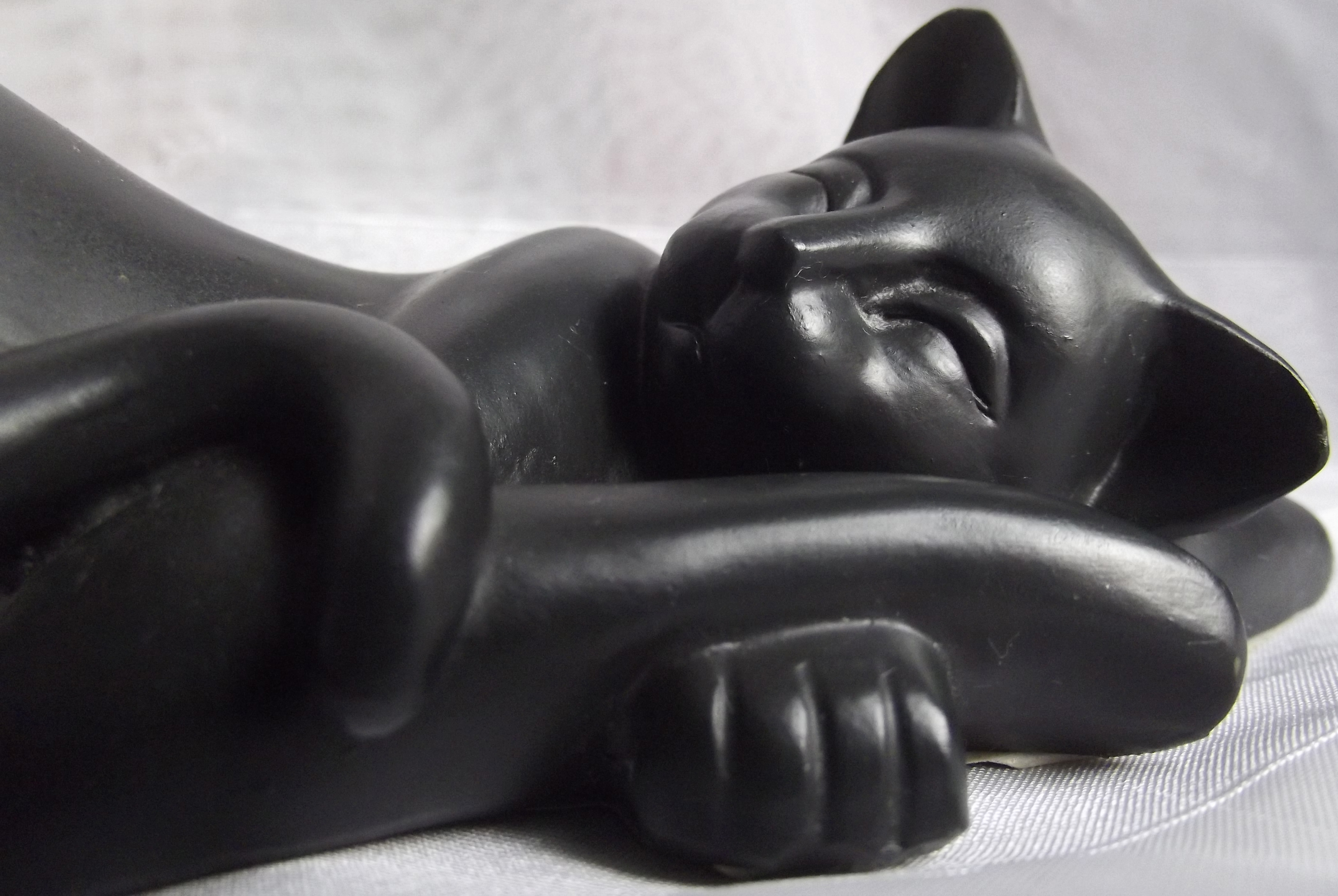
I recently bought this beautiful statue of a large mother cat with a kitten. I didn’t want to go with the generic ‘large’ photograph of items such as buildings, I wanted something different. I realised that this figure shows Large and Small, even though this was unintentionally. Because this sculpture is made from a beautiful shiny bronze like material, I didn’t want to place it on a plain white or plain black background, I wanted something shiny but not too shiny to take the focus off of the statue. I therefore used a piece of silver veil netting. I decided to centralise the subject and keep it quite close to the camera as I wanted to capture the size of the larger cat. I processed this image on Google Picasa and cropped the image, I also lightened it a small amount.

Small:

I realised I had some smaller cat figures which would work perfectly for the small contrast. I wanted to tie the cat theme in with both images as this would show the two contrasts easier. I decided to add some foreground to this image as I wanted to focus on how ‘small’ the figures were. If I zoomed in and focused on them, it would have taken the emphasis on them being small away. I processed the image in Google Picasa, I cropped the image and lightened it a small amount.

Sweet:

My mum recently bought me this union flag cake stand.  I knew this would be perfect for the ‘sweet’ contrast. I decided to go out and buy some delicious cup cakes and chocolate in order to photograph them on the cake stand (and eat afterwards). I used Google Picasa to process the final image. I added a sepia tone to the image. I wanted to make it look old-fashioned.

Sour:

The first thing you think of when asked to choose something sour would be a lemon. I decided to go with it and went and bought a lemon. I cut the lemon open and cut a few slices. I photographed them in daylight, however, it didn’t have the bright yellow colouring I had wanted. I wanted the lemon to be bright yellow. Mine was more pale and washed out. Too much sunlight I think. Therefore, when processing in Picasa, I decided to add a ‘1960’ tone to the image. It makes your image more yellow and saturated.

Black:

When I had to think of a subject to represent the contrast Black, I found a jet black cat figure in my house. I wanted something completely black and this figure was prefect. I edited the image on Picasa, and added a Black and White colour tone to the image, mainly so the figure could stand out more against the veil background.

White:

For this contrast I wanted something predominantly White. I have a white /off white model Chevrolet car.

Smooth:

For Smooth my mum has an old piece of polished wood. I wanted something which, when viewed, would allow the viewer to almost feel the smoothness of the object.

Rough:

For Rough I wanted something with a lot of detail to it. The same old piece of wood, when turned over had a lot of detail and roughness to it. I wanted something which, when viewed, would allow the viewer to almost feel the roughness of the object.

Pointed:

I decided to use extra sharp knives for this contrast, they were extremely pointed and sharp.

Blunt:

Keeping the knife theme, I decided to photograph a child’s blunt knife. I used the same piece of wood as a stand.

Light:

I have a beautiful white dreamcatcher with feathers and beads. I realised this would be great for the ‘light’ contrast. I was planning on photographing just one feather, but after seeing my dreamcatcher, I realised this would have more effect. I processed this on Picasa and added a vintage colouring to make the image look almost ‘floaty’ and ‘dream like’.

Heavy:

For heavy, I decided to photograph weights stacked ontop of eachother. Having more than one would have more of an impact of weight.

Light:

For light, I wanted to use a row of candles, I wanted as much light as possible, but I didn’t want to use a subject like the sun. I wanted something different. Therefore I used candles.

Dark:

For dark, I decided to use the same set up with the candle’s, however, I blew a few out and photographed the smoke rising. With less light and the smoke, it made the final image look ‘dark’ and ‘mysterious’
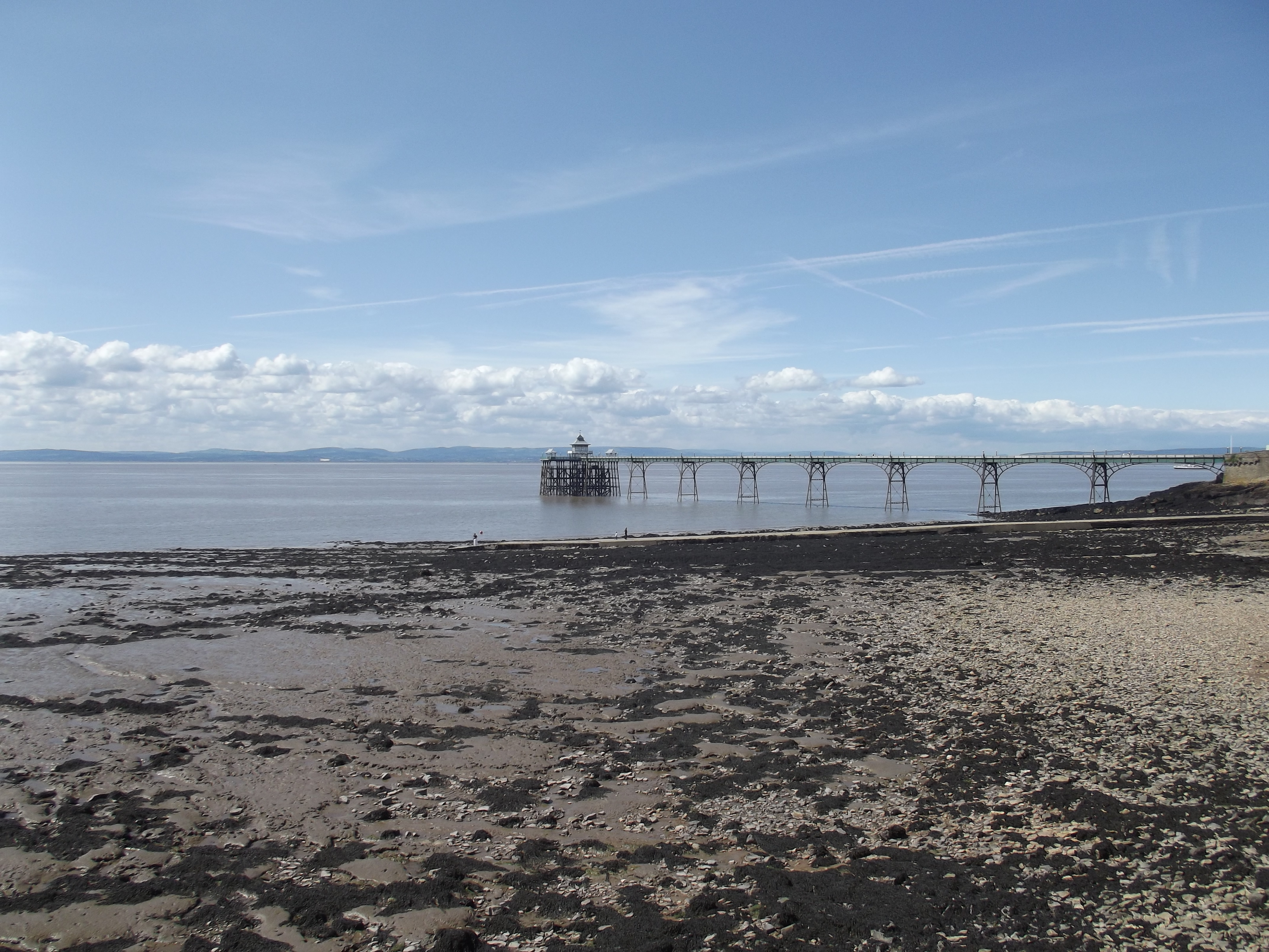
Many:

Rather than using items from around the house, I decided whilst out and about, to photograph an amazing scene of boats in the dock.
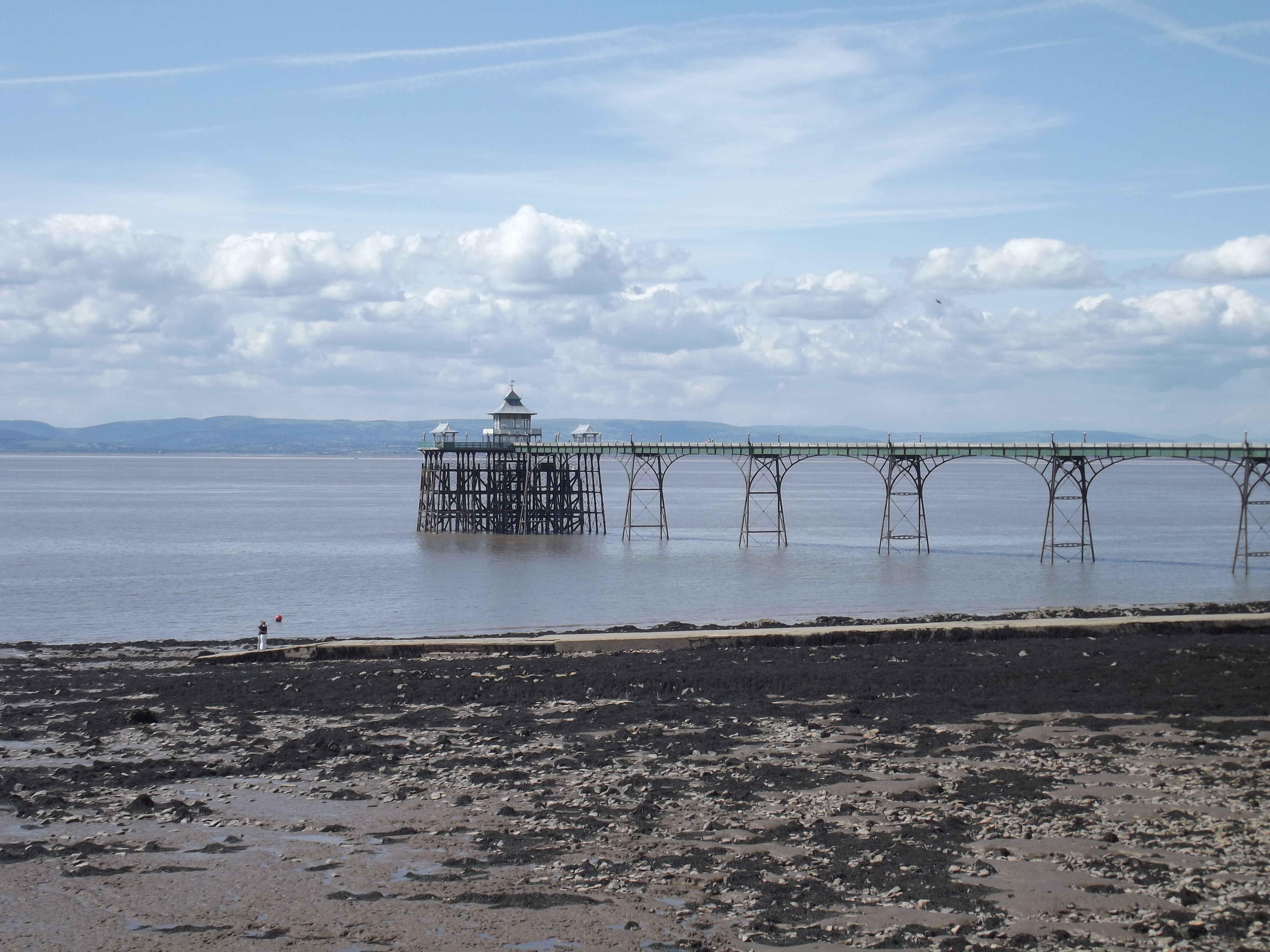
Few:

I then photograph a few boats, to contrast between many and few.

Contrasts in One Picture:

To express two contrasts in one picture. When photographing Light/Dark with candles. The only way I could photograph them was in a dark room. I switched the lights off and drew the curtains. To add more ‘Light’ I used more candles, and when I wanted the effect of ‘Dark’ I blew some candles out. However, there are both contrasts in the ‘Light’ photograph, mainly because the background is black whith the contrast of the light from the candles.

Conclusion:

This assignment could have had some more work done to it. I didn’t really plan to photograph locations or subjects outside. This would deffinately be something I would change. I would go out and find buildings or locations etc to photograph and represent the given contrasts. However, I am happy with how my photographs have come out. I could have changed a few of them, some were a bit light or dark. It took me a while to get the candle photographs right, I then had a lot of photographs to pick through until I found the right one. However, after only having less than 1 month to do the entire 1st assignment and projects, I believe it has gone well so far.

Now I just have to wait for my Tutor’s response and I will post the feedback here.

Tutor’s Feedback:

Overall Comments

Thank you for returning Assignment One to me, you have kept up with the deadline really well which gives me lots of faith in your assignments and course being completed in good time. Your learning log looks great and gives me a good insight into your thoughts on the assignment and images as well as of the process of your studies.

Pointers for the next assignment

Work on your composition skills more, this will come naturally from the next assignment. I look forward to seeing Assignment Two.

Large / Small

I like your image for large, it shows creativity in trying to think outside the box for a subject matter for your images. You have shown here a good understanding of composition, with the focal point (the cats faces) being placed off centre to create a more dynamic composition.

Your image for small is not so successful in my opinion in that there is nothing in the image to give a sense of scale and to show that these cats are small. The composition is also very central, this could be improved perhaps by considering the rule of thirds and placing the cat on one of these lines.

Sweet / Sour

The colours in the Sweet image look great, they give a really Vintage / Retro feel as you intended. The viewpoint shows the patterns on the cake stand well to this feel.

I think that your image for sour could have been more carefully considered. Maybe going in really close to a lemon cut in half and filling the frame with it; maybe showing someone’s reaction to eating the sour lemon. I agree about the yellow not being vibrant and feel it still could be mistaken for an orange. Maybe have a play with the hue as well as brightness and saturation.

Black / White

This image continues to show detail in a black object which can be hard to do, often it will be completely black and lose highlights and shadows but you have avoided this problem here. I think again going in closer and filling the frame with a certain part of the cat e.g. face and paws you could improve the composition and make it a more interesting image.

I think the setup for white has been very effective. I like the use of shallow depth of field here with the lights being pin sharp and gradually going out of focus towards the back of the car.

Smooth / Rough

I think this image is good to show the smoothness of this polished wood, I like the fact it also shows the texture of the wood and is not completely smooth. I like the viewpoint looking across the wooden surface and the sense of perspective this gives. You have also captured the rough texture if this wood very well, there is a lot of form and depth to this image due to the lighting.

Pointed / Blunt

I like the props used for this image but feel that arranging them differently may lead to a more successful composition, I feel your eye gets a bit stuck on the large knife and just looks up into the image then back down and out again. Maybe using this knife to lead your eye into the image might be better, for example placing it more angled off to the left to lead your eye up diagonally and then down the other two knives?

Blunt works very well in contrast with the pointed image. I think again the composition could be worked on a little, it is at a slight angle but maybe really having it cut across the image to create a really strong diagonal and a more dynamic composition.

Light / Heavy

I think that this is an interesting image and gives a good sense of lightness. The image for heavy also works very well. I like the choice of background for the image, the angle you have shot it at and the composition all work very well.

Light / Dark

I like the way that you have chosen to use different coloured candles here to add interest to the image. I like also the arrangement of the candles in a long line. I think though that the composition could be more carefully considered.

I think the image for dark is great. It is imaginative, mysterious and well composed with the unlit candles leading your eye into the lit candles and the smoke.

Many / Few

Wow, there really are many boats here! I like the use of a close up boat as the subject then the smaller boats filling the whole of the background of the image. They give the impression of going on for miles! In strong contrast you have the image of a few boats, they seem even more few from the fact that they are stranded on a low tide. Excellent couple of images here.

Light and Dark

Again, it would be nice to see the line used in an alternative way in the composition here. I like the darkness of the shadows cast by the flames and the different colours within the image.

I have taken my tutor’s advice, and have changed the images she recommended. I have included the new photographs below.

Changes: I took my tutors advice, and I have changed some of my final images. Below are the new, updated images.

Small: “Your image for small is not so successful in my opinion in that there is nothing in the image to give a sense of scale and to show that these cats are small. The composition is also very central, this could be improved perhaps by considering the rule of thirds and placing the cat on one of these lines.”

IMG_3960

Sour: “I think that your image for sour could have been more carefully considered. Maybe going in really close to a lemon cut in half and filling the frame with it; maybe showing someone’s reaction to eating the sour lemon. I agree about the yellow not being vibrant and feel it still could be mistaken for an orange. Maybe have a play with the hue as well as brightness and saturation.”

IMG_3998

Black: “This image continues to show detail in a black object which can be hard to do, often it will be completely black and lose highlights and shadows but you have avoided this problem here. I think again going in closer and filling the frame with a certain part of the cat e.g. face and paws you could improve the composition and make it a more interesting image.”

DSCF4665

Pointed: “I like the props used for this image but feel that arranging them differently may lead to a more successful composition, I feel your eye gets a bit stuck on the large knife and just looks up into the image then back down and out again. Maybe using this knife to lead your eye into the image might be better, for example placing it more angled off to the left to lead your eye up diagonally and then down the other two knives?”

IMG_3968

Blunt: “Blunt works very well in contrast with the pointed image. I think again the composition could be worked on a little, it is at a slight angle but maybe really having it cut across the image to create a really strong diagonal and a more dynamic composition.”

IMG_3977

Light: “I like the way that you have chosen to use different coloured candles here to add interest to the image. I like also the arrangement of the candles in a long line. I think though that the composition could be more carefully considered.”

DSCF5509


Exercise Cropping and Extending.

For this exercise, you had to choose 3 of your own photographs which you had taken. You were asked to choose a different subject for each image.

You had to crop a section of the photograph and add a brief not of the logic behind your choice of cropping

Photograph One:

With this image, I decided to focus mainly on the berry with the piece of string attached to it. I decided to crop it horizontally as I wanted to see it more clearly and the up close detail.

Second Photograph:

With this image, I wanted to focus in more on her facial area and include as much detail on the cards. I wanted to produce some sort of portrait. I decided to crop it vertical rather than horizontal as I only wanted her top half in the frame.

Third Photograph:

With this image, I wanted to focus in mainly on the watch which was hanging over the mirror at the back. I liked the effect of it hanging off centre, and wanted to capture the detail on the watch face.

Exercise Vertical and Horizontal Frames

Cameras are usually built to give us a horizontal view when held normally. This usually discourages many people from turning them sideways in order to shoot upright frames. It may not be as easy to shoot vertically as it is horizontally, however, it is well worth it in the end.

For this exercise, you were asked to choose some fairly compact locations. You would need to photograph the same view twice, One horizontally and one vertically. You need to fit as much of the scene you shoot into a vertical frame, then photograph the same scene horizontally.

For some of these, I used my tripod. I also tried to keep either the subject or the location vertical.

First set of Photographs:

I saw some very interesting lines of seaweed along the beach whilst at Clevedon and realised this would be perfect for showing horizontal and vertical frames.

  Vertical Taken Using: Aperture:F/8.0 , Shutter Speed:1/220 sec , ISO:64 , Distance: Focal Length 10.4mm (equivalent to 62mm on a 35mm film camera)

Horizontal Taken Using: Aperture:F/8.0 , Shutter Speed:1/180 sec , ISO:64  Distance: Focal Length 10.4mm (equivalent to 62mm on a 35mm film camera)

Second set of Photographs:

Whilst on the beach, there were a large amount of vertical stone beds in the sand. They were very interesting and I knew they would make a great image.

Vertical Taken Using: Aperture:F/4.6 , Shutter Speed:1/110 sec , ISO:64 , Distance: Focal Length 17.1mm (equivalent to 101mm on a 35mm film camera)

Horizontal Taken Using: Aperture:F/4.6 , Shutter Speed:1/110 sec , ISO:64 , Distance: Focal Length 17.1mm (equivalent to 101mm on a 35mm film camera)

Third set of Photograph:

Clevedon Pier

Vertical Taken Using: Aperture:F/5.6 , Shutter Speed:1/220 sec , ISO:64 , Distance: Focal Length 55.4mm (equivalent to 326mm on a 35mm film camera)

Horizontal Taken Using: Aperture:F/10 , Shutter Speed:1/90 sec , ISO:64 , Distance: Focal Length 20.2mm (equivalent to 119mm on a 35mm film camera)

Positioning the horizontal frame for this image was easy as I was able to fill the frame with the entire pier, however, choosing where to focus as a vertical frame was quite difficult as I had to only focus on part of the pier. Therefore I only chose the main part at the end.

Fourth set of Photographs:

Clevedon Beach. There was a vertical piece of concrete you could walk down to the sea on. This is what I focused on as it would be great for vertical photographs.

Vertical Taken Using: Aperture:F/6.4 , Shutter Speed:1/1300 sec , ISO:64 , Distance: Focal Length 50mm (equivalent to 30mm on a 35mm film camera)

Horizontal Taken Using: Aperture:F/6.4 , Shutter Speed:1/750 sec , ISO:64 , Distance: Focal Length 5.0mm (equivalent to 30mm on a 35mm film camera)

Fifth set of Photographs:

Vertical set of steps at the railway station.

Vertical Taken Using: Aperture:F/3.4 , Shutter Speed:1/180 sec , ISO:64 , Distance: Focal Length 6.3mm (equivalent to 37mm on a 35mm film camera)

Horizontal Taken Using: Aperture:F/3.4 , Shutter Speed:1/110 sec , ISO:64 , Distance: Focal Length 6.3mm (equivalent to 37mm on a 35mm film camera)

Sixth set of Photographs:

Waterfall in Snuff Mills forest.

  Vertical Taken Using: Aperture:F/4.0, Shutter Speed:1/120 sec , ISO:800 , Distance: Focal Length 15.3mm (equivalent to 97mm on a 35mm film camera)

Horizontal Taken Using: Aperture:F/4.0 , Shutter Speed:1/120 sec , ISO:800 , Distance: Focal Length 17.5mm (equivalent to 111mm on a 35mm film camera)

Seventh set of Photographs:

Lovely baby tree forming from a dead tree in Snuff Mills forest.

Vertical Taken Using: Aperture:F/4.5 , Shutter Speed:1/150 sec , ISO:800 , Distance: Focal Length 34.1mm (equivalent to 215mm on a 35mm film camera)

Horizontal Taken Using: Aperture:F/4.5 , Shutter Speed:1/150 sec , ISO:800 , Distance: Focal Length 34.1mm (equivalent to 215mm on a 35mm film camera)

Eighth set of Photographs:

Penguin at Bristol zoo.

Vertical Taken Using: Aperture:F/4.0, Shutter Speed:1/75 sec , ISO:64 , Distance: Focal Length 16.0mm (equivalent to 101mm on a 35mm film camera)

Horizontal Taken Using: Aperture:F/4.0 , Shutter Speed:1/75 sec , ISO:64 , Distance: Focal Length 16.0mm (equivalent to 101mm on a 35mm film camera)

Overall Opinion:

This was an enjoyable exercise. I wanted to keep either the scene or the subject in the frame such as the flower, vertical as this would help when shooting the vertical image. It would also create quite an interesting image when shot as horizontal.

I am pleased with the results of these photographs. Seeing the horizontal and vertical images show that you can either add detail to your image eg, when shooting horizontally, or only focus on one thing when shooting vertically. From now on, if the subject or location is vertical, or horizontal, I will photograph the scene or the subject both ways. I may end up with some interesting photographs.

Exercise Positioning the Horizon

With a photograph, if there are no obvious points of interest in the view, the horizon line can be the most important element in the picture.

For this exercise, you were asked to find a viewpoint outdoors that gives you an interesting landscape in which there is an unbroken, clear horizon.

I decided to do this exercise whilst I took a trip to Clevedon beach. The horizon line would be perfect for this exercise.

I used my tripod for this exercise as I was able to tilt the camera up and down to position the horizon differently in each image.

I also used the composition tool on my camera. It divides the screen in the viewfinder, and by doing this I was able to position the horizon easier.

First Photograph:

For this first image, I positioned the horizon line towards the top of the frame.

Image

Taken Using:

Aperture:F/8.0

Shutter Speed:1/125 sec

ISO:64

Distance: Focal Length 10.4mm (equivalent to 62mm on a 35mm film camera)

As you can see, there is more foreground in this image and less sky.

Positioning the horizon towards the top of the frame gives the image great depth. Having a lot of foreground in the image takes the focus off of the horizon line as you are now looking at the entire frame rather than just the horizon.

Second Photograph:

For this image, I positioned the horizon halfway to the top.

Image

Taken Using:

Aperture:F/8.0

Shutter Speed:1/180 sec

ISO:64

Distance: Focal Length 10.4mm (equivalent to 62mm on a 35mm film camera)

This image is beginning to let more sky into the frame.

Positioning the horizon line just below the top but not central, still gives great depth to the image.

Third Photograph:

For this image, I positioned the horizon central in the frame.

Image

Taken Using:

Aperture:F/8.0

Shutter Speed:1/220 sec

ISO:64

Distance: Focal Length 10.4mm (equivalent to 62mm on a 35mm film camera)

This image has an equal amount of sky and foreground in the frame.

Positioning the horizon line central in the frame gives the image an equal,static composition.

Fourth Photograph:

For this image, I positioned the horizon half way towards the bottom of the frame. Just off centre.

Image

Taken Using:

Aperture:F/8.0

Shutter Speed:1/220 sec

ISO:64

Distance: Focal Length 10.4mm (equivalent to 62mm on a 35mm film camera)

In this image, there is more sky than foreground.Placing the horizon line here allows the sky to be more dominant. However, it also gives the feeling that the pier is gradually coming closer as there isn’t too much foreground to make it feel distant.

Fifth Photograph:

For this image, I positioned the horizon right at the bottom of the frame.

Image

Taken Using:

Aperture:F/8.0

Shutter Speed:1/250 sec

ISO:64

Distance: Focal Length 10.4mm (equivalent to 62mm on a 35mm film camera)

This image shows only the sky and horizon line. There is no foreground.Therefore drawing your view to the horizon line and the pier in the corner.

Favourite Image:

My favourite image would have to be the third photograph. I prefer the horizon line central in the frame as it creates a balanced image. Your attention is still drawn to the horizon line, however, you are also drawn to the rest of the image. Your not focusing on one item in the image.

Overall Opinion:

I liked this exercise, especially as I was able to photograph a beautiful setting. It took me a few times to choose the right location. I took some photographs of just the water and the sky, but you couldn’t really see the horizon line. Choosing the beach ‘mud’ and the pier as something to focus on, allowed me to create a scenic image as well as showing the changing horizon lines.


Exercise Balance

The idea of balance is fundamental in composition;it applies not just to where a subject is positioned, but to every kind of arrangement. Balance means setting up equilibrium between two or more parts of something.

Two unequal objects can be balanced by placing them carefully in the frame so that the larger object is closer to the centre and the smaller one nearer to the edge of the frame. Maximum symmetry occurs when objects or lines radiate around the frame’s centre giving symmetry on all axes.

Balance does not have to be simply between two obvious objects. It can be between and object and a background, or between two different areas of tone or colour.

For this exercise, you were asked to choose 6 of your own photographs which you have previously taken yourself. You then had to decided how the balance works in each photograph. It didn’t matter whether or not the main element in the picture are masses of tone, or colour. You had to look for what you seemed to believe was the ‘dominant’ part or parts of the image.

You then had to identify the ‘dominant’ parts and draw a small rectangular sketch around the item. Then you had to draw a weighing scale to show the balance or off-balance in your image.

First Photograph:

The first photograph I chose to look at was one of two blue flowers I had taken a few years ago. I didn’t think much about composition at this point. It was more of a point and shoot image.

The balance between two subjects and colour. As you can see, one flower is higher than the second. There is some sort of balance in this image, even though you can clearly see the difference in height of the flowers. If the flowers were to be positioned side by side, it wouldn’t have the same feel to the image, it would be too cramped. The division in height and colour with the bright green stem cuts the bold blue colour and balances it out. Having a white background also helps.

Second Photograph:

The second photograph was of a seagull also taken a while back.

This photograph is balanced. The seagull is positioned directly in the centre of the frame.

Third Photograph:

The third photograph is of 3 tortoise.

The balance between subjects. This photographs shows three large tortoise. The one large on in the front is the main focal point, however, the two smaller ones in the back balance this image out. The way they are positioned make them almost as large as the main large tortoise in the front.

Fourth Photograph:

The fourth photograph is of a sunset.

The balance between two colours. Even though the division of the colours isn’t exactly 50-50, with the horizon line in the frame, the division between the light red and the dark sea is somewhat equal.Also the sun and the reflection on the sea is mirrored and central.

Overall Opinion:

I found this exercise quite difficult. Before I began this course, I didn’t really take too much time in composing my image unless it was for my a-level work. If I was out and saw something like the sunset or flowers, I would position myself to get the photograph I wanted. I did take more than one photograph of the same subject in different positions, but I have never really thought about composing my image with balance between subjects or colours etc until now. I usually divided the frame without too much thought. Looking back through my work, it is hard to choose photographs which in my opinion show obvious balance such as the tortoise photograph. Therefore I have only chosen 4 which I can see a balance in. I now understand how important it is to double look at everything you take a photograph of, whether its a subject or a location. Like some of the previous exercises, I will now look for either colours or items in the frame which will show some type of balance in the final photograph.

Exercise Focal Lengths and Different Viewpoints

For this exercise, you were asked to find a scene which was open, like the previous exercise.

This exercise was to help you learn that different lenses give different views. When you change your viewpoint, as you change your lens, the perspective can also become different.

I was unable to use the same scene as the previous exercise as I would be unable to do part of this exercise as it needed you to get up close to the subject.

I therefore chose a flower bed situated near my local railway station. I would be able to walk to and from the subject along the platform.

Due to me having a zoom lens camera, for this exercise, I would use my zoom at its farthest and at its shortest.

First Photograph:

The first photograph needed you to use a telephoto lens, for me I used my zoom at its farthest setting.

Image

Taken Using:

Aperture:F/5.6

Shutter Speed:1/170 sec

ISO:100

Distance: Focal Length 90.0mm (equivalent to 30mm on a 529mm film camera)

As you can see, the Foreground, Background and Middle – Ground appear close. Everything appears flat with no depth to it. The image consists of sharp  horizontal and verticle lines.

Second Photograph:

The second photograph needed you to use a Wide angle lens. I used my lens at its smallest setting.

Image

Taken Using:

Aperture:F/3.1

Shutter Speed:1/280sec

ISO:64

Distance: Focal Length 5.0mm (equivalent to 30mm on a 35mm film camera)

With this photograph we are now aware of the distance between the different elements in the frame. The distance from where Im stood to the background seems much longer. We get more details from items surrounding the scene such as the fencing which also helps to show the longer distance. You are now able to see trees in the background. The flower bed box is much clearer and the horizontal and verticle lines in the image are much sharper. The overall perspective is enhanced.

Overall Opinion:

It took me a while to get the right composition for this exercise. I needed to find a suitable scene for these photographs. The local train station helped as I was able to walk as far away on the platform as I needed. I didn’t use my tripod for this exercise, however I belive I should have as my images could have turned out a lot better. There is some slight blur in the photographs. Know that I know this, I wont forget for next time. I did enjoy this exercise. It allows you to understand how changing lenses, or in my case, using my different zoom lengths, you are able to have multiple perspectives in your photographs. You are able to see that you can cut items out of the frame such as trees or fences in my case with a long zoom, or add everything into the frame with a small zoom.

Exercise Focal Lengths for cameras with variable focal lengths

For this exercise, you were asked to find a view which was open, yet at the same time, had some detail in the distance or in the middle of the view. It was a beautiful sunny day, so I chose to take a trip to Clevedon, just down the road. There is a beautiful beach and coast line with a great pier with lots of detail, which stretches out into the sea. This was perfect for this exercise.

Without moving, you had to take a sequence of photographs, all aimed in the same direction, with whatever range of lenses you have. In my case, I have a camera with a zoom lens, so I had to use my aperture settings for this exercise.You were asked to begin with the

I used my tripod for this exercise. I set myself up on the beach front and aimed my camera so the pier stretched across my frame, but was still very central.

For this exercise, I set my camera to the aperture mode. I began by taking two test photographs. The first Wide angle, the Second, Telephoto.

First Photograph:

Wide Angle

Image

Taken Using:

Aperture:F/3.1

Shutter Speed:1/1200 sec

ISO:64

Distance: Focal Length 5.0mm (equivalent to 30mm on a 35mm film camera)

Second Photograph:

Telephoto

Image

Taken Using:

Aperture:F/11

Shutter Speed:1/58 sec

ISO:64

Distance: Focal Length 42.9mm (equivalent to 252mm on a 35mm film camera)

As you can see, the wide angle photograph shows the entire beach and sky, yet the telephoto photograph singles out the pier.

I then photographed a sequence of photographs with various focal lengths and apertures. I began with Wide angle at F/3.1, then somewhere in the middle which was F/7.1, and then telephoto which is F/11 on my camera. I also included the photographs in the middle of the sequence to show how the photographs show the change in the subject’s movement.

Photograph One:

Wide angle

Image

Taken Using:

Aperture:F/3.1

Shutter Speed:1/1100 sec

ISO:64

Distance: Focal Length 5.0mm (equivalent to 30mm on a 35mm film camera)

Photograph Two:

Image

Taken Using:

Aperture:F/4.0

Shutter Speed:1/680sec

ISO:64

Distance: Focal Length 10.4mm (equivalent to 62mm on a 35mm film camera)

 Third Photograph:

Middle focal point

Image

Taken Using:

Aperture:F/7.1

Shutter Speed:1/220sec

ISO:64

Distance: Focal Length 7.6mm (equivalent to 45mm on a 35mm film camera)

Fourth Photograph:

Image

Taken Using:

Aperture:F/8.0

Shutter Speed:1/160 sec

ISO:64

Distance: Focal Length 12.3mm (equivalent to 73mm on a 35mm film camera)

Fifth Photograph:

Image

Taken Using:

Aperture:F/9.0

Shutter Speed:1/125 sec

ISO:64

Distance: Focal Length 17.1mm (equivalent to 101mm on a 35mm film camera)

Sixth Photograph:

Image

Taken Using:

Aperture:F/10

Shutter Speed:1/110 sec

ISO:64

Distance: Focal Length 23.6mm (equivalent to 139mm on a 35mm film camera)

Seventh Photograph:

Telephoto

Image

Taken Using:

Aperture:F/11

Shutter Speed:1/90 sec

ISO:64

Distance: Focal Length 33.0mm (equivalent to 194mm on a 35mm film camera)

Overall Opinion:

After looking at the photographs in a series, you are able to see that as the focal length gets longer, the angle of view closes in. The magnification also increases and you are able to see the detail in the pier, especially at aperture F/11 with 33.0mm focal length.

I really enjoyed this exercise as I was able to choose a fantastic view to shoot. Having an empty (ish) beach allowed me to play around with my camera settings before I managed to get it right and was able to shoot a clear empty wide angle view of the beach and then show the gradual change in focal lengths.


Exercise A Sequence of Composition

This exercise was designed to help you think about the practical process of composing an image.

‘Ordinarily you would only shoot when the moment seemed just right, but here you will record all the moments that are ‘almost’ right’

You were asked to choose a situation which involved people, such as a parade or a market, however, I was unable to photograph a situation which involved people.

Whilst at a local graveyard, I decided to use a beautiful angel statue for this exercise. I would be able to move around the statue and focus in and around different area’s.

For this exercise, you were asked to use the camera as a viewer and keep your eye to it constantly. You were to take photographs as you go along. They would be able to record how you moved around and found the best image.

I used my tripod for this exercise whilst still moving around as I didn’t want any blurred images.

I also set my camera to auto, as it was an extremely sunny day, I would let the camera choose what ISO, Shutter speed and Aperture it wanted depending on what angle it was shot from.

Photograph One:

I began by positioning the Angel statue and grave in the middle of the frame. I wanted it to be the main subject.

I also wanted to keep the gravestone either side in the frame as well, as this would balance the image and keep it symmetrical. Due to the gravestones either side being smaller, it allows the angel statue to be the main focal point as it is much taller.

In my opinion, it may have looked better if the background would have been either all blue sky, or all dark. It would have made the statue stand out more.

Image

Taken using:

Shutter Speed:1/180 sec

ISO:64

Aperture:F/6.4

Distance: Focal Length 5.0mm (equivalent to 30mm on a 35mm film camera)

Second Photograph:

For this photograph, I focused in more on the statue itself. I took the foreground out, but still kept some of the gravestone either side.

Image

Taken using:

Shutter Speed:1/100 sec

ISO:64

Aperture:F/8.0

Distance: Focal Length 10.4mm (equivalent to 62mm on a 35mm film camera)

Third Photograph:

For this image, I focused in more to the angel statue, and kept the gravestones either side out of the frame.

Image

Taken using:

Shutter Speed:1/90 sec

ISO:64

Aperture:F/8.0

Distance: Focal Length 8.9mm (equivalent to 53mm on a 35mm film camera)

Fourth Photograph:

For this photograph, I wanted to focus closer in onto the angel itself. I wanted to capture the statue with the bright blue sky behind it, which would enable the statue to stand out more. I kept the green trees towards the bottom of the frame as I still wanted colour in the image.

Image

Taken using:

Shutter Speed:1/90 sec

ISO:64

Aperture:F/10

Distance: Focal Length 20.2mm (equivalent to 119mm on a 35mm film camera)

Fifth Photograph:

I wanted to cut some more of the trees and gravestones in the background out, and focused in more on the statue. I like the contrast between the green at the bottom and the blue sky.

Image

Taken using:

Shutter Speed:1/85 sec

ISO:64

Aperture:F/10

Distance: Focal Length 20.2mm (equivalent to 119mm on a 35mm film camera)

Sixth Photograph:

I then decided to completely cut out the trees and only focused in on the angel.

I really like how the blue background enables the statue to be bold and stand out. It may have looked better if the dark tree in the top left hand corner would not be there.

Image

Taken using:

Shutter Speed:1/280 sec

ISO:64

Aperture:F/5.5

Distance: Focal Length 37.8mm (equivalent to 222mm on a 35mm film camera)

Seventh Photograph:

I then moved in closer to focus in more on the top part, in order to get more details on the face and flowers. I wanted to allow the statue to stand out against the blue background. However, there is still a part of the tree in the corner. This would be something I would have to erase out of the frame.

Image

Taken using:

Shutter Speed:1/280 sec

ISO:64

Aperture:F/5.5

Eighth Photograph:

I then focused in more towards the facial area and top half. Focusing in more allowed me to cut the tree out of the frame.

Image

Taken using:

Shutter Speed:1/280 sec

ISO:64

Aperture:F/5.5

Ninth Photograph:

I then focused in on the flowers and her hands

Image

Taken using:

Shutter Speed:1/280 sec

ISO:64

Aperture:F/5.5

After focusing on the statue from the front, I then decided to move towards the left hand side of the grave, in order to see whether or not focusing on the statue from an angle may be a more interesting photograph. There were also more gravestones to the right hand side and by moving towards the left, I would be able to include more of them in the background which I thought may have made a more interesting photograph.

Tenth Photograph:

I began by photographing the grave from a short distance. I wanted to include some foreground and background.

Image

Taken using:

Shutter Speed:1/170 sec

ISO:64

Aperture:F/6.4

Distance: Focal Length 5.0mm (equivalent to 30mm on a 35mm film camera)

Eleventh Photograph:

For this photograph, I focused in more towards the grave itself, whilst cutting out the foreground.

Image

Taken using:

Shutter Speed:1/180 sec

ISO:64

Aperture:F/6.4

Distance: Focal Length 5.0mm (equivalent to 30mm on a 35mm film camera)

Twelfth Photograph:

I then focused in more towards the main statue grave, and the gravestone on the right hand side, whilst still keeping some of the background.

Image

Taken using:

Shutter Speed:1/140 sec

ISO:64

Aperture:F/8.0

Distance: Focal Length 8.9mm (equivalent to 53mm on a 35mm film camera)

Thirteenth Photograph:

Focused in more. I wanted the blue sky to surround the statue, whilst still having some of the green trees to keep some colour in the frame.

Image

Taken using:

Shutter Speed:1/100 sec

ISO:64

Aperture:F/9.0

Distance: Focal Length 17.7mm (equivalent to 101mm on a 35mm film camera)

Fourteenth Photograph:

I focused in on the statue more and cut out some of the background

Image

Taken using:

Shutter Speed:1/90 sec

ISO:64

Aperture:F/10

Distance: Focal Length 20.2mm (equivalent to 119mm on a 35mm film camera)

Fifteenth Photograph:

I focused on the angel statue only.  I like this photograph because I kept the colours half and half in the frame, half blue half green.

Image

Taken using:

Shutter Speed:1/90 sec

ISO:64

Aperture:F/10

Distance: Focal Length 28.3mm (equivalent to 167mm on a 35mm film camera)

Sixteenth Photograph:

Focusing in more on the statue.

Image

Taken using:

Shutter Speed:1/90 sec

ISO:64

Aperture:F/10

Distance: Focal Length 20.2mm (equivalent to 119mm on a 35mm film camera)

Seventeenth Photograph:

I then focused in more towards the statue. The statue really stands out against this background.

Taken using:

Shutter Speed:1/90 sec

ISO:64

Aperture:F/10

Eighteenth Photograph:

I focused more towards the facial area.

Taken using:

Shutter Speed:1/90 sec

ISO:64

Aperture:F/10

Nineteenth Photograph:

I then decided to move myself and the camera around to the right hand side of the grave. There was a large tree and more head stones next to it and in the background. I thought that this may make an interesting photograph as the background would be a different colour, rather than blue, as there is a dark tree behind it.

I began by photographing it wide-angle to include everything in the frame.

Taken using:

Shutter Speed:1/120 sec

ISO:64

Aperture:F/6.4

Distance: Focal Length 5.0mm (equivalent to 30mm on a 35mm film camera)

Twentieth Photograph:

I then focused in on the statues more, cutting out the foreground.

Taken using:

Shutter Speed:1/240 sec

ISO:64

Aperture:F/4.2

Distance: Focal Length 12mm (equivalent to 73mm on a 35mm film camera)

Twenty First Photograph:

I focused on the angel statue, and cut out the head stones either side.

Taken using:

Shutter Speed:1/150 sec

ISO:64

Aperture:F/5.2

Distance: Focal Length 28.3mm (equivalent to 167mm on a 35mm film camera)

Twenty Second Photograph:

I focused in more on the statue.

Taken using:

Shutter Speed:1/170 sec

ISO:100

Aperture:F/5.6

Distance: Focal Length 55.4mm (equivalent to 326mm on a 35mm film camera)

Final Image:

I chose this out of the series of images, as my final choice, mainly because I like how the statue is the main focal point. The clue sky surrounds the statue and makes it more prominent. I like how there is still colour from the green trees at the bottom. If this image had only blue colour, the statue wouldn’t have been as prominent.

Overall Opinion:

I really enjoyed this exercise. I liked how you were able to photograph things quickly without having to position the subject or the background correctly. You were able to take as many photographs as you wanted without worrying if you were doing it right. I did still use my tripod for some stability. Once the images were uploaded, I was able to see how the photographs showed the movements I made around the subject and the different focal lengths I used. They do show a ‘Stop-frame movie’ of your subject and area. I am not 100% happy with how some of them have come out. There are some photographs which I have taken in the series which I haven’t uploaded as they don’t fit in right with the sequence of composition. Some are blurred or not too clear, some are too bright etc, but these types of photographs which you can learn from and reflect on how this exercise has gone. This exercise has taught me that there are many different elements in a photograph and photographing a scene without fully knowing what you are set to photograph, allows you to view a scene or a subject in a different way. You end up with photographs you may not have chosen or may have dismissed usually.

This would be an exercise which I may have to try again at a later date. Perhaps using people in an event like the project said. As people move and don’t stay still at events, this would lead to a set of interesting images.

Exercise Object in different positions in the frame

For this exercise, you were asked to find a subject which is clear and set within a large, even background.

I decided to use two subjects with two completely different backgrounds.

The first would be a gravestone set within the graveyard, the other would be a birdcage on a pink blanket.

You were asked to take a series of photographs in which the subject would be placed in different positions in the frame.

For this series of photographs, I used my tripod as it would reduce any camera shake. I would also be able to move the subject in the frame by gradually loosening the head of the tripod, and tilting the camera.

I used the ‘Best framing; tool which I have on my camera. It divides the frame with small squares which enable you to choose where your subject is positioned.

The first photograph needed the subject to be positioned in the centre of the frame.

First Photograph:

Image

The first photograph was taken using

Shutter Speed:1/125 sec

ISO:64

Aperture:F/4.2

Distance: Focal Length 12.3mm (equivalent to 73mm on a 35mm film camera)

Using the ‘Best framing tool’, I positioned the headstone in the centre box in the viewfinder. This would make the headstone the main focal point in the photograph.

Second Photograph:

The second photograph had to position the subject a little way from the centre.

Image

The second photograph was taken using

Shutter Speed:1/125 sec

ISO:64

Aperture:F/4.2

Distance: Focal Length 12.3mm (equivalent to 73mm on a 35mm film camera)

Using the ‘Best framing tool’, I positioned the headstone in the centre box of the left-hand side in the viewfinder. This would make the headstone appear off centre towards the left hand side of the photograph.

Third Photograph:

I decided to position the headstone in the right hand area of the photograph, whilst remembering to keep it off-centre.

Image

The Third photograph was taken using

Shutter Speed:1/120 sec

ISO:64

Aperture:F/4.2

Distance: Focal Length 12.3mm (equivalent to 73mm on a 35mm film camera)

Using the ‘Best framing tool’, I positioned the headstone in the centre of the box in the right hand area of the viewfinder. This would make the headstone appear off centre towards the right hand side of the photograph.

Fourth Photograph:

The fourth photograph had to have the subject positioned in a corner of the frame.

Image

The fourth photograph was taken using

Shutter Speed:1/200 sec

ISO:64

Aperture:F/4.2

Distance: Focal Length 12.3mm (equivalent to 73mm on a 35mm film camera)

Using the ‘Best framing tool’, I positioned the headstone in the centre box in the bottom right hand corner in the viewfinder. This would make the headstone sit in the right hand corner of the photograph.

Fifth Photograph:

For this photograph I decided to position the head stone in left hand corner.

Image

The fifth photograph was taken using

Shutter Speed:1/160 sec

ISO:64

Aperture:F/4.2

Distance: Focal Length 12.3mm (equivalent to 73mm on a 35mm film camera)

Using the ‘Best framing tool’, I positioned the headstone in the centre box of the left hand bottom corner in the viewfinder. This would make the headstone sit in the bottom left hand corner of the photograph.

Sixth Photograph:

I positioned the headstone in the top left hand corner of the photograph

Image

The sixth photograph was taken using

Shutter Speed:1/100 sec

ISO:64

Aperture:F/4.2

Distance: Focal Length 12.3mm (equivalent to 73mm on a 35mm film camera)

Using the ‘Best framing tool’, I positioned the headstone in the centre box of the top left hand corner in the viewfinder. This would make the headstone sit in the top left hand corner of the photograph.

Seventh Photograph:

I positioned the headstone in the top right hand corner of the photograph.

Image

The seventh photograph was taken using

Shutter Speed:1/90 sec

ISO:64

Aperture:F/4.2

Distance: Focal Length 12.3mm (equivalent to 73mm on a 35mm film camera)

Using the ‘Best framing tool’, I positioned the headstone in the centre box in the right hand corner in the viewfinder. This would make the headstone sit in the right hand corner of the photograph.

  1. When your photographs have been processed, lay them out and put them in order of preference. Which version appears to work the most comfortably and which the least?
  2. As you asses what you have done concentrate on the relationship between the subject and its background. When the subject was placed in the middle of the frame, the subject will certainly be prominent, but the background may have no central mass, it has  been ‘puncture’ so that it just surrounds the subject equally. Compare this version with your others. Do you think this makes the subject and background work together?
  1. My personal preference: Most – Least

Photograph 1, Photograph 4, Photograph 5, Photograph 2, Photograph 6, Photograph 3, Photograph 7

In my opinion, the subject fits most comfortably in the middle of the frame. You are able to see the background as well as the grass in the foreground. Having the subject positioned in the centre of the photograph, draws your eye to the image more.

The photograph that is least comfortable would have to be photograph 7. There is too much grass in the foreground and not enough background.

2.  When the subject is positioned in the middle of the frame, the background may have no central mass making it surround the subject equally.  Compare this version with your others. Do you think this makes the subject and background work together? Comparing Photograph 1 with Photograph 2, 4 and 7. I will determine whether or not positioning the subject in a different position of the frame, will make the subject and the background work better together.

Photograph 2: The subject in this photograph is positioned off centre towards the left hand side. The background surrounds the subject just like when the subject is positioned central in the frame. With this photograph, you become more aware of the background, as the subject is not central, however, the background isn’t too prominent, you are still drawn in by the head stone.In my opinion, the background does work best with subject.

Photograph 4: The subject in this photograph is positioned in the bottom right hand corner of the frame. The background in this photograph is more prominent than the previous two. The colours from the tree and the detail on the head stones behind are what draw your eye in first, then you look at the head stone in the bottom corner.In my opinion, the background doesn’t work best with the subject.

Photograph 7: The subject in this photograph is positioned in the top right hand corner. There is more foreground than there is background. Your eye is more drawn to the foreground and the headstone rather than the background. In my opinion, the background doesn’t work with the subject.

For my second series of photographs, I decided to use a simple white birdcage on a plain pink background. I wanted to see whether or not using a plain background, could enable the subject to be more prominent in the frame. I didn’t want anything in the background to distract your attention.

For this exercise, I also used the ‘Best framing’ tool.

First Photograph:

The first photograph needed the subject to be positioned in the middle of the frame.

The first photograph was taken using

Shutter Speed:1/34 sec

ISO:800

Aperture:F/3.4

Distance: Focal Length 6.3mm (equivalent to 37mm on a 35mm film camera)

Using the ‘Best framing tool’, I positioned the Birdcage in the centre box in the viewfinder. This would make the birdcage the main focal point in the photograph.

Second Photograph:

The second photograph had to position the subject a little way from the centre.

The second photograph was taken using

Shutter Speed:1/30 sec

ISO:800

Aperture:F/3.4

Distance: Focal Length 6.3mm (equivalent to 37mm on a 35mm film camera)

Using the ‘Best framing tool’, I positioned the Birdcage in the centre box of the right hand side in the viewfinder. This would make the birdcage appear off centre in the photograph.

Third Photograph:

The third photograph had to position the subject in a corner of the frame.

The third photograph was taken using

Shutter Speed:1/26 sec

ISO:800

Aperture:F/3.4

Distance: Focal Length 6.3mm (equivalent to 37mm on a 35mm film camera)

Using the ‘Best framing tool’, I positioned the Birdcage in the centre box of the top right hand corner in the viewfinder.

Fourth Photograph:

The fourth photograph had to position the subject in a corner of the frame.

The fourth photograph was taken using

Shutter Speed:1/20 sec

ISO:800

Aperture:F/3.8

Distance: Focal Length 6.3mm (equivalent to 37mm on a 35mm film camera)

Using the ‘Best framing tool’, I positioned the Birdcage in the centre box of the bottom right hand corner in the viewfinder.

Fifth Photograph:

The fifth photograph had to position the subject in a corner of the frame.

The fifth photograph was taken using

Shutter Speed:1/28 sec

ISO:800

Aperture:F/3.8

Distance: Focal Length 6.3mm (equivalent to 37mm on a 35mm film camera)

Using the ‘Best framing tool’, I positioned the Birdcage in the centre box of the bottom left hand corner in the viewfinder.

  • When your photographs have been processed, lay them out and put them in order of preference. Which version appears to work the most comfortably and which the least?
  •  My personal preference: Most – Least

Photograph 1, Photograph 5, Photograph 2, Photograph 3, Photograph 4.

In my opinion, the subject fits most comfortably in the middle of the frame. Having the subject positioned in the centre of the photograph, draws your eye to the image more. The photograph that is least comfortable would have to be photograph 4. The subject doesn’t fit the frame right, In my opinion it looks awkward.

Overall Opinion:

I really enjoyed this exercise. Using the viewfinder, I was able to view a subject and position the camera different ways. After looking at the final series of photographs with the subject in different positions of the frame, I was able to see that subjects can look different depending on where they are positioned. They can be more prominent or less prominent. The background can be more or less defined. Looking back on this exercise, I have learnt that you should take as many different photographs with the subject in different positions in the frame, as you are unaware of what the photograph will look like once it’s processed. It may look like a good shot in the viewfinder, but it may not be what you wanted once it’s been processed. By taking multiple photographs with the subject in different positions, you have the choice of what photograph looks the best in then. This exercise has given me more confidence when taking photographs. I will take more in order to give myself that choice at the end.